Unlock a world of possibilities! Login now and discover the exclusive benefits awaiting you.
- Qlik Community
- :
- Forums
- :
- Analytics
- :
- New to Qlik Analytics
- :
- Bell curve
- Subscribe to RSS Feed
- Mark Topic as New
- Mark Topic as Read
- Float this Topic for Current User
- Bookmark
- Subscribe
- Mute
- Printer Friendly Page
- Mark as New
- Bookmark
- Subscribe
- Mute
- Subscribe to RSS Feed
- Permalink
- Report Inappropriate Content
Bell curve
Hi all,
I need to create a bell curve in qlik sense.
Bell curve should represent the average time taken to complete the each subject.
I tried it but i am not getting.
i have attaching the .qvf file and sample data.
please explain how to do it.
Thanks,
Pramod
- Mark as New
- Bookmark
- Subscribe
- Mute
- Subscribe to RSS Feed
- Permalink
- Report Inappropriate Content
Hi all,
After trying i got a graph like below.
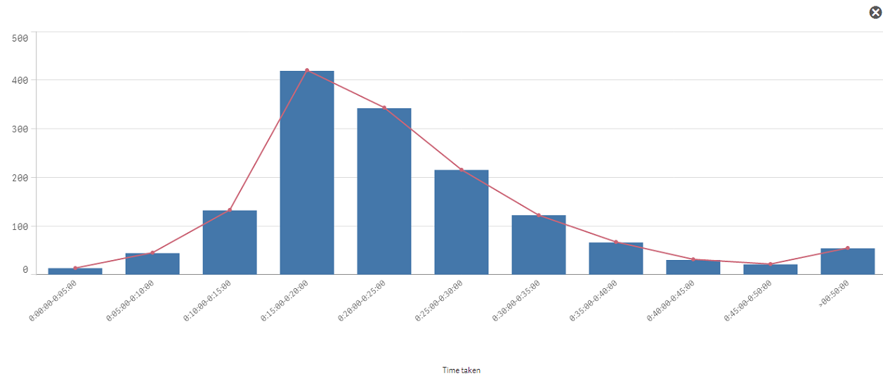
I am not sure is this correct.
I am using same expression for both bar and line.
Dimensions: class([`total_time_taken`],'00:05:00.000','Timetaken')
Measures:
Bar Graph: count({$<subject_id={'2'},subject_status={'passed','completed'}>}user_id)
Line : count({$<subject_id={'2'},subject_status={'passed','completed'}>}user_id)
I am not getting how to use the NORMDIST() for line.
I used Measure for line as below,This is not working.
Only(Normdist(class(user_id,0),Avg(total user_id),Stdev(total user_id), 0))*0*Count(total user_id)
Please anyone explain about the Normdist() syntax regarding this example. in original post i have added sample data and .qvf file.
Thanks,
Pramod
- Mark as New
- Bookmark
- Subscribe
- Mute
- Subscribe to RSS Feed
- Permalink
- Report Inappropriate Content
Hi Pramod,
This a link to an excellent article written for QlikView illustrating how to solve the same problem as you have outlined. The example will also work in Qlik Sense. Recipe for a Histogram
Hope this helps.
Rod
- Mark as New
- Bookmark
- Subscribe
- Mute
- Subscribe to RSS Feed
- Permalink
- Report Inappropriate Content
Hi all,
Anyone help to create a bell curve for above data....
Thanks,
Pramod