Unlock a world of possibilities! Login now and discover the exclusive benefits awaiting you.
- Qlik Community
- :
- Forums
- :
- Analytics
- :
- New to Qlik Analytics
- :
- Best way to visualize a table
Options
- Subscribe to RSS Feed
- Mark Topic as New
- Mark Topic as Read
- Float this Topic for Current User
- Bookmark
- Subscribe
- Mute
- Printer Friendly Page
Turn on suggestions
Auto-suggest helps you quickly narrow down your search results by suggesting possible matches as you type.
Showing results for
Contributor II
2022-11-23
03:36 AM
- Mark as New
- Bookmark
- Subscribe
- Mute
- Subscribe to RSS Feed
- Permalink
- Report Inappropriate Content
Best way to visualize a table
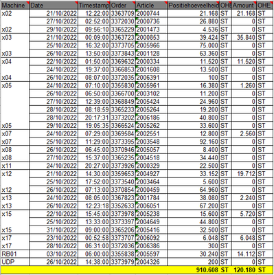
I'm fairly new to Qliksense, I was wondering what would be the best way to visualize data in a similar way as the image below?
Hope someone can come with suggestions!
Thank you in advance,
506 Views
1 Solution
Accepted Solutions
Master
2022-11-24
03:27 AM
- Mark as New
- Bookmark
- Subscribe
- Mute
- Subscribe to RSS Feed
- Permalink
- Report Inappropriate Content
I would say using a pivot table. Data can be analyzed in multiple dimensions and measures simultaneously and rearranged to gain a different perspective. You can expand the rows of interest while keeping the rows collapsed in the rest of the table.
479 Views
2 Replies
Master
2022-11-24
03:27 AM
- Mark as New
- Bookmark
- Subscribe
- Mute
- Subscribe to RSS Feed
- Permalink
- Report Inappropriate Content
I would say using a pivot table. Data can be analyzed in multiple dimensions and measures simultaneously and rearranged to gain a different perspective. You can expand the rows of interest while keeping the rows collapsed in the rest of the table.
480 Views
Contributor II
2022-11-29
09:11 AM
Author
- Mark as New
- Bookmark
- Subscribe
- Mute
- Subscribe to RSS Feed
- Permalink
- Report Inappropriate Content
Thank you for your solution, I ended up visualising it this way:
457 Views
Community Browser

