Unlock a world of possibilities! Login now and discover the exclusive benefits awaiting you.
- Qlik Community
- :
- Forums
- :
- Analytics
- :
- New to Qlik Analytics
- :
- Re: Burndown Sample in Qlik
- Subscribe to RSS Feed
- Mark Topic as New
- Mark Topic as Read
- Float this Topic for Current User
- Bookmark
- Subscribe
- Mute
- Printer Friendly Page
- Mark as New
- Bookmark
- Subscribe
- Mute
- Subscribe to RSS Feed
- Permalink
- Report Inappropriate Content
Burndown Sample in Qlik
Hi All,
Does any one has sample of burndown chart in qlik sense with burndown rate and the project timeline, if so pls guide me with details or share the file.
Thanks
- Mark as New
- Bookmark
- Subscribe
- Mute
- Subscribe to RSS Feed
- Permalink
- Report Inappropriate Content
Check this community thread...It's a QVW but you can use the same load script.
https://community.qlik.com/t5/QlikView-App-Dev/Burn-down-chart/m-p/1580105/thread-id/442776#M442807
If you don't have a QV desktop to open with, here is the load script from the QVW mentioned.
Directory;
LOAD Qtr,
Hours
FROM
SampleData.xls
(biff, embedded labels, table is Sheet1$);
Dim:
LOAD * INLINE [
Dim
1
2
];
=========================
The Sample sheet data can be downloaded from the community post above...
Hopefully this puts you on the right track...if not, please add additional details about your requirement here along with any mockups or snapshots of expected results.
ps: here is another example from a community member: https://community.qlik.com/t5/QlikView-App-Dev/Advice-on-creating-a-burn-down-chart/td-p/252298
Kind regards...
- Mark as New
- Bookmark
- Subscribe
- Mute
- Subscribe to RSS Feed
- Permalink
- Report Inappropriate Content
Thanks Frank_S for the details. It will help me to understand and use the concept to build the solution.
- Mark as New
- Bookmark
- Subscribe
- Mute
- Subscribe to RSS Feed
- Permalink
- Report Inappropriate Content
Hi @Frank_S ,
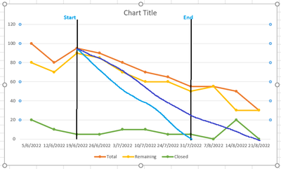
I am looking some thing line in the attached image. Please guide me in this how can this be achieved. I am doing it in Qlik sense. Your suggestion will be much appreciated.
The requirement is to create a trend chart with burndown values and expected closure date by looking at 2 weeks average. Below table has data on weekly basis which will be used to plot the graph. Highlighted dates are planned start and end dates. Between these 2 dates we should be able to draw a dotted line to show the planned date trend.
From the start date, we should start calculating 2 weeks average to derive the projected end date and draw trend line to point the expected closure date.
Blue line in chart is Planned trend
purple is expected line with the calculation of 2 weeks average.
Hope i have explained all the points.
| Date | Total | Remaining | Closed |
| 5/6/2022 | 100 | 80 | 20 |
| 12/6/2022 | 80 | 70 | 10 |
| 19/6/2022 | 95 | 90 | 5 |
| 26/6/2022 | 90 | 85 | 5 |
| 3/7/2022 | 80 | 70 | 10 |
| 10/7/2022 | 70 | 60 | 10 |
| 24/7/2022 | 65 | 60 | 5 |
| 31/7/2022 | 55 | 50 | 5 |
| 7/8/2022 | 55 | 55 | 0 |
| 14/8/2022 | 50 | 30 | 20 |
| 21/8/2022 | 30 | 30 | 0 |
- Mark as New
- Bookmark
- Subscribe
- Mute
- Subscribe to RSS Feed
- Permalink
- Report Inappropriate Content
It's going to be useful to check out these links to assist you as I did not receive any internal feedback to your detailed development requirement.
- https://developer.qlik.com/garden
- https://community.qlik.com/t5/App-Development/bd-p/qlik-sense-app-development
Kind regards...
- Mark as New
- Bookmark
- Subscribe
- Mute
- Subscribe to RSS Feed
- Permalink
- Report Inappropriate Content
Thank @Frank_S for sharing the links, i will check it.
