Unlock a world of possibilities! Login now and discover the exclusive benefits awaiting you.
- Qlik Community
- :
- Forums
- :
- Analytics
- :
- New to Qlik Analytics
- :
- Re: CDF (cumulative distribution function) Graph
- Subscribe to RSS Feed
- Mark Topic as New
- Mark Topic as Read
- Float this Topic for Current User
- Bookmark
- Subscribe
- Mute
- Printer Friendly Page
- Mark as New
- Bookmark
- Subscribe
- Mute
- Subscribe to RSS Feed
- Permalink
- Report Inappropriate Content
CDF (cumulative distribution function) Graph
Hello everyone,
I am very new to Qlik Sense and I am looking for a way to create a graph based on a CDF function.
I know how to do it in Excel 🙂 but I am not sure if I could apply the same principle here.
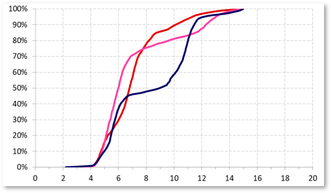
For example in Excel I would create a pivot table to individually list all the values. Then I would create a "percentile" formula from 0 to 100 over the data set. In the end I am looking to get something like in the chart below:
Any help where and how to start would be very appreciated. In the meantime I continue my search 🙂
Greets
Daniel
- Mark as New
- Bookmark
- Subscribe
- Mute
- Subscribe to RSS Feed
- Permalink
- Report Inappropriate Content
Hello. For the ones interested I managed to find a solution. In a Line Chart use the following formulas:
Dimensions
=if(Field1='Filter1' AND Field2='Filter2' AND Field3='Filter3', Class([Field5]],1))
Where Field1, Field2 and Field3 are filters (if you need to filter to a specific dataset), and Field5 is the data I want represented.
The value after comma in the Class function gives you the width/interval of the Class. Meaning that depending on your dataset if you want narrower ranges, you need to change this value. Or if you want a smoother representation in the Appearance section go to X-Axis and change the "Continuous" option to "Custom" and choose "Use continuous scale". Depending on how much data you have, it will take now (in comparison to the non continuous option) longer to calculate the chart.
Unfortunatelly the X-Axis Range cannot be manually formated, but it can be manipulated a bit by the filters you use here. Meaning, that if you only represent a portion of your dataset, you could use filters here to filter out data that has a different MAX value that will then be represented on your X-Axis.
Measures
=RangeSum(Above(Count({<[Field1]={"Filter1"}, [Field2]={"Filter2"}, [Field3]={"Filter3"}, [Field4]={"Filter4"}>} [Field5]]),0,RowNo(TOTAL))) / Count({<[Field1]={"Filter1"}, [Field2]={"Filter2"}, [Field3]={"Filter3"}, [Field4]={"Filter4"}>} TOTAL [Field5]])
More, under Measures I formated the number as Simple / Percentage and you should set the Range under Appearance / Y-Axis to "Custom" -> Min/Max -> 0 to 1.
Cheers Daniel
- Mark as New
- Bookmark
- Subscribe
- Mute
- Subscribe to RSS Feed
- Permalink
- Report Inappropriate Content
Hi Daniel,
I am afraid, I have followed your comments correctly, but, I am not getting the desired CDF graph.
Is there any other link, anyone may be aware of ?
Regards,
Chinmaya
- Mark as New
- Bookmark
- Subscribe
- Mute
- Subscribe to RSS Feed
- Permalink
- Report Inappropriate Content
This piece of code is working fine if you have just 1 dimension as shown.
=if(Field1='Filter1' AND Field2='Filter2' AND Field3='Filter3', Class([Field5]],1))
I have another dimension to include in the chart, I have tried to include TOTAL<DIM1> in place of TOTAL (as shown below ) but it didn't worked out.
Measures
=RangeSum(Above(Count({<[Field1]={"Filter1"}, [Field2]={"Filter2"}, [Field3]={"Filter3"}, [Field4]={"Filter4"}>} [Field5]]),0,RowNo(TOTAL))) / Count({<[Field1]={"Filter1"}, [Field2]={"Filter2"}, [Field3]={"Filter3"}, [Field4]={"Filter4"}>} TOTAL<DIM1> [Field5]])
I have to add the above measure for each of my dimension as a temporary workaround. If anyone having any thought please let me know.
Regards,
Chinmaya