Unlock a world of possibilities! Login now and discover the exclusive benefits awaiting you.
- Qlik Community
- :
- Forums
- :
- Analytics
- :
- New to Qlik Analytics
- :
- Change bar chart color if value is above average.
- Subscribe to RSS Feed
- Mark Topic as New
- Mark Topic as Read
- Float this Topic for Current User
- Bookmark
- Subscribe
- Mute
- Printer Friendly Page
- Mark as New
- Bookmark
- Subscribe
- Mute
- Subscribe to RSS Feed
- Permalink
- Report Inappropriate Content
Change bar chart color if value is above average.
Hello Folks,
I've got a simple bar chart, with an Average calculation reference line. Thus far, it looks like this.
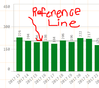
What I would like is that when the Bar is above the reference line, it's Blue and when it's below the reference line it's Green
My expression looks like so:
If( Count(Order) > Avg(Aggr(Count(Order),[Scheduled Week])), Blue(), Green())
But not matter what, the bar is ALWAYS green. What should I be using to get this to work? For instance, the value 226 should be Blue as it is above the average and the value of 184 is below the average.
Any help is greatly appreciated.
Accepted Solutions
- Mark as New
- Bookmark
- Subscribe
- Mute
- Subscribe to RSS Feed
- Permalink
- Report Inappropriate Content
Your bar chart seems to be suffering from an inverse "Lake Wobegon effect" (Lake Wobegon - Wikipedia).
Add a TOTAL keyword.
If( Count(Order) > Avg(TOTAL Aggr(Count(Order),[Scheduled Week])), Blue(), Green())
-Rob
- Mark as New
- Bookmark
- Subscribe
- Mute
- Subscribe to RSS Feed
- Permalink
- Report Inappropriate Content
Hi Justin,
Try Putting your expression in a variable and then try.
Something like this
if( Sum(Sales) >
$(vAvg),Blue( ),Green( ) )
Regards,
Rajan
- Mark as New
- Bookmark
- Subscribe
- Mute
- Subscribe to RSS Feed
- Permalink
- Report Inappropriate Content
Hi,
Actual I'm in need of same but have one doubt. Where are you using this expression? In the expression for reference line or your dimension?
Your help is very much appreciated.
Thanks
- Mark as New
- Bookmark
- Subscribe
- Mute
- Subscribe to RSS Feed
- Permalink
- Report Inappropriate Content
Hello Gentleman,
Here I am very new to Qliksense and did lot of work using Tableau.
I have similar use case where I have simple bar chart and color out above of avg value to blue and below the avg bar to green.

Need your help.
I have used an expression to similar to what you wrote in 'DImension Reference Line' section but no luck.
=if (sum(Spend) > avg(total aggr(sum(Spend), Region)), red(), Green())
- Mark as New
- Bookmark
- Subscribe
- Mute
- Subscribe to RSS Feed
- Permalink
- Report Inappropriate Content
In the Dimension Reference Line Expression, write this :
avg(aggr(sum(Spend), Region))
In the color expression, write this :
=if(sum(Spend) > avg(total aggr(sum(Spend), Region)), red(), Green())

Enjoy your Qlik.
Kind regards,
Théo ATRAGIE.
- Mark as New
- Bookmark
- Subscribe
- Mute
- Subscribe to RSS Feed
- Permalink
- Report Inappropriate Content
Instead of adding to dimension reference line have the formula:
- In Appearance section change the Colors from Auto to custom.
- Set the threshold to avg(spend).
- Write the formula:
=if (sum(Spend) > avg(total aggr(sum(Spend), Region)), red(), Green())
It worked for me.