Unlock a world of possibilities! Login now and discover the exclusive benefits awaiting you.
- Qlik Community
- :
- Forums
- :
- Analytics
- :
- New to Qlik Analytics
- :
- Re: Chart colours with Set Expression
- Subscribe to RSS Feed
- Mark Topic as New
- Mark Topic as Read
- Float this Topic for Current User
- Bookmark
- Subscribe
- Mute
- Printer Friendly Page
- Mark as New
- Bookmark
- Subscribe
- Mute
- Subscribe to RSS Feed
- Permalink
- Report Inappropriate Content
Chart colours with Set Expression
Hi,
I have a line chart showing a KPI across years. It uses a full load of data from 5 DHBs. There is one line for all DHBs using the set expression
avg({<DHB=>} LOS)
and another line using
avg({<DHB={'A'}>} LOS)
The chart works as expected, but I'd like to change its colours. At the moment the "all DHBs" line is pale blue and the A line is pale red - these are automatic colours.
If I use custom colours by expression, something like
if([DRG] = 'A', red(), RGB(179,179,179))
which worked before I used set expressions, both lines are grey.
Is this because DHB 'A' is included in the 'All DHBs' set?
Is there anything I can do about it?
Thanks!
Steve
- « Previous Replies
-
- 1
- 2
- Next Replies »
- Mark as New
- Bookmark
- Subscribe
- Mute
- Subscribe to RSS Feed
- Permalink
- Report Inappropriate Content
Do you want to color only the second line? Not sure your requirement is clear as to what you are looking to do?
- Mark as New
- Bookmark
- Subscribe
- Mute
- Subscribe to RSS Feed
- Permalink
- Report Inappropriate Content
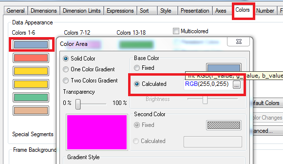
I assume, You may use Color which already built in Color Tab from properties of that chart? There you have to customize the Color Code Color functions ‒ QlikView
- Mark as New
- Bookmark
- Subscribe
- Mute
- Subscribe to RSS Feed
- Permalink
- Report Inappropriate Content
Thanks, Sunny
Sorry for the lack of clarity: I want to colour the 'A' line red, and either leave the 'All' line grey or force it to be grey.
That way the coloured selection stands out against the lighter one.
Regards,
Steve
- Mark as New
- Bookmark
- Subscribe
- Mute
- Subscribe to RSS Feed
- Permalink
- Report Inappropriate Content
Thanks, Anil,
Yes, the chart can be coloured with the standard colours - I just want to change them...
- Mark as New
- Bookmark
- Subscribe
- Mute
- Subscribe to RSS Feed
- Permalink
- Report Inappropriate Content
May be check here
- Mark as New
- Bookmark
- Subscribe
- Mute
- Subscribe to RSS Feed
- Permalink
- Report Inappropriate Content
I don't think that Qlik Sense Desktop has that method; it looks very clever...
We do have the ability to specify colours, but they aren't working (using the method I've used in the past).
Thanks,
Steve
- Mark as New
- Bookmark
- Subscribe
- Mute
- Subscribe to RSS Feed
- Permalink
- Report Inappropriate Content
I apologies, That's my fault 
Will you able to share the screen, and can you tell us whether where we need to change i mean which line that may helps to understand rather than Functional
- Mark as New
- Bookmark
- Subscribe
- Mute
- Subscribe to RSS Feed
- Permalink
- Report Inappropriate Content
Let's see whether I can do this:
First, I have a simple chart. Colours are selected automatically:

Then I tried to colour the lines: if the DHB is A, use a deeper red, otherwise grey:

The expression is
if(DHB = 'A',RGB(178,36,36),RGB(179,179,179))
Sadly, I got this:

so my expression didn't work.
I have used
if(DHB = 'B' , argb(125,0,0,255) ,
if(DHB = 'C', argb(125,0,255,0) ,
if(DHB = 'D', argb(125,255,0,0) ,
if(DHB = 'E', ARGB(125,0,255,255),
if(DHB = 'A',RGB(178,36,36))))))
and the result was

so I know the method works - bit I think it might be tripping up when DHB 'A' is part of the whole.
Thanks,
Steve
- Mark as New
- Bookmark
- Subscribe
- Mute
- Subscribe to RSS Feed
- Permalink
- Report Inappropriate Content
May be data points are more for DHB - A. Can you check over there? Because of color the line won't effect. And We really don't know which is for which color. The Red color is for A? I am sorry to question you?
- « Previous Replies
-
- 1
- 2
- Next Replies »