Unlock a world of possibilities! Login now and discover the exclusive benefits awaiting you.
- Qlik Community
- :
- Forums
- :
- Analytics
- :
- New to Qlik Analytics
- :
- Chart with 24 hour time scale to display Data
Options
- Subscribe to RSS Feed
- Mark Topic as New
- Mark Topic as Read
- Float this Topic for Current User
- Bookmark
- Subscribe
- Mute
- Printer Friendly Page
Turn on suggestions
Auto-suggest helps you quickly narrow down your search results by suggesting possible matches as you type.
Showing results for
Contributor II
2021-10-06
07:39 AM
- Mark as New
- Bookmark
- Subscribe
- Mute
- Subscribe to RSS Feed
- Permalink
- Report Inappropriate Content
Chart with 24 hour time scale to display Data
Hi All,
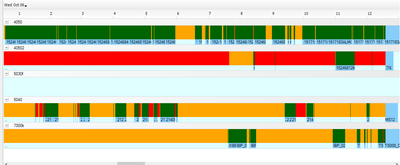
I recently started using qliksense so not too familiar yet. I was wanting to create a chart which shows the current running state of our machines on a 24 hour timescale.
I have been looking online and haven't seen anything similar in qlik yet!
I have timestamp fields and I have created the difference in seconds. I have attached a copy of the report we are wanting something similar to and the table I have. I know this is probably relatively simple but I am completely lost!
Any help is appreciated!
333 Views
1 Reply
Partner - Contributor III
2021-10-08
08:09 AM
- Mark as New
- Bookmark
- Subscribe
- Mute
- Subscribe to RSS Feed
- Permalink
- Report Inappropriate Content
Hello,
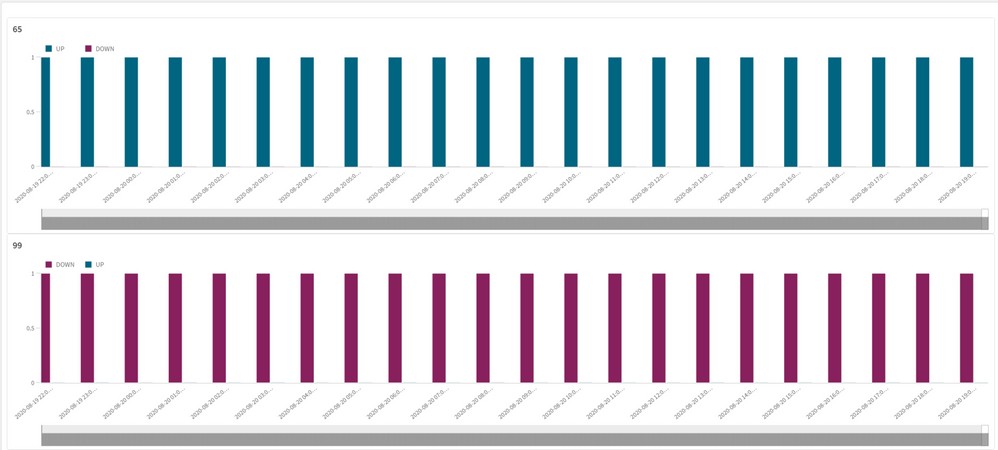
Look attached qvf file for a quick solution, may can help you.
The logic below:
- Load custom data
- Create master calendar
- Use interval match
- Create a master visualization
- Use a trellis Container
286 Views
Community Browser


