Unlock a world of possibilities! Login now and discover the exclusive benefits awaiting you.
- Qlik Community
- :
- Forums
- :
- Analytics
- :
- New to Qlik Analytics
- :
- Re: Circular Graphic - Help recreating in Qlik Sen...
- Subscribe to RSS Feed
- Mark Topic as New
- Mark Topic as Read
- Float this Topic for Current User
- Bookmark
- Subscribe
- Mute
- Printer Friendly Page
- Mark as New
- Bookmark
- Subscribe
- Mute
- Subscribe to RSS Feed
- Permalink
- Report Inappropriate Content
Circular Graphic - Help recreating in Qlik Sense
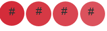
Could anyone point me towards the best way to recreate a graphic that would sort of look like this? Basically just a circle with a number displayed in it?
Accepted Solutions
- Mark as New
- Bookmark
- Subscribe
- Mute
- Subscribe to RSS Feed
- Permalink
- Report Inappropriate Content
If you want it fully built-out the code is even smaller:
HTML:
<div ng-repeat="row in data.rows" style="float:left">
<svg width="120" height="120">
<g font-size="20pt">
<circle style="cx:60;fill:{{row.measures[1].qText}}"/>
<text x="60" y="65">{{row.measures[0].qText}}</text>
</g>
</svg>
</div>
CSS:
circle {cy:60; r:50; fill:red}
text {fill:white; stroke:white; text-anchor:middle}
I added one dimension and two measures. The first measure needs to contain the number/text that will be shown in the circle. The second measure if specified will have values that gives the colors in color names from the CSS color name list.
For instance:
=Pick( RowNo(), 'red','green','blue','orange','yellow')
or using the standard colors of Qlik:
=Color(RowNo())
Or you could simply have the colornames in a field associated with the dimension of course.
A final use of a the widget looks like this:
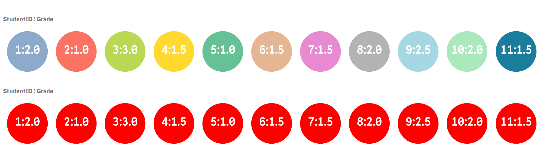
The widget has been added twice as a component on a sheet. The first has the Color(RowNo()) expression as the second measurement. The last one doesn't have a second measure and defaults to using red as set in the CSS of the widget for all KPIs.
- Mark as New
- Bookmark
- Subscribe
- Mute
- Subscribe to RSS Feed
- Permalink
- Report Inappropriate Content
Creating a Qlik Sense Widget would be a way to get what you want. However you will need the skills to be able to use HTML, CSS, AngularJS. You have the option of creating the widget in the Qlik Sense Dev Hub.
- Mark as New
- Bookmark
- Subscribe
- Mute
- Subscribe to RSS Feed
- Permalink
- Report Inappropriate Content
A quick-hack to serve as a proof-of-concept:

This is static with exactly five circles.... So you will have to extend it yourself.
- Mark as New
- Bookmark
- Subscribe
- Mute
- Subscribe to RSS Feed
- Permalink
- Report Inappropriate Content
Wow thanks Peter that is really going above and beyond.
Looks like I will be putting in some extra time today 
I will put this in the column of "Things I thought would be much easier to do in Qlik Sense" lol
- Mark as New
- Bookmark
- Subscribe
- Mute
- Subscribe to RSS Feed
- Permalink
- Report Inappropriate Content
If you want it fully built-out the code is even smaller:
HTML:
<div ng-repeat="row in data.rows" style="float:left">
<svg width="120" height="120">
<g font-size="20pt">
<circle style="cx:60;fill:{{row.measures[1].qText}}"/>
<text x="60" y="65">{{row.measures[0].qText}}</text>
</g>
</svg>
</div>
CSS:
circle {cy:60; r:50; fill:red}
text {fill:white; stroke:white; text-anchor:middle}
I added one dimension and two measures. The first measure needs to contain the number/text that will be shown in the circle. The second measure if specified will have values that gives the colors in color names from the CSS color name list.
For instance:
=Pick( RowNo(), 'red','green','blue','orange','yellow')
or using the standard colors of Qlik:
=Color(RowNo())
Or you could simply have the colornames in a field associated with the dimension of course.
A final use of a the widget looks like this:
The widget has been added twice as a component on a sheet. The first has the Color(RowNo()) expression as the second measurement. The last one doesn't have a second measure and defaults to using red as set in the CSS of the widget for all KPIs.
- Mark as New
- Bookmark
- Subscribe
- Mute
- Subscribe to RSS Feed
- Permalink
- Report Inappropriate Content
Non-custom widget solution.
Use a Text & image widget .. set circle image as background
- Mark as New
- Bookmark
- Subscribe
- Mute
- Subscribe to RSS Feed
- Permalink
- Report Inappropriate Content
Did this work for you?
- Mark as New
- Bookmark
- Subscribe
- Mute
- Subscribe to RSS Feed
- Permalink
- Report Inappropriate Content
Sorry for the late response Petter. This appears to be working. Thanks.