Unlock a world of possibilities! Login now and discover the exclusive benefits awaiting you.
- Qlik Community
- :
- Forums
- :
- Analytics
- :
- New to Qlik Analytics
- :
- Re: Color for a limit area based on a condition in...
- Subscribe to RSS Feed
- Mark Topic as New
- Mark Topic as Read
- Float this Topic for Current User
- Bookmark
- Subscribe
- Mute
- Printer Friendly Page
- Mark as New
- Bookmark
- Subscribe
- Mute
- Subscribe to RSS Feed
- Permalink
- Report Inappropriate Content
Color for a limit area based on a condition in a Gauge
Hi,
I have a Gauge Chart, for which I have set a limit. Is there any possibility to set the color for a limit area in the gauge based on a condition??
For instance, I have two Variables(ACTUAL and BUDGET), which generates values based on selection. I set a limit in the gauge using an expression, which identifies whether ACTUAL or BUDGET applies to the limit. If the limit is BUDGET, the area in Gauge from the limit to MAX should be green and if ACTUAL is the limit, then the area from the limit to MAX should be red.
I am attaching the screenshot of my scenario,(Selection values are specified below each)


I have kept a KPI to show the variance for the related items(In another way, my requirement is like when the KPI is green, i want the area in graph to be green and if the KPI is red, i want the area in graph to be red(by default its showing green))
Attaching the qvf for the same also.
- « Previous Replies
-
- 1
- 2
- Next Replies »
- Mark as New
- Bookmark
- Subscribe
- Mute
- Subscribe to RSS Feed
- Permalink
- Report Inappropriate Content
Hi
Gauge shart does'nt support custom colors
- Mark as New
- Bookmark
- Subscribe
- Mute
- Subscribe to RSS Feed
- Permalink
- Report Inappropriate Content
I selected a Cauge
> go to > Appearance > Presentation >
- Select Use segments
- Drag The Scale (1) to customize your GOAL
- Clik the area after the threshold point to give it a color ,and the area below threshold to give it another color
- Select Gradient (2) to be Grading between the two colors.
- But Unfortunatly there is no option to color it by expression
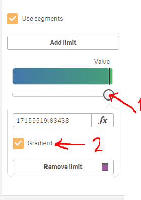
Does this answer your Question ???
- Mark as New
- Bookmark
- Subscribe
- Mute
- Subscribe to RSS Feed
- Permalink
- Report Inappropriate Content
Hi shaimamahmoud,
Thanks for your response, I appreciated.
Actually setting up the Gradient will not suit for my requirement. I want it to change the color of the area, from RED / GREEN depending on the Variable(ACTUAL / BUDGET). 
- Mark as New
- Bookmark
- Subscribe
- Mute
- Subscribe to RSS Feed
- Permalink
- Report Inappropriate Content
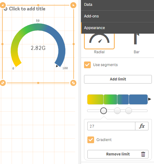
You can also , add multiple ranges and multiple thresholds , or Limits
by pressing button Add Limit as in the pic,
and use Gradient at every Limit on its own
- you can use the expression at the Limit Value , for evaluation value , not for evaluating color,
this makes you do what you want in a reverse way
- Mark as New
- Bookmark
- Subscribe
- Mute
- Subscribe to RSS Feed
- Permalink
- Report Inappropriate Content
Clarifying my requirement.
I have an expression to set the Maximum Limit of the Gauge, (If ACTUAL is greater, MaxLimit is ACTUAL, if BUDGET is GREATER, MaxLimit is BUDGET).
Now I set a Limit in the Gauge(If ACTUAL is greater, limit is BUDGET, if BUDGET is GREATER, limit is ACTUAL).
Now about the color of Area in Gauge from Limit to MaxLimit. If the limit is ACTUAL, then color of the area should be RED and if the Limit is BUDGET then the color is GREEN.
The variables and expressions I used for my requirement is there in the .qvf
- Mark as New
- Bookmark
- Subscribe
- Mute
- Subscribe to RSS Feed
- Permalink
- Report Inappropriate Content
How about adding 2 Limits
Actual and Budget and coloring each one of them
- Mark as New
- Bookmark
- Subscribe
- Mute
- Subscribe to RSS Feed
- Permalink
- Report Inappropriate Content
If we add two limits, then it will be two different areas. Even there won't be any intersected area for both.
- Mark as New
- Bookmark
- Subscribe
- Mute
- Subscribe to RSS Feed
- Permalink
- Report Inappropriate Content
Limit 1 = MIN (Actual , Budget)
LIMIT2 = MAX(Actaul, Budget)
- Mark as New
- Bookmark
- Subscribe
- Mute
- Subscribe to RSS Feed
- Permalink
- Report Inappropriate Content
Instead of a gauge, you could use a stacked bar chart with a KPI object underneath and get a similar look. For bar charts you can absolutely set the colors of each of the bar segments conditionally.
- « Previous Replies
-
- 1
- 2
- Next Replies »