Unlock a world of possibilities! Login now and discover the exclusive benefits awaiting you.
- Qlik Community
- :
- Forums
- :
- Analytics
- :
- New to Qlik Analytics
- :
- Color line chart by fieldname "Year"
- Subscribe to RSS Feed
- Mark Topic as New
- Mark Topic as Read
- Float this Topic for Current User
- Bookmark
- Subscribe
- Mute
- Printer Friendly Page
- Mark as New
- Bookmark
- Subscribe
- Mute
- Subscribe to RSS Feed
- Permalink
- Report Inappropriate Content
Color line chart by fieldname "Year"
Hello together,
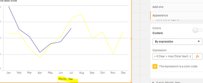
I have a line chart with two dimensions. Month and Year. So I can compare the months in the years.
As an expression I used the following:
sum ({<year = {$ (= max (year)), $ (= max (year) -1), $ (= max (year) -2)}, quarter =, month =,% date =>} au.number)
Because Qlik Sense chooses colors that look too similar, I want to use a formula for my own colors.
I thought of the following formula:
= if (year = max (year) -1, yellow (), if (year = max (year) -2, green (), blue ()))
But it does not work.
Do you have a solution for me?
- Tags:
- color
- line chart
- Mark as New
- Bookmark
- Subscribe
- Mute
- Subscribe to RSS Feed
- Permalink
- Report Inappropriate Content
Try like below
= if (Year = max (Total Year) -1, yellow (), if (Year = max (Total Year) -2, green (), blue ()))
Please close the thread by marking correct answer & give likes if you like the post.
- Mark as New
- Bookmark
- Subscribe
- Mute
- Subscribe to RSS Feed
- Permalink
- Report Inappropriate Content
Thank you for your response. Unfortunately the formula doesn't work 😞
- Mark as New
- Bookmark
- Subscribe
- Mute
- Subscribe to RSS Feed
- Permalink
- Report Inappropriate Content
its working fine.
Please close the thread by marking correct answer & give likes if you like the post.
- Mark as New
- Bookmark
- Subscribe
- Mute
- Subscribe to RSS Feed
- Permalink
- Report Inappropriate Content
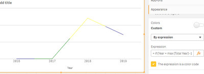
Sorry for the missunderstanding. The years are shown as a single line.
And I need a color for every single year.
- Mark as New
- Bookmark
- Subscribe
- Mute
- Subscribe to RSS Feed
- Permalink
- Report Inappropriate Content
Can you provide sample qvf file.
Please close the thread by marking correct answer & give likes if you like the post.
- Mark as New
- Bookmark
- Subscribe
- Mute
- Subscribe to RSS Feed
- Permalink
- Report Inappropriate Content
I have the "Qlik Sense Enterprise" version. I don't think I can do an export with that. Or do you know how?
- Mark as New
- Bookmark
- Subscribe
- Mute
- Subscribe to RSS Feed
- Permalink
- Report Inappropriate Content
Can't anyone help?


