Unlock a world of possibilities! Login now and discover the exclusive benefits awaiting you.
- Qlik Community
- :
- Forums
- :
- Analytics
- :
- New to Qlik Analytics
- :
- Coloring measures by dimension for employee tenure...
- Subscribe to RSS Feed
- Mark Topic as New
- Mark Topic as Read
- Float this Topic for Current User
- Bookmark
- Subscribe
- Mute
- Printer Friendly Page
- Mark as New
- Bookmark
- Subscribe
- Mute
- Subscribe to RSS Feed
- Permalink
- Report Inappropriate Content
Coloring measures by dimension for employee tenure gantt chart
Hello,
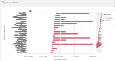
I'm currently putting together employee tenure gantt chart and I've managed to make some progress thanks to the Qlik Community. My current employee tenure chart sorted by joining date order looks like below, but I'd like to use a blue color for male employees and a red color for female employees in order to distinguish and visualize gender in the chart below. I'd greatly appreciate it if you could let me know how I can do that.
Thanks a lot for your help!
Accepted Solutions
- Mark as New
- Bookmark
- Subscribe
- Mute
- Subscribe to RSS Feed
- Permalink
- Report Inappropriate Content
This issue was solved by creating two measures for each gender with color association in each measure and stacking up together in a stacked bar chart.
- Mark as New
- Bookmark
- Subscribe
- Mute
- Subscribe to RSS Feed
- Permalink
- Report Inappropriate Content
Regarding my question above, after my novice online research, I have a feeling that the solution could be achieved by combining measures
Alt(date([Leave date]), today(0)) - Alt([HR changes.Hiring date], today(0))
and
if(Gender='M',blue(),red())
I'd appreciate it if anyone could let me know how I could combine the time dimension measure and color function above to be used in the 2nd measure in a horizontal stacked bar chart.
Thank you for your guidance.
- Mark as New
- Bookmark
- Subscribe
- Mute
- Subscribe to RSS Feed
- Permalink
- Report Inappropriate Content
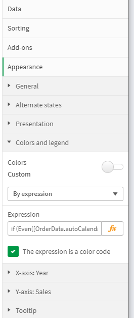
Expand Appearance -> Colors and Legend. Uncheck Color Custom and select "By Expression". Enter your gender color expression in the input box.
- Mark as New
- Bookmark
- Subscribe
- Mute
- Subscribe to RSS Feed
- Permalink
- Report Inappropriate Content
Thanks for your response. However, because my horizontal stacked bar chart has two measures, 'Hiring Date' and Tenure, and I want to white (or no fill) color to 'Hiring Date' master measure, and I just want the Tenure measure to be color coded by the color expression of blue for male and red for female, the solution above alone does not produce what I need, as it colors not only Tenure measure but also 'Hiring Date' measure by that expression. I guess I need something like if formula to specify if the measure is Hiring Date, use white color and if the measure is Tenure, follow the color coding if-expression, but I am not familiar with Qlik Sense syntax and I don't know how to do this. I'd appreciate it if anyone can let me know how I can achieve what I am trying to do.
- Mark as New
- Bookmark
- Subscribe
- Mute
- Subscribe to RSS Feed
- Permalink
- Report Inappropriate Content
I'd appreciate it if anyone could let me know how I can write color expression when there are two measures which I want to apply different color conditions. If it is 'Hiring date' measure, I want it to be white for both male and female, but if it is 'Tenure' measure I want it to be blue for male and red for female. I know now how I can combine the color expression if formula with the different conditions for two measures.
- Mark as New
- Bookmark
- Subscribe
- Mute
- Subscribe to RSS Feed
- Permalink
- Report Inappropriate Content
This issue was solved by creating two measures for each gender with color association in each measure and stacking up together in a stacked bar chart.
- Mark as New
- Bookmark
- Subscribe
- Mute
- Subscribe to RSS Feed
- Permalink
- Report Inappropriate Content
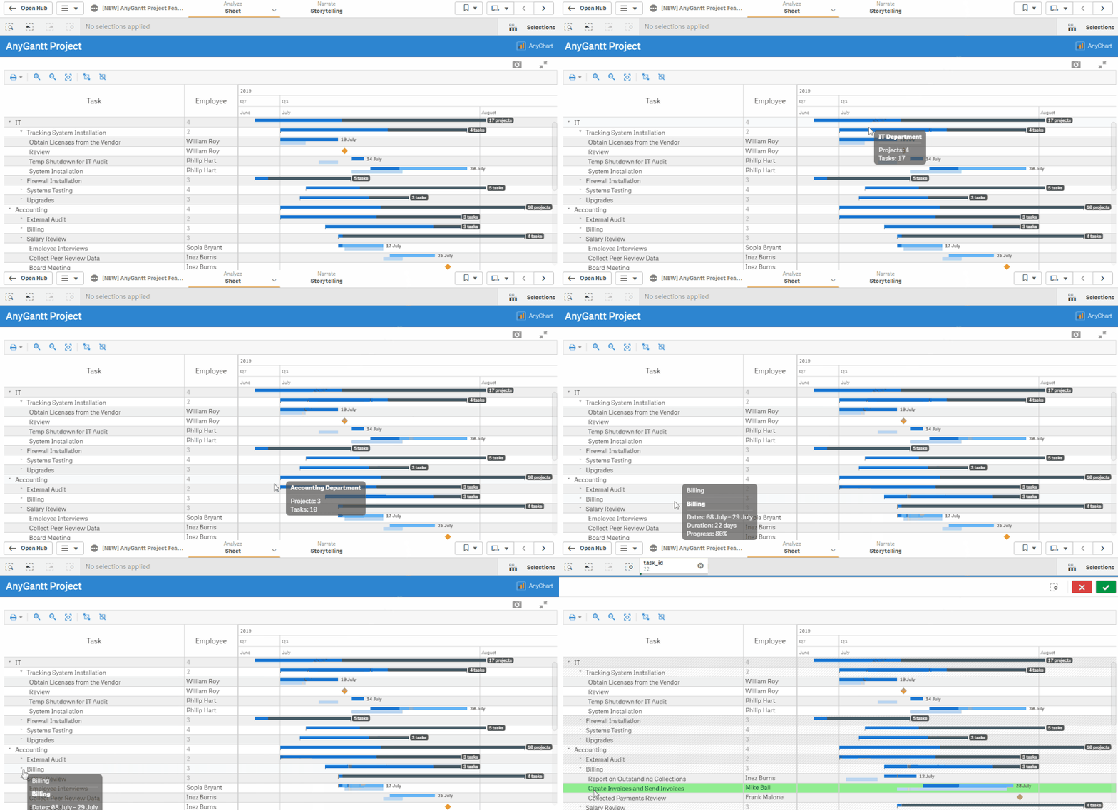
Just in case, feel free to experience our Gantt Charts for Qlik Sense, with various features and extensive settings for customization.
Overview | Download | Documentation | Demo apps | Schedule a live demo


