Unlock a world of possibilities! Login now and discover the exclusive benefits awaiting you.
- Qlik Community
- :
- Forums
- :
- Analytics
- :
- New to Qlik Analytics
- :
- Re: Combo Chart: how to assign name to each data ...
- Subscribe to RSS Feed
- Mark Topic as New
- Mark Topic as Read
- Float this Topic for Current User
- Bookmark
- Subscribe
- Mute
- Printer Friendly Page
- Mark as New
- Bookmark
- Subscribe
- Mute
- Subscribe to RSS Feed
- Permalink
- Report Inappropriate Content
Combo Chart: how to assign name to each data occurance or color coding it
Hi
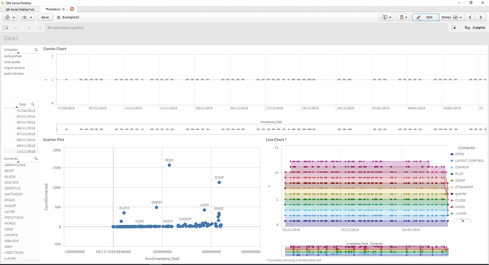
I have the combo chart below. It basically shows the history of commands used in a software during a period of time, so it only has one dimension - timestamp_field - and I chose as measure '1' because this is a 1D graphic.
However, I would like to add a coding to the dots on this chart so I can easily identify which command does each dot represent. As you can see in the two graphics below, the scatter plot shows the name of the command above the dot and the line chart color codes the commands. I would like to do the same thing to the combo chart, either assign the name to the dot or color code it.
How can I do this?
Any help would be appreciated.
Here is what I have tried:
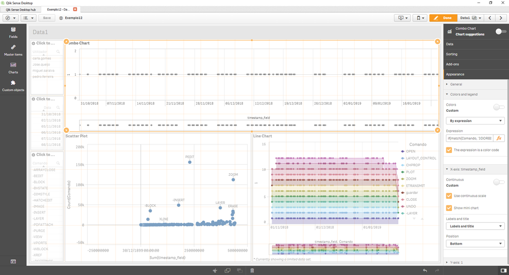
I went to the 'Appearance' section and tried changing the colors to 'by dimension' and choosing the Command dimension which contains the data names of the commands. Unfortunately, this isn't working and the graphic fails to color code the dots.
I have also tried with an expression, but still doesn't work.
if(match(Comando, '3DORBIT'), red(), if(match(Comando, 'ZOOM'), blue(), if(match(Comando, 'PEDIT'), yellow(), lightgray())))
- Mark as New
- Bookmark
- Subscribe
- Mute
- Subscribe to RSS Feed
- Permalink
- Report Inappropriate Content
Hi! You might be able to do this by creating a Master Item for each command. And then assign a color for each one of them.
Here's how to do it: Assigning Colors to Master Items
Let me know if this helps!


