Unlock a world of possibilities! Login now and discover the exclusive benefits awaiting you.
- Qlik Community
- :
- Forums
- :
- Analytics
- :
- New to Qlik Analytics
- :
- Combo chart comparison of Customer against Custome...
- Subscribe to RSS Feed
- Mark Topic as New
- Mark Topic as Read
- Float this Topic for Current User
- Bookmark
- Subscribe
- Mute
- Printer Friendly Page
- Mark as New
- Bookmark
- Subscribe
- Mute
- Subscribe to RSS Feed
- Permalink
- Report Inappropriate Content
Combo chart comparison of Customer against Customer Group
Hi,
I have a combo chart which uses the user's selection of a Customer and Customer Group (ideally, I'd like to derive the Customer Group from the Customer filter selection...but that's another post!).
My objective is to render a Customer's KPI against that of their Group's average (each Customer can only belong to one Group). Both Customer and Customer Group are already in the data set.
My Dimension of my chart is the Customer Group. The Measures are various KPIs.
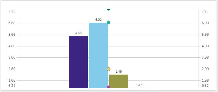
Using set expressions, I'm able to render the bars as the individual Customer - and the markers as the Customer Group average. However, as the Dimension is the Group, the Markers are not sitting with their respective Customer Measures. They are instead all sitting in the middle (see image).
Is there a way to get the markers to sit with their bars (i.e. Customer KPI with respective Customer Group KPI)?
Or...should I be modelling my data differently or using a different visualisation?
The objective is to show how a Customer is performing against their Group's average, max, min etc.. in different visualisations.
The attached image shows four Customer KPIs and their respective Group averages - however, the Group averages are not sitting on their respective bars how I need them.
Any help greatly appreciated.
Cheers,
