Unlock a world of possibilities! Login now and discover the exclusive benefits awaiting you.
- Qlik Community
- :
- Forums
- :
- Analytics
- :
- New to Qlik Analytics
- :
- Combo chart in qlik sense
- Subscribe to RSS Feed
- Mark Topic as New
- Mark Topic as Read
- Float this Topic for Current User
- Bookmark
- Subscribe
- Mute
- Printer Friendly Page
- Mark as New
- Bookmark
- Subscribe
- Mute
- Subscribe to RSS Feed
- Permalink
- Report Inappropriate Content
Combo chart in qlik sense
how to use combo chart in Qlik sense,
i am able to add the measures but it is not reflecting the chart and getting only bar chart.
can any one explain the complete process or share me the video link.
thank you
- « Previous Replies
-
- 1
- 2
- Next Replies »
Accepted Solutions
- Mark as New
- Bookmark
- Subscribe
- Mute
- Subscribe to RSS Feed
- Permalink
- Report Inappropriate Content
may be this will help
ColorMix1( rank(total column(1))/noofrows(TOTAL) , rgb(15,97,119), rgb(36,242,197))
change rgb value according to your color.
- Mark as New
- Bookmark
- Subscribe
- Mute
- Subscribe to RSS Feed
- Permalink
- Report Inappropriate Content
in second expression change like this
- Mark as New
- Bookmark
- Subscribe
- Mute
- Subscribe to RSS Feed
- Permalink
- Report Inappropriate Content
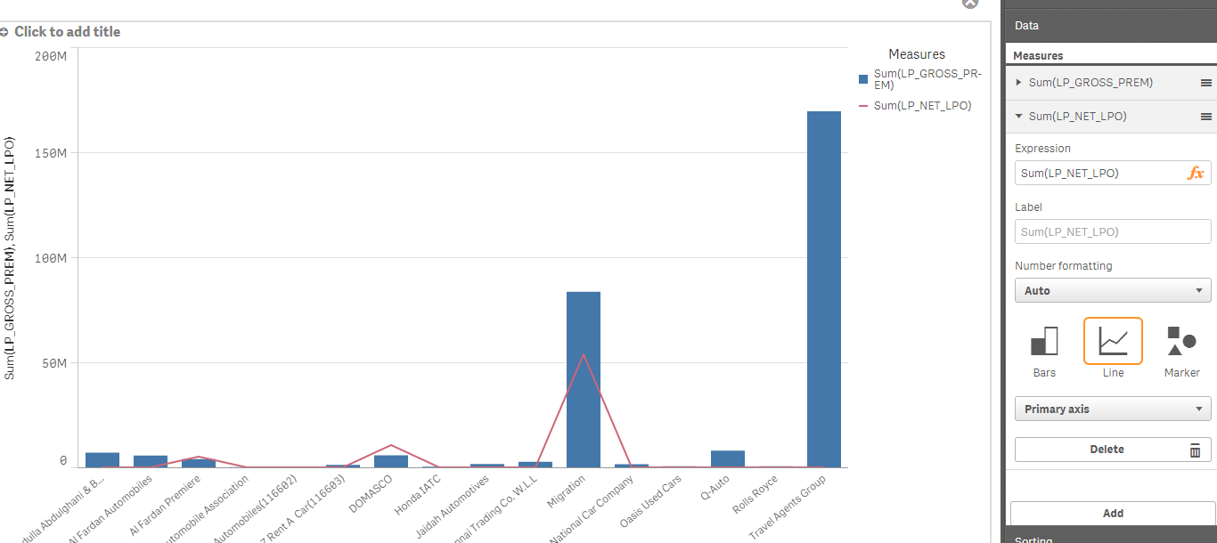
Hi Laxman,
Try changing you second Measure to Secondary axis. There may be a vast difference between the values of both the measures which must have caused this problem.
Regards,
Rohan
- Mark as New
- Bookmark
- Subscribe
- Mute
- Subscribe to RSS Feed
- Permalink
- Report Inappropriate Content
Thank you Rohan,
can you help me with the following issue,
@
i have a straight table with customer and sales
i need to sort the table with descending order of Sales
and i need sales values should be in sequential gradient
can any one help me to resolve it.
- Mark as New
- Bookmark
- Subscribe
- Mute
- Subscribe to RSS Feed
- Permalink
- Report Inappropriate Content
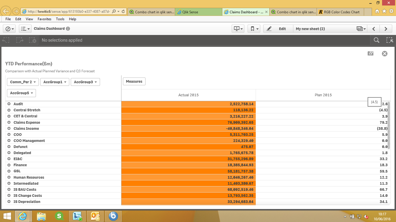
Hi Laxman,
Add the dimension and measure in your straight table.
Go in the Sorting tab and make sure that Sales is your first preference for sorting. If not, drag it at the top.
Select Custom and then Descending.
Like the screen shot given below.

Regards,
Rohan
- Mark as New
- Bookmark
- Subscribe
- Mute
- Subscribe to RSS Feed
- Permalink
- Report Inappropriate Content
Got it ,
but how to change the colour of text or field values dynamically
- Mark as New
- Bookmark
- Subscribe
- Mute
- Subscribe to RSS Feed
- Permalink
- Report Inappropriate Content
In Data tab, under the Sales tab, you will find those properties.

You can define your conditions here which will help in dynamically changing the background and text colour.
Regards,
Rohan
- Mark as New
- Bookmark
- Subscribe
- Mute
- Subscribe to RSS Feed
- Permalink
- Report Inappropriate Content
Hi Laxman do you mean like this :

Thanks
- Mark as New
- Bookmark
- Subscribe
- Mute
- Subscribe to RSS Feed
- Permalink
- Report Inappropriate Content
Thanks Chandra,
but it not matching to my exact requirement
The colour of the highest value should dark and the lower values are little bit light in the same colour.
please have a look at the highlighted ones .
i want my data in a table to be in this kind of colour pattern.
.png)
- Mark as New
- Bookmark
- Subscribe
- Mute
- Subscribe to RSS Feed
- Permalink
- Report Inappropriate Content
Looking for this:
for the measure in the background colour expression I have use the below expression
if(rowNo()/2=floor(rowNo()/2),RGB(255,128,0),RGB(255,153,51))
you can get the colour coding for RGB from the internet link below:
http://www.rapidtables.com/web/color/RGB_Color.htm
- « Previous Replies
-
- 1
- 2
- Next Replies »