Unlock a world of possibilities! Login now and discover the exclusive benefits awaiting you.
- Qlik Community
- :
- Forums
- :
- Analytics
- :
- New to Qlik Analytics
- :
- Compare Current Counts to Baseline / Required Coun...
- Subscribe to RSS Feed
- Mark Topic as New
- Mark Topic as Read
- Float this Topic for Current User
- Bookmark
- Subscribe
- Mute
- Printer Friendly Page
- Mark as New
- Bookmark
- Subscribe
- Mute
- Subscribe to RSS Feed
- Permalink
- Report Inappropriate Content
Compare Current Counts to Baseline / Required Counts
Hello - I'm a newer user to Qlik Sense and hoping to find direction on how to approach a request I've been given...
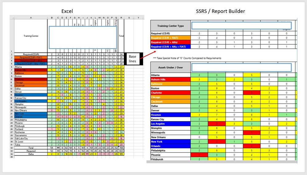
We are tracking Assets per building location and need to be able to compare current location asset counts to a baseline given for the asset and location (type).
The custom provided an excel mockup of the desired output. I've been able to replicate the mockup using SSRS / Report Builder and now need to create a Qlik Sense application of the same.
The requirements are as follows
- Locations are defined by a category and colored as such
- Each location type needs to have a required number of each asset
- A baseline requirements table exists for Location Type / Asset Type and Required Count
- The comparison needs to compare current Location Type counts by asset against the Requirements and color code the current cells background color:
- Red - Under Requirement
- Yellow - Over Requirement
- Green - Equal to Requirement
The first priority is the middle of the table cells counts ... Addressing the row totals is a nice to have
I'm Google'ing articles and watching Qlik Sense videos on how to compare two sets of data...
Any direction or suggestions would be greatly appreciated !!!
- Mark as New
- Bookmark
- Subscribe
- Mute
- Subscribe to RSS Feed
- Permalink
- Report Inappropriate Content
Hey,
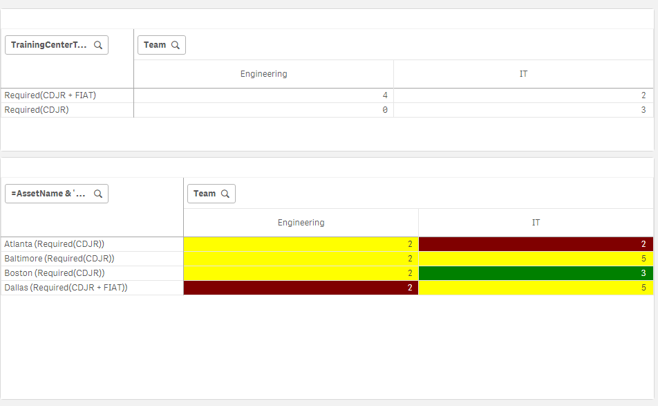
In the default pivot table in qlik you cannot color the labels. The closest I could get to your requirements is this:
- Mark as New
- Bookmark
- Subscribe
- Mute
- Subscribe to RSS Feed
- Permalink
- Report Inappropriate Content
Thank you for the response ...
I believe I have found a way to color the labels as needed...
Would you be able to explain how the comparison / colorization of the numbers was accomplished?

