Unlock a world of possibilities! Login now and discover the exclusive benefits awaiting you.
- Qlik Community
- :
- Forums
- :
- Analytics
- :
- New to Qlik Analytics
- :
- Re: Comparison Graph
- Subscribe to RSS Feed
- Mark Topic as New
- Mark Topic as Read
- Float this Topic for Current User
- Bookmark
- Subscribe
- Mute
- Printer Friendly Page
- Mark as New
- Bookmark
- Subscribe
- Mute
- Subscribe to RSS Feed
- Permalink
- Report Inappropriate Content
Comparison Graph
Hi Guys
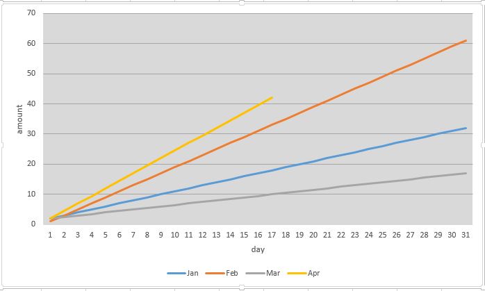
I am struggling to create a comparison graph - I want to create a graph whereby I can select 2 or 3 different months and compare daily performance.
If someone knows how please assist. I have also attached the type of graph I would like to achieve.
- Tags:
- joe magweregwede
- « Previous Replies
-
- 1
- 2
- Next Replies »
- Mark as New
- Bookmark
- Subscribe
- Mute
- Subscribe to RSS Feed
- Permalink
- Report Inappropriate Content
Would you be able to provide a sample with detailed expected output to help you better 
- Mark as New
- Bookmark
- Subscribe
- Mute
- Subscribe to RSS Feed
- Permalink
- Report Inappropriate Content
Thanks Sunny T for a quick response
I have data from july 2015 to date. This data shows the money that was paid by customers to our account.
I want to create a cumulative line graph with "day" as dimension and for the "measure" I want to use (the sum of money paid per month on that day), I do not want the graph to add all the months at once but i want to add a filter pane that contains all the months so that when I select 2 different months I can be able to compare how we are tracking e.g. compared to last month.
If I select 2 different months I want to see 2 lines on a line, one line showing the first month I have selected and the other line showing the second month I have selected. Please check the attachment in my earlier post
- Mark as New
- Bookmark
- Subscribe
- Mute
- Subscribe to RSS Feed
- Permalink
- Report Inappropriate Content
You could simply create a two dimension line chart. The dimensions will need to be day then month, and it will need to be a single expression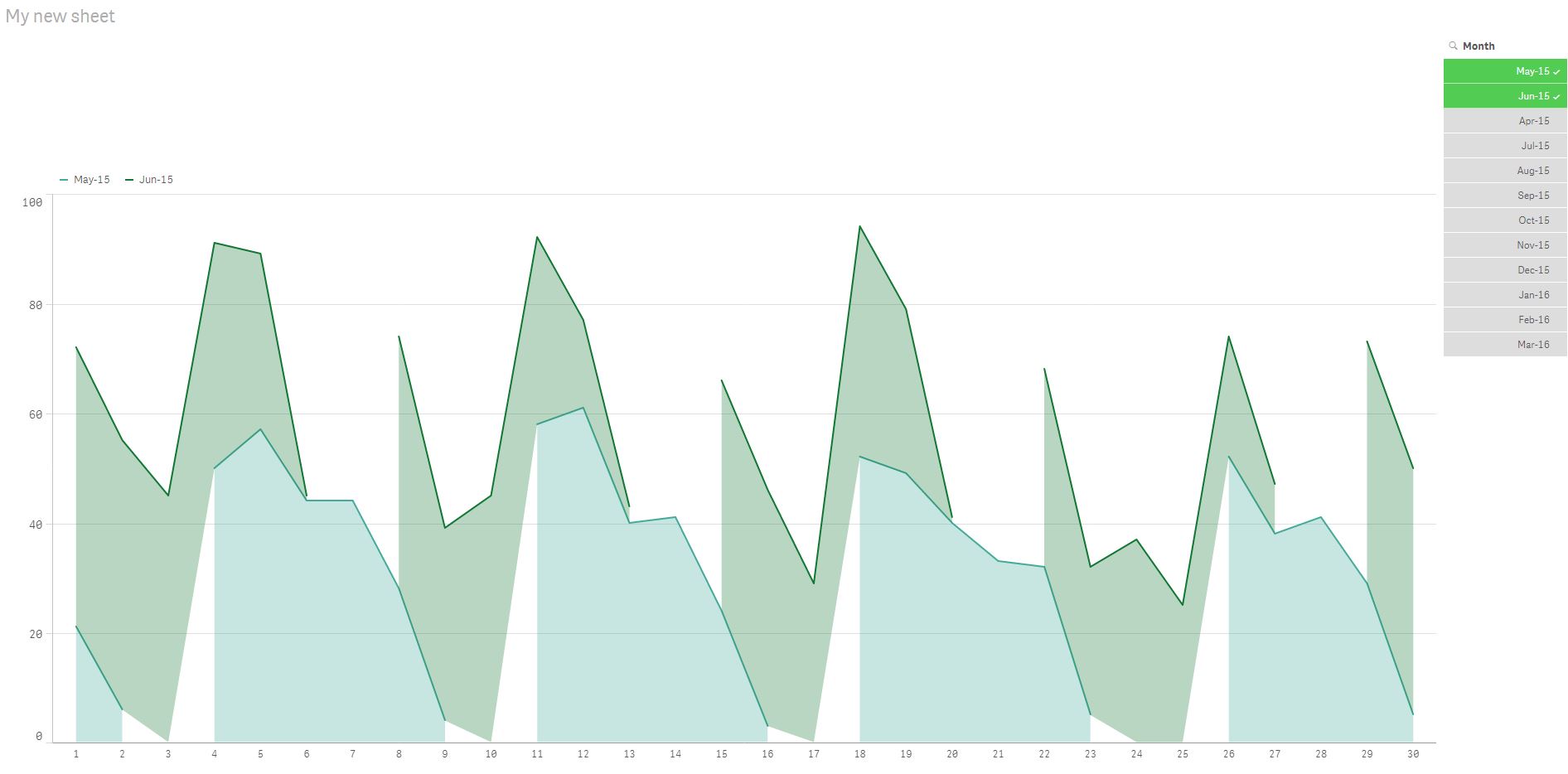
- Mark as New
- Bookmark
- Subscribe
- Mute
- Subscribe to RSS Feed
- Permalink
- Report Inappropriate Content
Thank Michael - This looks exactly like what i want to do but I am still learning this. Please give me an example on how the expression should read or how I can actually do it so that i can also document it for future.
- Mark as New
- Bookmark
- Subscribe
- Mute
- Subscribe to RSS Feed
- Permalink
- Report Inappropriate Content
Hi,
Check the attached file
- Mark as New
- Bookmark
- Subscribe
- Mute
- Subscribe to RSS Feed
- Permalink
- Report Inappropriate Content
Ooops the file is blank when I open it, can you type the logic for me?
- Mark as New
- Bookmark
- Subscribe
- Mute
- Subscribe to RSS Feed
- Permalink
- Report Inappropriate Content
Joe,
I can't share a QVF file because my app has private data, but here is the step by step:
1. Assuming you've loaded your app with your day/month data, drag a line chart object onto your sheet.
2. On the right hand chart menu go to the data section and add two dimensions, day first, then month.
3. Then further down the menu you'll see the measures input. Add your measure expression, something like sum(), count().
4. Lastly, add a filter pane object onto you sheet (back on the left side menu under charts) and add month as the dimension
- Mark as New
- Bookmark
- Subscribe
- Mute
- Subscribe to RSS Feed
- Permalink
- Report Inappropriate Content
Thanks Michael -this helps but the problem comes in when the below expression is made void which helps to calculate cumulative per month because thats what I want the graph to show
$(accum)Sum(Gross_Amount_Rands)$(/accum)
- Mark as New
- Bookmark
- Subscribe
- Mute
- Subscribe to RSS Feed
- Permalink
- Report Inappropriate Content
Joe,
I think it's complicated to get exactly what you want, but here's something you can try:
Set your dimension as day of month
Set your expression as rangesum( above( Sum(Gross_Amount_Rands),0,rowno()))/Sum(Total Gross_Amount_Rands)
Then filter on you desired month
This won't show all the months together so it's not exactly what you need. Just suggesting as an easy alternative
- « Previous Replies
-
- 1
- 2
- Next Replies »