Unlock a world of possibilities! Login now and discover the exclusive benefits awaiting you.
- Qlik Community
- :
- Forums
- :
- Analytics
- :
- New to Qlik Analytics
- :
- Comparison to PY on a chart
- Subscribe to RSS Feed
- Mark Topic as New
- Mark Topic as Read
- Float this Topic for Current User
- Bookmark
- Subscribe
- Mute
- Printer Friendly Page
- Mark as New
- Bookmark
- Subscribe
- Mute
- Subscribe to RSS Feed
- Permalink
- Report Inappropriate Content
Comparison to PY on a chart
Hi All,
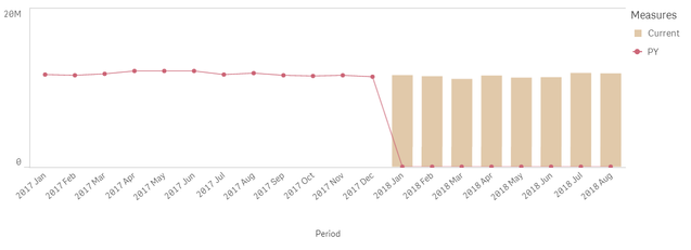
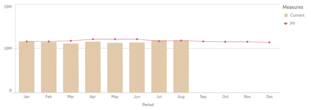
Is there a way to compare PY to current year on a time trend chart with month-year (e.g. 2018 Aug) rather than month on the X axis?
Dimension: year_month
Measure (current): sum({<year={$(vMaxYear)}>}[kpi_value])
Measure (PY): sum({<year={$(vPreviousYear)}>}[kpi_value])
This produced the following chart:
Is there a way to have make the chart look like this instead (but with year-month, not month on X axis):
- « Previous Replies
-
- 1
- 2
- Next Replies »
Accepted Solutions
- Mark as New
- Bookmark
- Subscribe
- Mute
- Subscribe to RSS Feed
- Permalink
- Report Inappropriate Content
Try out this alternative approach where I use The As Of Table to do this by creating this at the end of the script
AsOfTable:
LOAD DISTINCT month as AsOfMonth,
	 year as AsOfYear,
     month,
     'CY' as Flag
Resident Table;

Concatenate(AsOfTable)
LOAD DISTINCT month as AsOfMonth,
	 year as AsOfYear,
     Date(MonthStart(month, -12), 'YYYYMM') as month,
     'PY' as Flag
Resident Table;
and then use these
Dimension
AsOfMonth
Expressions
If(GetSelectedCount(AsOfMonth) > 0,
Sum({<Flag = {'CY'}>}[kpi_value]),
Sum({<year={$(vMaxYear)}, Flag = {'CY'}>}[kpi_value]))

If(GetSelectedCount(AsOfMonth) > 0,
Sum({<Flag = {'PY'}>}[kpi_value]),
Sum({<Flag = {'PY'}, AsOfYear={$(vMaxYear)}>} [kpi_value]))
- Mark as New
- Bookmark
- Subscribe
- Mute
- Subscribe to RSS Feed
- Permalink
- Report Inappropriate Content
Change the PY expression to this
Above(Sum({<year = {$(vPreviousYear)}>} [kpi_value]), 12)
- Mark as New
- Bookmark
- Subscribe
- Mute
- Subscribe to RSS Feed
- Permalink
- Report Inappropriate Content
I would dynamically update the legend to show 'Current Year - 2018' 'PY - 2017'
how will the x axis look like in the ideal scenario you want?
- Mark as New
- Bookmark
- Subscribe
- Mute
- Subscribe to RSS Feed
- Permalink
- Report Inappropriate Content
Thank you Sunny, the formula works! Although:
The reason I need year-month is so that I would be able to select the same month from different years from the filter to compare on the chart, e.g. 2018 July and 2017 July. However, with the above formula (Above(Sum({<year={$(vPreviousY)}>} [kpi_value]), 12)) when I select these two months from the filter, I see only one bar on the chart (2018 July). Is there a way to adjust the formula to allow for that comparison?
- Mark as New
- Bookmark
- Subscribe
- Mute
- Subscribe to RSS Feed
- Permalink
- Report Inappropriate Content
Which two bars are you looking to get? July 2017 and July 2018?
- Mark as New
- Bookmark
- Subscribe
- Mute
- Subscribe to RSS Feed
- Permalink
- Report Inappropriate Content
Yes, so I have year_month as a filter, and I would like to be able to select any month from there and have them displayed on the chart (so e.g. 2018 July and 2017 July)
- Mark as New
- Bookmark
- Subscribe
- Mute
- Subscribe to RSS Feed
- Permalink
- Report Inappropriate Content
So, why have you used this set analysis
{<year={$(vMaxYear)}This is forcing your expression to show Max(Year) which is 2018... I guess you need to remove that?
- Mark as New
- Bookmark
- Subscribe
- Mute
- Subscribe to RSS Feed
- Permalink
- Report Inappropriate Content
But I need to have only months from the latest year displayed on the chart (unless specific months are selected in filter) - how else could I do that without that set analysis?
- Mark as New
- Bookmark
- Subscribe
- Mute
- Subscribe to RSS Feed
- Permalink
- Report Inappropriate Content
Then in that case... try something like this out
If(GetSelectedCount(Month) = 0, With Set Analysis expression, Without Set Analysis expression)
- Mark as New
- Bookmark
- Subscribe
- Mute
- Subscribe to RSS Feed
- Permalink
- Report Inappropriate Content
Thanks Sunny, that worked!
When a specific month is selected, PY trendline disappears (only current is displayed) though, is there a way to keep when a filter selection is applied?
- « Previous Replies
-
- 1
- 2
- Next Replies »

