Unlock a world of possibilities! Login now and discover the exclusive benefits awaiting you.
- Qlik Community
- :
- Forums
- :
- Analytics
- :
- New to Qlik Analytics
- :
- Configuring a scatter plot chart in Qlik Sense
- Subscribe to RSS Feed
- Mark Topic as New
- Mark Topic as Read
- Float this Topic for Current User
- Bookmark
- Subscribe
- Mute
- Printer Friendly Page
- Mark as New
- Bookmark
- Subscribe
- Mute
- Subscribe to RSS Feed
- Permalink
- Report Inappropriate Content
Configuring a scatter plot chart in Qlik Sense
Hi all,
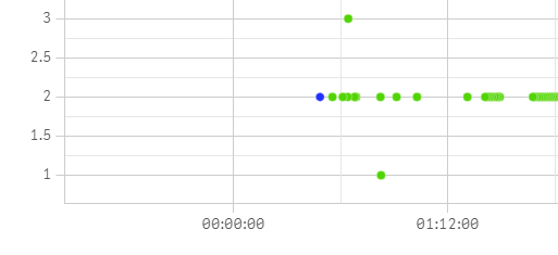
Do you know if there's a way to configure the step of the y-axis in a scatter plot chart? I'm using Qlik Sense February 2019. I've defined the ranges of the y-axis and I want to avoid that decimals show up if the user zooms in in the chart. If not possible, can I at least remove the zoom functionality of the chart?
The second thing I want to do is represent 3,000 points approx. Is there a way to override the 1,000 points limitation that turns the chart into a compressed one?
Thanks much,
Juan
- Mark as New
- Bookmark
- Subscribe
- Mute
- Subscribe to RSS Feed
- Permalink
- Report Inappropriate Content
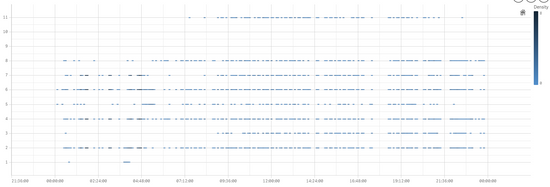
I changed the strategy and now I'm using a distribution plot chart. That way I solved the step and the zoom issues.
I am still looking for a way to force the chart to show all points (3,000) even if it takes longer to load. My objective is to display everything and get rid of the "* Currently showing a limited data set." message in the corner of the chart.
Any idea is welcome!
Thanks

