Unlock a world of possibilities! Login now and discover the exclusive benefits awaiting you.
- Qlik Community
- :
- Forums
- :
- Analytics
- :
- New to Qlik Analytics
- :
- Re: Create Bar Chart with Multiple Dimensions
- Subscribe to RSS Feed
- Mark Topic as New
- Mark Topic as Read
- Float this Topic for Current User
- Bookmark
- Subscribe
- Mute
- Printer Friendly Page
- Mark as New
- Bookmark
- Subscribe
- Mute
- Subscribe to RSS Feed
- Permalink
- Report Inappropriate Content
Create Bar Chart with Multiple Dimensions
Can someone explain to me how I create the Bar chart in QlikSense below. I have a Dimension for (Goods, R&D and Services) and a Measure for Cost.
How can I:
a) Add a dimension for Total Cost
b) Add multiple years to the chart
c) Format the Y (Cost) axis to Billions
Thanks

Accepted Solutions
- Mark as New
- Bookmark
- Subscribe
- Mute
- Subscribe to RSS Feed
- Permalink
- Report Inappropriate Content
Chris - The method to create the summary table will depend on your data model. If you data model has a transaction table that looks something like this right now will each cost category as its own field then to create the summary table you would use:
Transaction:
| Transaction# | Date | FY | Goods | R&D | Services |
|---|---|---|---|---|---|
| zzz | 1/1/2016 | FY15 | $10 | $5 | 0 |
| zzz2 | 1/1/2015 | FY14 | 0 | $100 | 0 |
| zzz3 | 1/1/2014 | FY13 | 0 | 0 | $50 |
| zzz4 | 1/1/2013 | FY12 | $25 | 0 | $10 |
Summary:
Load
FY,
sum(Goods) as Cost,
'Goods' as CostType
Resident Transaction
Group by FY;
You would repeat this for each type (Goods, R&D, Services,etc...). This would link back to the rest of your data model by FY (or you could link by date if you prefer).
If your data model looks more like this with all the costs in one field.
Transaction:
| Transaction# | Date | FY | Costs | Type |
|---|---|---|---|---|
| zzz | 1/1/2016 | FY15 | $10 | Goods |
| zzz | 1/1/2016 | FY15 | $5 | R&D |
| zzz2 | 1/1/2015 | FY14 | $100 | R&D |
| zzz3 | 1/1/2014 | FY3 | $50 | Services |
Summary:
Load
FY,
Type as CostType,
sum(Costs) as Cost
Resident Transaction
Group by FY, CostType;
You would not need to repeat and it would also link back to your data model by FY.
For more on the group by and other load statements I would suggest this nice write up:
Hope this helps.
- Mark as New
- Bookmark
- Subscribe
- Mute
- Subscribe to RSS Feed
- Permalink
- Report Inappropriate Content
If you want to have different types of Cost (Goods, R&D...) and the total on the same plot then you will likely need to create a summary table in your data model that contains at least 3 columns Year, Cost and Cost Type, where the cost type field contains possible values of Total, Goods, R&D, and Services). If you want to be able to parse to other levels of detail it could contain more columns, like maybe Quarter or Month or Department. Once you have the summary table, then the plot in QlikSense has two dimensions (Cost Type and Year) and 1 measure Cost.
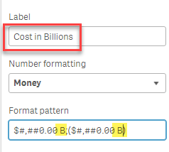
To get the Cost to show as Billions, you will need to divide the measure by 1 Billion and then adjust the number format or label
.
- Mark as New
- Bookmark
- Subscribe
- Mute
- Subscribe to RSS Feed
- Permalink
- Report Inappropriate Content
You can try using dummy dimension in this case
valuelist('Total Cost','Goods','R&D','Services')
and then use 4 different measures for each FY.
It might help
- Mark as New
- Bookmark
- Subscribe
- Mute
- Subscribe to RSS Feed
- Permalink
- Report Inappropriate Content
HI Chris,
First, Create 4 measure with respect to FY12 ...FY15 with the help of set analysis. Drag 4 bar chart and use dimension which has value as ,'Goods','R&D','Services' .
Note. By above statement, you have to make new chart for FY16 or I can say it will not a dynamic visualization. But for now it will solve your purpose.
Please mark the appropriate replies as CORRECT / HELPFUL so our team and other members know that your question(s) has been answered to your satisfaction.
Rohit Kumar
- Mark as New
- Bookmark
- Subscribe
- Mute
- Subscribe to RSS Feed
- Permalink
- Report Inappropriate Content
Thanks for the reply Sarah,
I have created a summary table by:
Summary:
LOAD * Inline [
Year, Cost, CostType
"Fiscal Year", "Action Obligation", "G-R&D-S"
];
How do I tie my data (from my other tables) to these parameters in my data model? Where can I place my SUM function?
Thanks,
Chris
- Mark as New
- Bookmark
- Subscribe
- Mute
- Subscribe to RSS Feed
- Permalink
- Report Inappropriate Content
Chris - The method to create the summary table will depend on your data model. If you data model has a transaction table that looks something like this right now will each cost category as its own field then to create the summary table you would use:
Transaction:
| Transaction# | Date | FY | Goods | R&D | Services |
|---|---|---|---|---|---|
| zzz | 1/1/2016 | FY15 | $10 | $5 | 0 |
| zzz2 | 1/1/2015 | FY14 | 0 | $100 | 0 |
| zzz3 | 1/1/2014 | FY13 | 0 | 0 | $50 |
| zzz4 | 1/1/2013 | FY12 | $25 | 0 | $10 |
Summary:
Load
FY,
sum(Goods) as Cost,
'Goods' as CostType
Resident Transaction
Group by FY;
You would repeat this for each type (Goods, R&D, Services,etc...). This would link back to the rest of your data model by FY (or you could link by date if you prefer).
If your data model looks more like this with all the costs in one field.
Transaction:
| Transaction# | Date | FY | Costs | Type |
|---|---|---|---|---|
| zzz | 1/1/2016 | FY15 | $10 | Goods |
| zzz | 1/1/2016 | FY15 | $5 | R&D |
| zzz2 | 1/1/2015 | FY14 | $100 | R&D |
| zzz3 | 1/1/2014 | FY3 | $50 | Services |
Summary:
Load
FY,
Type as CostType,
sum(Costs) as Cost
Resident Transaction
Group by FY, CostType;
You would not need to repeat and it would also link back to your data model by FY.
For more on the group by and other load statements I would suggest this nice write up:
Hope this helps.