Unlock a world of possibilities! Login now and discover the exclusive benefits awaiting you.
- Qlik Community
- :
- Forums
- :
- Analytics
- :
- New to Qlik Analytics
- :
- Re: Create a bar chart based on a condition
- Subscribe to RSS Feed
- Mark Topic as New
- Mark Topic as Read
- Float this Topic for Current User
- Bookmark
- Subscribe
- Mute
- Printer Friendly Page
- Mark as New
- Bookmark
- Subscribe
- Mute
- Subscribe to RSS Feed
- Permalink
- Report Inappropriate Content
Create a bar chart based on a condition
I have my data where the important columns are - date_a, date_b, date_c
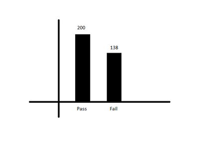
in a bar chart I need to show the X axis - pass and fail, and Y axis - counts of pass and fail (image pasted below)
logic -
1) if date_a < date_b, then consider date_a else date_b ( the date which is considered say imp_date), after that
2)if date_c - imp_date < 60 then pass else fail
Any help will be appreciated, Thanks in advance
- Mark as New
- Bookmark
- Subscribe
- Mute
- Subscribe to RSS Feed
- Permalink
- Report Inappropriate Content
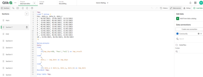
First you need to do some work in the script to build up your conditions. I assume you are counting sokmething so added a simple unique key to the model.
// Sample Data
Tmp:
Load * Inline [
Key, date_a, date_b, date_c
1 , 01/01/2023, 15/01/2023, 31/12/2022
2 , 15/01/2023, 01/01/2023, 31/12/2022
3 , 15/01/2023, 01/01/2023, 31/01/2023
4 , 01/01/2023, 15/01/2023, 31/01/2023
5 , 01/01/2023, 15/01/2023, 31/12/2022
6 , 01/01/2023, 15/01/2023, 31/05/2022
7 , 15/01/2023, 01/01/2023, 31/05/2023
8 , 15/01/2023, 01/01/2023, 31/03/2023
9 , 15/01/2023, 01/01/2023, 31/03/2023
10 , 15/01/2023, 01/01/2023, 01/01/2023
];
// your business logic to get Imp Date, Imp days and Imp result.
NoConcatenate
Data:
Load
*,
If(imp_days<60, 'Pass','Fail') as imp_result
;
Load
*,
date_c - imp_date as imp_days
;
Load
*,
if( date_a < date_b, date_a, date_b) as imp_date
Resident Tmp;
drop table Tmp;
Then apply them easily in the front end.
- Mark as New
- Bookmark
- Subscribe
- Mute
- Subscribe to RSS Feed
- Permalink
- Report Inappropriate Content
Hi sir, thanks for the help.
just need to ask, I have imported the data by simple drag and drop,
and what is happening in Tmp?
- Mark as New
- Bookmark
- Subscribe
- Mute
- Subscribe to RSS Feed
- Permalink
- Report Inappropriate Content
Tmp is just the data I created to prove the solution would work so replace Tmp with whatever you've called your data table.
The solution I've created requires you to modify the script so go to data load editor once imported and unlock your script so you can add the logic I've provided.
once added load the data and you can create what you need in the front end chart wise.
- Mark as New
- Bookmark
- Subscribe
- Mute
- Subscribe to RSS Feed
- Permalink
- Report Inappropriate Content
ooh okay sir got it, now its clear, ok let me give it a try (that load script screen shot really helped, thanks).
- Mark as New
- Bookmark
- Subscribe
- Mute
- Subscribe to RSS Feed
- Permalink
- Report Inappropriate Content
As below
Dimension
= Aggr( If ( (date_c - rangemin(date_a ,date_b)) <60,'Pass','Fail') , SomeIDField )
Measure
=Count(Distinct SomeIDField )
SomeIDField is a field that identifies each row uniquely
If a post helps to resolve your issue, please accept it as a Solution.


