Unlock a world of possibilities! Login now and discover the exclusive benefits awaiting you.
- Qlik Community
- :
- Forums
- :
- Analytics
- :
- New to Qlik Analytics
- :
- Create a graph on evolution
- Subscribe to RSS Feed
- Mark Topic as New
- Mark Topic as Read
- Float this Topic for Current User
- Bookmark
- Subscribe
- Mute
- Printer Friendly Page
- Mark as New
- Bookmark
- Subscribe
- Mute
- Subscribe to RSS Feed
- Permalink
- Report Inappropriate Content
Create a graph on evolution
Dear community,
I would like to create a dashboard on evolution but I have some problems regarding the formula
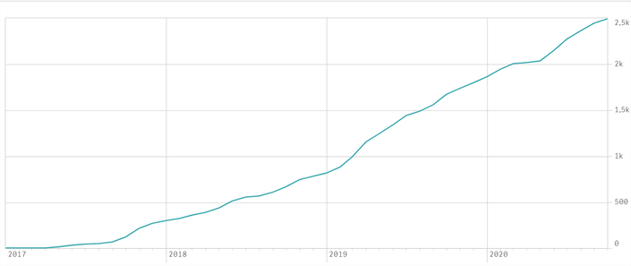
Regarding the following picture, I would like to create a graph with a curve of the evolution of my contracts
In January I have 50 new contracts and 30 cancellations. 50 new contracts - 30 cancellations = +20
In february I have 60 contracts - 30 cancellations = +30 (I would like to add also the +20 of january which means +50)
In march I have 50 contracts - 70 cancellations = -20 (Then I would like 50 - 20 = +30).
I tried the following dimensions :
=Dual(Year([date_signup])&'-'&Month([date_signup]),MonthStart([date_signup]))
I tried the following measures :
RangeSum(Above((Count({<[signup_plan_type]= {'plantype-standard'}>} [date_signup])),0, RowNo()))
-
RangeSum(Above((Count({<[signup_plan_type]= {'plantype-standard'}>} [date_cancelled])),0, RowNo()))
My graph is continually increasing. Therefore, there is a problem since I know there are months when there were more cancellations than new contracts
Thank you in advance for you help
Regards,
- Mark as New
- Bookmark
- Subscribe
- Mute
- Subscribe to RSS Feed
- Permalink
- Report Inappropriate Content
Hi,
Try like below
RangeSum(Above((Count({<[signup_plan_type]= {'plantype-standard'}>} [date_signup]) - Count({<[signup_plan_type]= {'plantype-standard'}>} [date_cancelled])),0, RowNo()))
Please close the thread by marking correct answer & give likes if you like the post.
- Mark as New
- Bookmark
- Subscribe
- Mute
- Subscribe to RSS Feed
- Permalink
- Report Inappropriate Content
Hi Mayilvahanan,
I still have the same graph and the same problem with the formula you advised me.
- Mark as New
- Bookmark
- Subscribe
- Mute
- Subscribe to RSS Feed
- Permalink
- Report Inappropriate Content
Does anyone have any idea regarding the formula?
Regards,


