Unlock a world of possibilities! Login now and discover the exclusive benefits awaiting you.
- Qlik Community
- :
- Forums
- :
- Analytics
- :
- New to Qlik Analytics
- :
- Re: Create a line chart with total sales this week...
- Subscribe to RSS Feed
- Mark Topic as New
- Mark Topic as Read
- Float this Topic for Current User
- Bookmark
- Subscribe
- Mute
- Printer Friendly Page
- Mark as New
- Bookmark
- Subscribe
- Mute
- Subscribe to RSS Feed
- Permalink
- Report Inappropriate Content
Create a line chart with total sales this week compared to last week
Hey guys,
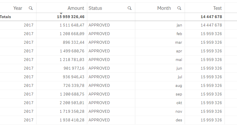
I have this table below:
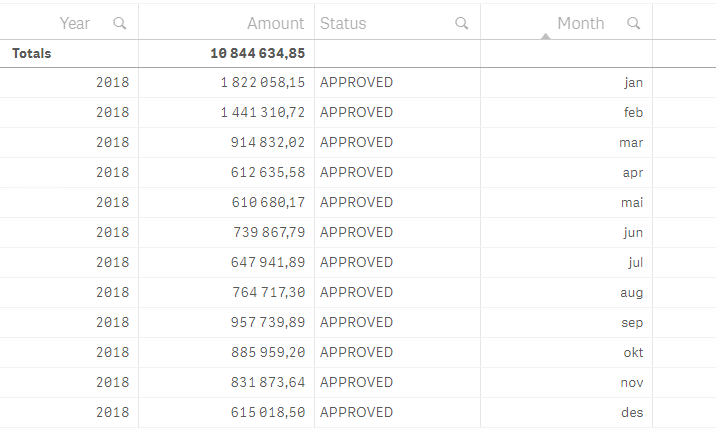
And what I am trying to do is I want it to show the total amount for the entire table on the row of jan 2018 and then as the total amount grows I want the next total amount on 2018 februar etc. as it goes.
The key here is that I want to know what is the total of amount today. And then I want to see what is the total amount at that day and be able to see the development on a line chart.
Is this something that I can solve / calculate front-end or would it best to make an aggregated table in the script and have that on the side?
Any suggestions is welcomed!
- « Previous Replies
-
- 1
- 2
- Next Replies »
- Mark as New
- Bookmark
- Subscribe
- Mute
- Subscribe to RSS Feed
- Permalink
- Report Inappropriate Content
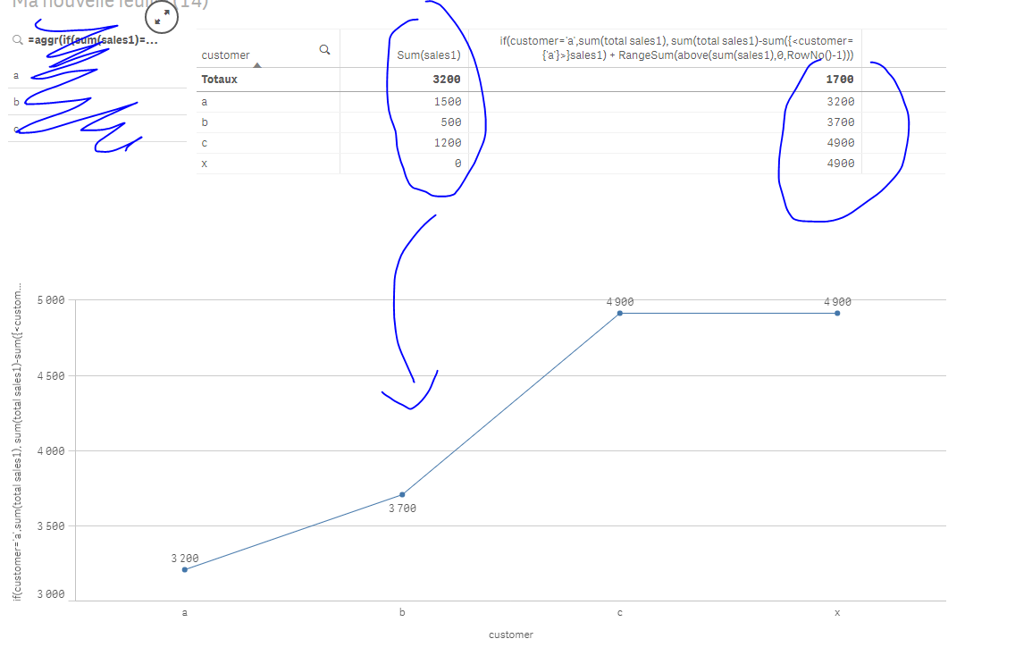
Try sthing like this:
if(Capitalize(Month)='Jan',sum(total {<Month>} Amount), sum(total {<Month>} Amount) + RangeSum(above(sum( {<Month>} Amount),0,RowNo()-1)))
and tell me what happens
Per analogy the result would be :
- Mark as New
- Bookmark
- Subscribe
- Mute
- Subscribe to RSS Feed
- Permalink
- Report Inappropriate Content
Don't mind the numbers. I am changing them as we go, but you can see the logic. Is this really possible to be honest? Because I have a total which is X in January, and in February they might have sold more so the total amount would be X more than the previous X amount and I don't have that value stored anywhere.
- Mark as New
- Bookmark
- Subscribe
- Mute
- Subscribe to RSS Feed
- Permalink
- Report Inappropriate Content
Can u please do a simple thing like this to explain what u aim to do :
| Dim | Measure | New Measure |
|---|---|---|
| 1 | 100 | |
| 2 | 200 | |
| 3 | 300 | |
| 5 | 400 | |
| 6 | 500 |
What I did :
| Dim | Measure | New Measure(what I did) |
|---|---|---|
| 1 | 100 | 1500 (total of all rows |
| 2 | 200 | 1700(1500+200) |
| 3 | 300 | 2000(1700+300) |
| 5 | 400 | 2400(2000+400) |
| 6 | 500 | 2900(2400+500) |
- Mark as New
- Bookmark
- Subscribe
- Mute
- Subscribe to RSS Feed
- Permalink
- Report Inappropriate Content
Let me try.
Look at following picture:
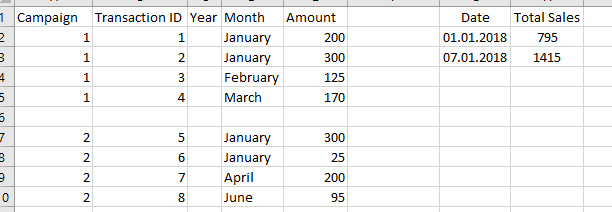
So you can see there are two different campaigns. These campaigns have a total value, but are distributed throughout the year. So On the first of January the total sales is 795 because there was only campaign 1 active. Then campaign 2 became active and that also distributes an amount throughout the year, but now the total sales that we have on that day is the total amount on that date.
Gives an idea of sales rate.
- Mark as New
- Bookmark
- Subscribe
- Mute
- Subscribe to RSS Feed
- Permalink
- Report Inappropriate Content
I'm sorry... still not clear to me..
Well, hope I have helped you a little though 
- Mark as New
- Bookmark
- Subscribe
- Mute
- Subscribe to RSS Feed
- Permalink
- Report Inappropriate Content
Thank you none the less.
Basically it is Sales Rate Week by Week I am trying to visualise.
Lets see what other replies I get.
- Mark as New
- Bookmark
- Subscribe
- Mute
- Subscribe to RSS Feed
- Permalink
- Report Inappropriate Content
Ok.
Let me try another explanation.
Lets say you write down how much did your company have in total sales today.
Then you next week write down how did the company have in total sales that day.
And then you put that in a line graph.
Makes sense ?
- Mark as New
- Bookmark
- Subscribe
- Mute
- Subscribe to RSS Feed
- Permalink
- Report Inappropriate Content
today is 26 January 2018; when u say, today I want to know how many total sales I have, starting from when?
From 2018? from 2017? from 2001? from the first date in ur model?
- Mark as New
- Bookmark
- Subscribe
- Mute
- Subscribe to RSS Feed
- Permalink
- Report Inappropriate Content
Current year.
So Today 26.01.2018 I want to know how much do we have sold for for in total current year.
Next week I want to know February 2nd I want to know how much have we sold for the current year in total on that date.
Then I am going to make a similar expression for previous year and the interval will be set week for week.
- « Previous Replies
-
- 1
- 2
- Next Replies »