Unlock a world of possibilities! Login now and discover the exclusive benefits awaiting you.
- Qlik Community
- :
- Forums
- :
- Analytics
- :
- New to Qlik Analytics
- :
- Create a pie chart
- Subscribe to RSS Feed
- Mark Topic as New
- Mark Topic as Read
- Float this Topic for Current User
- Bookmark
- Subscribe
- Mute
- Printer Friendly Page
- Mark as New
- Bookmark
- Subscribe
- Mute
- Subscribe to RSS Feed
- Permalink
- Report Inappropriate Content
Create a pie chart
Hello Community,
For my project I have data with thousands of items. I have a table which is limited to top 15 best selling items in a market. The items are produced by different companies. and sorted by the total revenue made by each item (product).
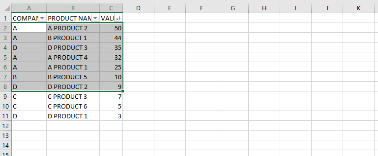
I need to create a pie chart, where the dimension would be the Company name, with limit set to top 15 best items. The pie chart should present what percentage of these 15 items are produced by each company (i.e. count company name in column A in the image above).
So ideally, the chart should be sorted by Value (Sales revenue), but should present as measure the count(Company).
Can anyone suggest ways to achieve this?
Thanks!
Edil