Unlock a world of possibilities! Login now and discover the exclusive benefits awaiting you.
- Qlik Community
- :
- Forums
- :
- Analytics
- :
- New to Qlik Analytics
- :
- Re: Create nested if statements in color by expres...
- Subscribe to RSS Feed
- Mark Topic as New
- Mark Topic as Read
- Float this Topic for Current User
- Bookmark
- Subscribe
- Mute
- Printer Friendly Page
- Mark as New
- Bookmark
- Subscribe
- Mute
- Subscribe to RSS Feed
- Permalink
- Report Inappropriate Content
Create nested if statements in color by expression
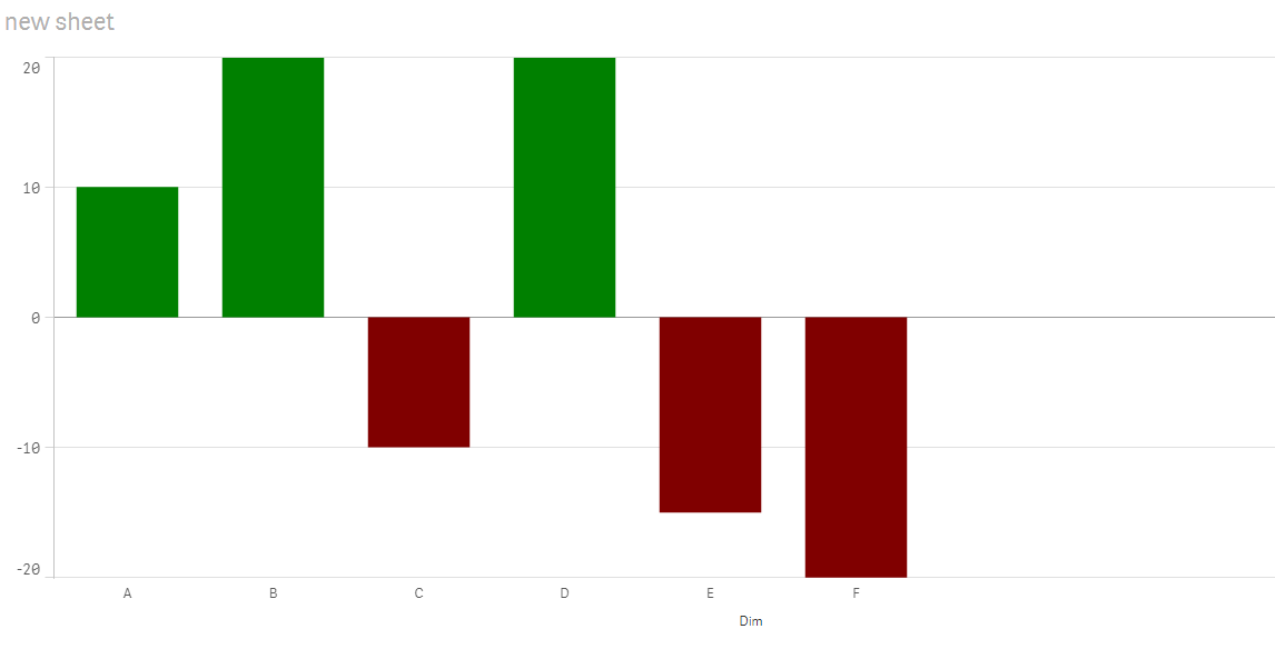
I created a positive-negative bar chart and I would like to implement 2 colors: green for positive values and red for negative values for example.
I have used two measures to obtain this chart a Min(value) and a Max(value), so when I insert a color expression I have something like this:
=If(Min(Value) < 0, Green(), Red()) but I would like to create a nested if statement something like:
=If(Min(Value) < 0, Green(), Red(),
If(Max(Value) > 0, Green(), Red())
But I'm not sure if I can use this approach in this case cause is not working. Any ideas how to create something like this?Thanks,
- « Previous Replies
-
- 1
- 2
- Next Replies »
Accepted Solutions
- Mark as New
- Bookmark
- Subscribe
- Mute
- Subscribe to RSS Feed
- Permalink
- Report Inappropriate Content
I guess you can't because you have only one expression color to set for both measures.
To achieve what you want you should be able to set color expression for each measure.
- Mark as New
- Bookmark
- Subscribe
- Mute
- Subscribe to RSS Feed
- Permalink
- Report Inappropriate Content
what's the expression you're using in your chart?
- Mark as New
- Bookmark
- Subscribe
- Mute
- Subscribe to RSS Feed
- Permalink
- Report Inappropriate Content
Hi Sinziana,
Instead of using min(Value) and max(value) for the color, use your expression for the color option (selected in blue in my screenshot).
something like:
if(sum([Compras Preço Custo])>0,Green(),Red()) // sum([Compras Preço Custo]) is my expression for the graph below).
In my case, it gives me
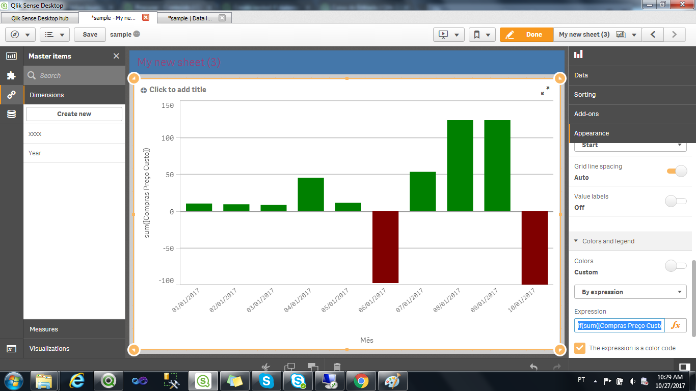
Since your expression is if(min(Value)<0,Red(),Green()), its always evaluating true, because your min value for the dataset is lower than 0 (zero) giving all bars the red color.
- Mark as New
- Bookmark
- Subscribe
- Mute
- Subscribe to RSS Feed
- Permalink
- Report Inappropriate Content
why not using simple expression as below
=if( Sum(Value) < 0, Red(), Green() )
?
- Mark as New
- Bookmark
- Subscribe
- Mute
- Subscribe to RSS Feed
- Permalink
- Report Inappropriate Content
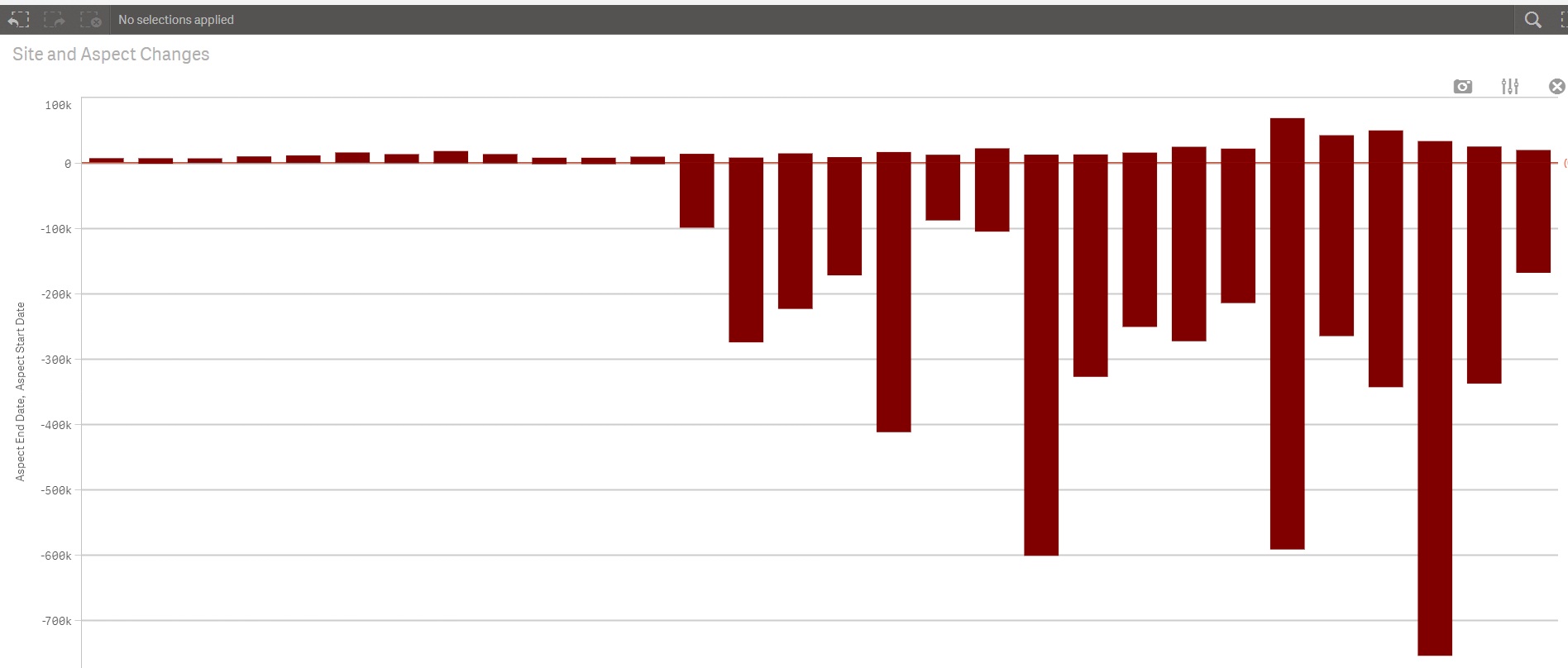
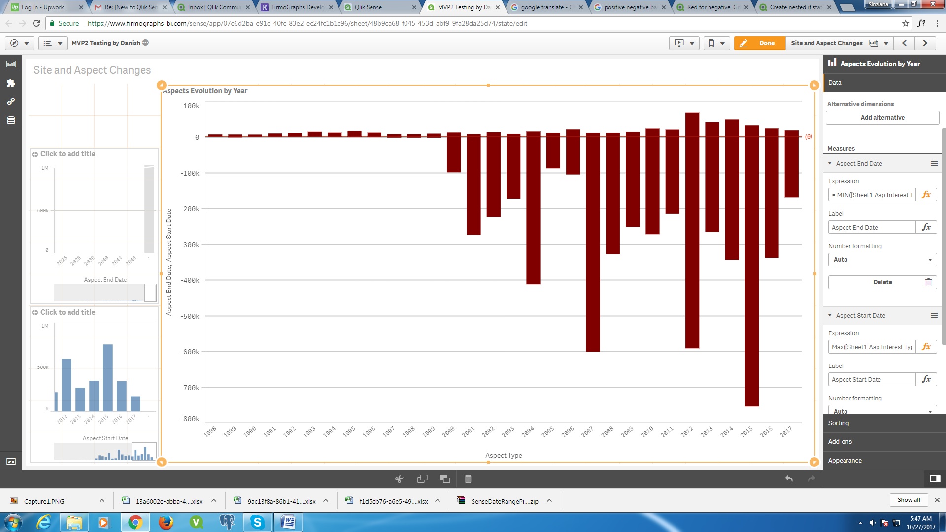
The thing is my chart is created with 2 columns of data united: a list of values that I want to see below the line (I gave them the minimum function) and a list of values that I want to display above the line (I gave them Maximum function).
That's why the syntax doesn't work in my case because I have 2 stacked measures and your syntax works with a measure (sum([Compras Preço Custo]) and 2 colors .
Maybe you have another idea how to display my data above and below the line O without the trick of Min and Max function. All values are on the same dimension.
- Mark as New
- Bookmark
- Subscribe
- Mute
- Subscribe to RSS Feed
- Permalink
- Report Inappropriate Content
why do you need two values for each year ?
- Mark as New
- Bookmark
- Subscribe
- Mute
- Subscribe to RSS Feed
- Permalink
- Report Inappropriate Content
There are two series of data (two values) united in the same graph because they show different things: a series shows how many processes ended in each year and the second how many processes started.
- Mark as New
- Bookmark
- Subscribe
- Mute
- Subscribe to RSS Feed
- Permalink
- Report Inappropriate Content
what about your color request related to those series of data ?
what's exactly the logic you have in mind ?
- Mark as New
- Bookmark
- Subscribe
- Mute
- Subscribe to RSS Feed
- Permalink
- Report Inappropriate Content
I want the values above in blue (Positive series of values) and the values below (Negative series of values) in red for example.
- Mark as New
- Bookmark
- Subscribe
- Mute
- Subscribe to RSS Feed
- Permalink
- Report Inappropriate Content
I guess you can't because you have only one expression color to set for both measures.
To achieve what you want you should be able to set color expression for each measure.
- « Previous Replies
-
- 1
- 2
- Next Replies »