Unlock a world of possibilities! Login now and discover the exclusive benefits awaiting you.
- Qlik Community
- :
- Forums
- :
- Analytics
- :
- New to Qlik Analytics
- :
- Re: Creating Flow Chart to show Life Cycle
- Subscribe to RSS Feed
- Mark Topic as New
- Mark Topic as Read
- Float this Topic for Current User
- Bookmark
- Subscribe
- Mute
- Printer Friendly Page
- Mark as New
- Bookmark
- Subscribe
- Mute
- Subscribe to RSS Feed
- Permalink
- Report Inappropriate Content
Creating Flow Chart to show Life Cycle
Hi,
I want to create a flowchart showing 10 different dates for one ref_id at different steps.
Ref_ID -> Date1 -> Date2 -> Date3 -> Date4 -> Date5 -> Date6 -> Date7 -> Date8 -> Date9 -> Date10
Please suggest something which is scalable and can be extended for more dates if required.
Please Accepts as Solution if it solves your query.
- Mark as New
- Bookmark
- Subscribe
- Mute
- Subscribe to RSS Feed
- Permalink
- Report Inappropriate Content
Do you mean something like a gantt-chart? Maybe you could apply something like this:
Recipe for a Gantt chart - Qlik Community - 1469842
Creating a Gantt Chart in Qlik Sense - Qlik Community - 1606833
- Marcus
- Mark as New
- Bookmark
- Subscribe
- Mute
- Subscribe to RSS Feed
- Permalink
- Report Inappropriate Content
I tried but it isn't working as in example
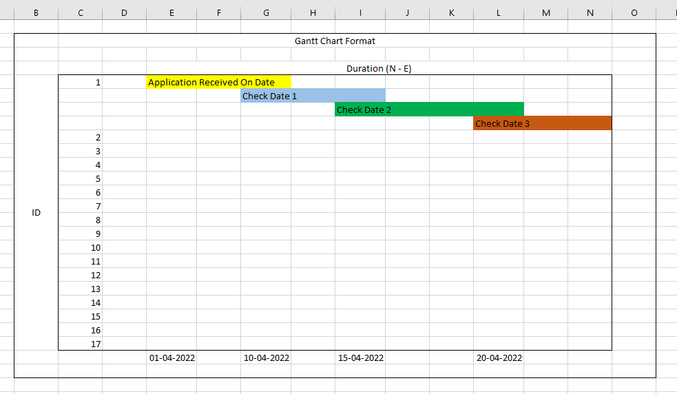
I have 7 Different dates related to one ID,
I would like to show lifecycle of this ID From Start of Task 1 to End of Task 7
Application Received On -> Check Date 1 -> Check Date 2 -> Check Date 3 -> Check Date 4 -> Check Date 5 -> Check Date 6
All these dates are in dimension.
I am getting this currently
Please Accepts as Solution if it solves your query.
- Mark as New
- Bookmark
- Subscribe
- Mute
- Subscribe to RSS Feed
- Permalink
- Report Inappropriate Content
Did you go carefully through the examples? Showing chains of events isn't only a UI matter else you may need to adjust the data-model appropriately. Further be aware that to each other shifted bars are enabled with the offset-feature within the attribute-expressions.
- Marcus
- Mark as New
- Bookmark
- Subscribe
- Mute
- Subscribe to RSS Feed
- Permalink
- Report Inappropriate Content
Yes I followed step by step can't find this offset feature in bar chart
Please Accepts as Solution if it solves your query.
- Mark as New
- Bookmark
- Subscribe
- Mute
- Subscribe to RSS Feed
- Permalink
- Report Inappropriate Content
In QV it belongs to the attribute expressions. I assume that they are also available within Sense but they might be called different. Take a look for expressions with which you could conditionally adjust something like font/background color or making it bold. If they didn't completely change the logic it should be in the near.
- Marcus
- Mark as New
- Bookmark
- Subscribe
- Mute
- Subscribe to RSS Feed
- Permalink
- Report Inappropriate Content
This is what I am getting notice dates in X Axis can't figure it how its coming like that. Actual dates are displayed above the measure.
Please Accepts as Solution if it solves your query.
- Mark as New
- Bookmark
- Subscribe
- Mute
- Subscribe to RSS Feed
- Permalink
- Report Inappropriate Content
If I look on your screenshot I think that there is something wrong with data because the axis shows several hundred years and nearly all bar-parts show a date. I suggest you starts again at the beginning with the provided links and you could also search for another ones (the number of examples isn't huge but there are more as those two). The next then might be to rebuild the logic with dummy-data like in the examples to comprehend the methods deeply before you tries to adapt it to your real data.
- Marcus


