Unlock a world of possibilities! Login now and discover the exclusive benefits awaiting you.
- Qlik Community
- :
- Forums
- :
- Analytics
- :
- New to Qlik Analytics
- :
- Re: Customised line graph not showing the required...
- Subscribe to RSS Feed
- Mark Topic as New
- Mark Topic as Read
- Float this Topic for Current User
- Bookmark
- Subscribe
- Mute
- Printer Friendly Page
- Mark as New
- Bookmark
- Subscribe
- Mute
- Subscribe to RSS Feed
- Permalink
- Report Inappropriate Content
Customised line graph not showing the required color for line
Hi,
I am making a dashboard where one of my charts is a line graph showing 3 lines for different fields. I want the color of area of line to match with my other charts so trying to customize the colors of line but it is not working.
I am writing the following code in expression of line graph.
if(IsNum([Meters Instructed]),red(),
if(IsNum(Planned), LightBlue(),
if(IsNum(Completed),Green(),Yellow())))
Please find attached my input file for the chart. My X-axis has date and Y-axis shows 3 lines (Meter instructed, planned and completed column from input file).
Please suggest the way forward.
Regards,
Romila.
- Mark as New
- Bookmark
- Subscribe
- Mute
- Subscribe to RSS Feed
- Permalink
- Report Inappropriate Content
Which version are you using. latest version has the option of setting colors for master measures. i.e.
each measure in your chart set as a master measure, assign the appropriate colot
- Mark as New
- Bookmark
- Subscribe
- Mute
- Subscribe to RSS Feed
- Permalink
- Report Inappropriate Content
Hi,
I am using Qlik sense desktop version 12.26.1.
Sorry but I am not able to see any master measures there. Please suggest.
Regards,
Romila.
- Mark as New
- Bookmark
- Subscribe
- Mute
- Subscribe to RSS Feed
- Permalink
- Report Inappropriate Content
I meant add your measures e.g. Sum(Meters Instructed]) as a master measure and then assign a color.
not sure its available in 12.26 though. i am using september release
- Mark as New
- Bookmark
- Subscribe
- Mute
- Subscribe to RSS Feed
- Permalink
- Report Inappropriate Content
Ok, mine is June 2018 release.
I am adding 3 measures as sum(planned) etc and then trying to write expression in Colors and Legends.
Please let me know where do we get assign a color for master measures ?
- Mark as New
- Bookmark
- Subscribe
- Mute
- Subscribe to RSS Feed
- Permalink
- Report Inappropriate Content
see below. not sure if its there in june 2018 though
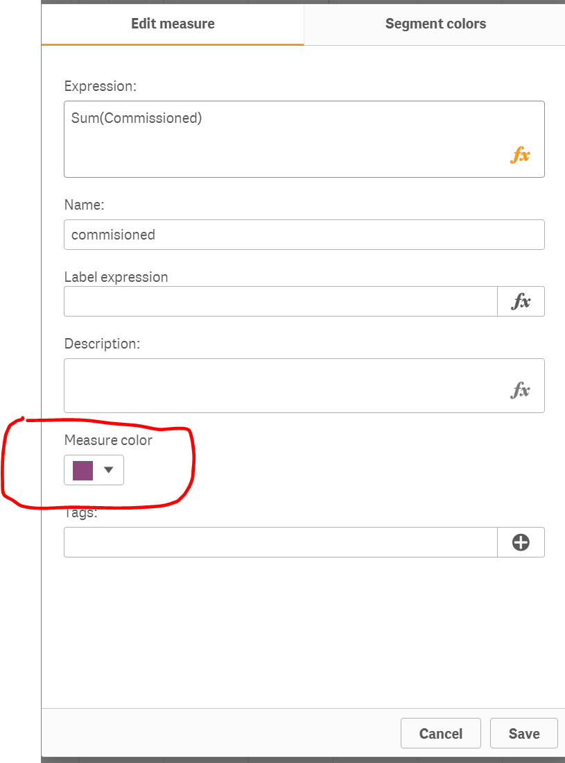
if you cant upgrade see link below
Qlik Sense: How to set custom colors by measure in a bar chart