Unlock a world of possibilities! Login now and discover the exclusive benefits awaiting you.
- Qlik Community
- :
- Forums
- :
- Analytics
- :
- New to Qlik Analytics
- :
- Re: Dashboard with multiple graphs
- Subscribe to RSS Feed
- Mark Topic as New
- Mark Topic as Read
- Float this Topic for Current User
- Bookmark
- Subscribe
- Mute
- Printer Friendly Page
- Mark as New
- Bookmark
- Subscribe
- Mute
- Subscribe to RSS Feed
- Permalink
- Report Inappropriate Content
Dashboard with multiple graphs
Hello everybody!
I need to create a dashboard that includes the information showed here (boxes 1, 5, and 9 are filters):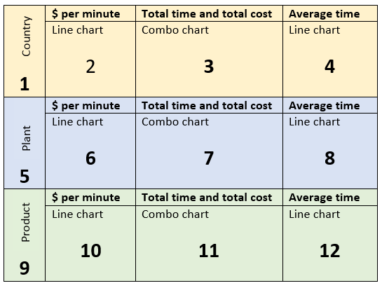
However, I’m not sure if the following scenario is possible:
First, I would like to select a country, which will update boxes 2, 3, 4, 5, 6, 9, 10. Then I want to select a plant in that country, which should only update 6, 7, 8, 9, and 10. Lastly, I need to select a product manufactured in that plant so that boxes 10, 11, and 12 change accordingly. In summary, selecting a plant shouldn’t affect the first row of the dashboard and selecting a product shouldn’t affect the first two rows. As a result the dashboard will present the summarized information for a selected country, plant, and individual product.
I hope this is somehow possible. Thank you very much! 
Accepted Solutions
- Mark as New
- Bookmark
- Subscribe
- Mute
- Subscribe to RSS Feed
- Permalink
- Report Inappropriate Content
For the charts you can use set analysis - so something like Sum({<Plant=,Product=>})[Your Measure]) in 2-4 and Sum({<Product=>})[Your Measure]) in 10-12.
I think you are rather fighting how QlikView wants to work however.
- Mark as New
- Bookmark
- Subscribe
- Mute
- Subscribe to RSS Feed
- Permalink
- Report Inappropriate Content
You could create all the different objects making use of the Trellis option. This would split the analysis by the relevant dimensions you have.
Alternatively, you could use containers (and container within containers ) get the desire view that you are looking for. However, I do agree with Christopher in that it is counter intuitive to the way Qlik works.
Cheers,
Pravesh
- Mark as New
- Bookmark
- Subscribe
- Mute
- Subscribe to RSS Feed
- Permalink
- Report Inappropriate Content
Neither Trellis charts nor Containers are available in Sense!
It would be far better to educate your users to understand how the data is associated in Sense, and the relevance of the Green White and Grey selections rather than working around the logic inherent in Qlik.
- Mark as New
- Bookmark
- Subscribe
- Mute
- Subscribe to RSS Feed
- Permalink
- Report Inappropriate Content
Thank you very much! I did it like this:
2-4: Sum({<Plant=,Product=>} Expression)
6-8: Sum({<Product=>} Expression)
10-12: Sum(Expression)
It seems to be working fine. The dashboard shows information per country, plant, and product and e.g. selecting a material updates only the last row of the dashboard, but does not change the first and the second. Thanks again!
- Mark as New
- Bookmark
- Subscribe
- Mute
- Subscribe to RSS Feed
- Permalink
- Report Inappropriate Content
Apologies, did not realised this was posted in the QlikSense Section!
The StoryBoard and Mashups would also be a great way of educating users on functionality and content of the application.