Unlock a world of possibilities! Login now and discover the exclusive benefits awaiting you.
- Qlik Community
- :
- Forums
- :
- Analytics
- :
- New to Qlik Analytics
- :
- Re: Dimension colours in stacked bar charts Qlik S...
- Subscribe to RSS Feed
- Mark Topic as New
- Mark Topic as Read
- Float this Topic for Current User
- Bookmark
- Subscribe
- Mute
- Printer Friendly Page
- Mark as New
- Bookmark
- Subscribe
- Mute
- Subscribe to RSS Feed
- Permalink
- Report Inappropriate Content
Dimension colours in stacked bar charts Qlik Sense
Hello
I have a bar chart that measures sales across a number of financial periods. For each period I want the bar to be broken down by customer category (i.e. stacked bar chart). So the bar chart has two dimensions, Period and Category. On the sheet, the period is a filter. The user can select a period and other objects on the sheet reflect various values for that period. But within the bar chart I want all periods to be shown and so I have the measure expression set as
sum({$<Period=>}SalesValue)
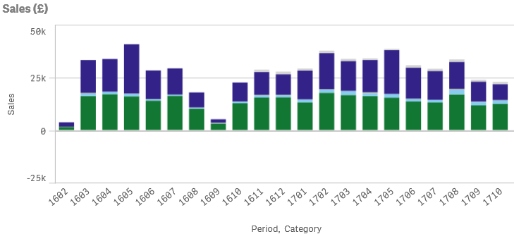
When no period is selected each bar is shown as a stacked bar chart reflecting the various categories,
However, when a period is selected, only the selected period shows the categories,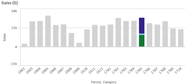
Is it possible to make all periods show the categories when a period is selected?
Periods are 4 digits, first 2 are the year, last 2 represent the period in the year. E.g. 1710 means period 10 of year 17.
Categories are text, e.g. 'Shops'. There are 6 categories.
Thanks, appreciate any help that anyone can give.
- « Previous Replies
-
- 1
- 2
- Next Replies »
Accepted Solutions
- Mark as New
- Bookmark
- Subscribe
- Mute
- Subscribe to RSS Feed
- Permalink
- Report Inappropriate Content
Ignore selection for dim field
If(Only({<Period>} dim) = 'Value1', Green(), Red())
- Mark as New
- Bookmark
- Subscribe
- Mute
- Subscribe to RSS Feed
- Permalink
- Report Inappropriate Content
Hi Semir
Not sure what you are trying to achieve with the request.
If the user selects a period why is it an issue that only the users selection is coloured so they focus on their selection?
Regards
Andy
- Mark as New
- Bookmark
- Subscribe
- Mute
- Subscribe to RSS Feed
- Permalink
- Report Inappropriate Content
Suppose you have rolling 12 months for example; and when u select a month; you want to show it and its previous 11 months.. but when u color with dimension; and select any month;; you'll have all the previous shown month scolored in grey..
So, we NEED to figure out a way to keep all the months colored and break the association
Do u see the point?
- Mark as New
- Bookmark
- Subscribe
- Mute
- Subscribe to RSS Feed
- Permalink
- Report Inappropriate Content
stalwar1, have any idea on how to do this?
- Mark as New
- Bookmark
- Subscribe
- Mute
- Subscribe to RSS Feed
- Permalink
- Report Inappropriate Content
So is the issue down to how the setting of colour is being applied to the chart using colour by Expression rather than using the colour by dimension and measure features added in master items?
Ive not come across the issue myself but perhaps tackling the adding of colour in a different way will resolve this.
Regards
Andy
- Mark as New
- Bookmark
- Subscribe
- Mute
- Subscribe to RSS Feed
- Permalink
- Report Inappropriate Content
Omar is correct in that I want to be able to see how the selected period compares with other periods.
- Mark as New
- Bookmark
- Subscribe
- Mute
- Subscribe to RSS Feed
- Permalink
- Report Inappropriate Content
Perhaps you are trying to do to much with one chart.
http://help.qlik.com/en-US/sense/September2017/Content/Videos/Videos-choose-chart-comparison.htm
- Mark as New
- Bookmark
- Subscribe
- Mute
- Subscribe to RSS Feed
- Permalink
- Report Inappropriate Content
Are you using an expression for colors in the chart? If you are, then you might need to ignore selection in your color expression also... For example if the expression is like this
Color
change it to this
Only({1} Color)
or
Only({<Period>} Color)
Basically ignore selection in Period for your color expression also...
- Mark as New
- Bookmark
- Subscribe
- Mute
- Subscribe to RSS Feed
- Permalink
- Report Inappropriate Content
But I want to have different colors;
sthing like; if(dim='Value1',Green(),red())
how can I do in this case?
- Mark as New
- Bookmark
- Subscribe
- Mute
- Subscribe to RSS Feed
- Permalink
- Report Inappropriate Content
Ignore selection for dim field
If(Only({<Period>} dim) = 'Value1', Green(), Red())
- « Previous Replies
-
- 1
- 2
- Next Replies »