Unlock a world of possibilities! Login now and discover the exclusive benefits awaiting you.
- Qlik Community
- :
- Forums
- :
- Analytics
- :
- New to Qlik Analytics
- :
- Re: Distribution plot help
- Subscribe to RSS Feed
- Mark Topic as New
- Mark Topic as Read
- Float this Topic for Current User
- Bookmark
- Subscribe
- Mute
- Printer Friendly Page
- Mark as New
- Bookmark
- Subscribe
- Mute
- Subscribe to RSS Feed
- Permalink
- Report Inappropriate Content
Distribution plot help
Hi all
I really hope that someone can help - it is driving me crazy! I have a data set with a lot of data which can be simplified to something like the table below:
| Client | Inspection | Score |
| Client_A | Health | 1 |
| Client_B | Health | 9 |
| Client_C | Health | 7 |
| Client_A | Safety | 1 |
| Client_B | Safety | 8 |
| Client_C | Safety | 1 |
| Client_A | Security | 5 |
| Client_B | Security | 2 |
| Client_C | Security | 7 |
| Client_A | Environment | 2 |
| Client_B | Environment | 6 |
| Client_C | Environment | 7 |
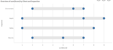
I would like to show the Min and Max for each Inspection (Health, Safety, Security and Environment - disregarding any selections) and then I also want to show the average for the clients selected as another dot on a distribution plot. I also need the bands to be shown. Something like the graph below (it is the wrong data, but it is just to give you an idea):
I tried making Inspection my Y-axis, ValueList('Min','Max','Avg') my Points and my X-axis (measure) the following:
If(ValueList('Min','Max','Avg')='Min',
Min({1}Score),
If(ValueList('Min','Max','Avg')='Max',
Max({1}Score),
If(ValueList('Min','Max','Avg')='Avg',
Avg(Score)
)
)
)
It gives me the correct data, but the bands disappear like in the screenshot below:
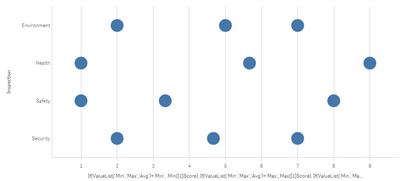
Like I said, the data is fine, but the layout not as I don't get the bands anymore (which is an explicit requirement). I have spent hours on this and really hope there is a simple answer. I cannot show all the data points as my actual data set will have way more than 100 scores for each inspection. I have attached* the sample app.
Any help would be greatly appreciated (other suggestions also welcome, but I am not allowed to use a Box Plot).
Regards,
Mauritz
PS. I have tried doing this with a stacked combo chart and tried to make the bottom bar transparent, but I cannot use ARGB colours as part of my master measure colours and the white doesn't look good![]() .
.
- « Previous Replies
-
- 1
- 2
- Next Replies »
Accepted Solutions
- Mark as New
- Bookmark
- Subscribe
- Mute
- Subscribe to RSS Feed
- Permalink
- Report Inappropriate Content
Hi Mauritz,
There seems to be something with the value list. Not really sure what, but I've asked the devs to have a check.
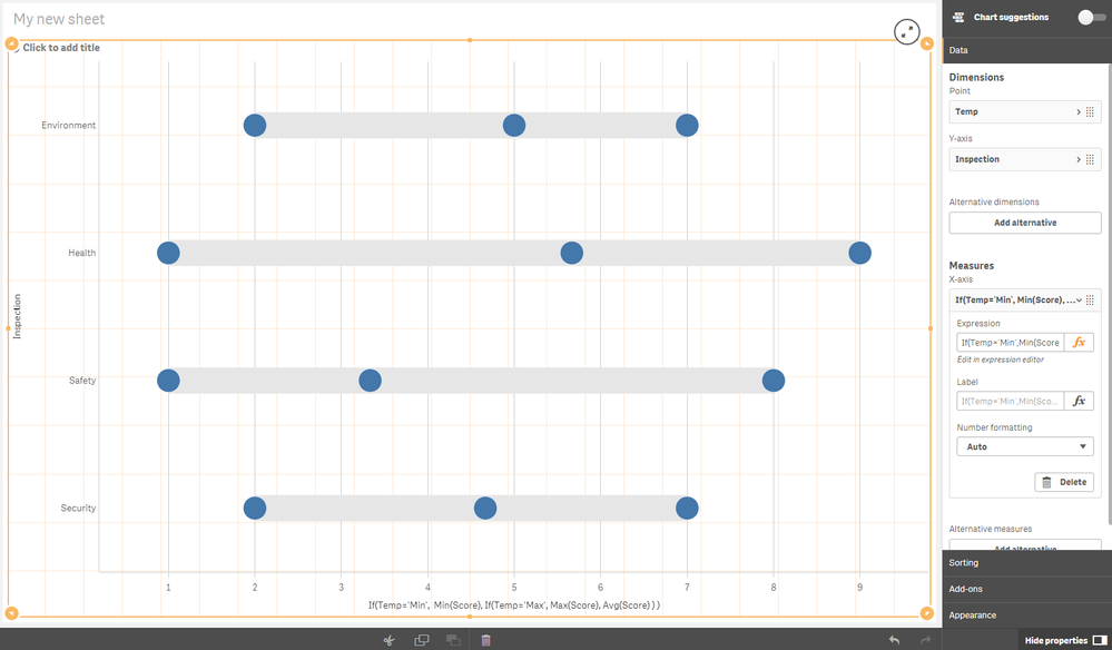
A workaround that works for me is to create a new 'Temp' field in a data island with the values Max, Min, Avg.
Then I changed the measure to be just
If(Temp='Min',
Min(Score),
If(Temp='Max',
Max(Score),
Avg(Score)
)
)
Seems to work
Regards,
Patrik.
- Mark as New
- Bookmark
- Subscribe
- Mute
- Subscribe to RSS Feed
- Permalink
- Report Inappropriate Content
Hi Patrik
Thank you so much for the feedback. Your solution works perfectly! Would be nice to know if this can be done from the front end using something like Valuelist as other users won't have access to the data load.
Thanks again.
Regards,
Mauritz
- Mark as New
- Bookmark
- Subscribe
- Mute
- Subscribe to RSS Feed
- Permalink
- Report Inappropriate Content
Hi Maurtiz,
The issue is indeed with the valuelist. When the chart it tries to get the max and min value of each row to calculate the background box. The expression to find the max value is in your case
Max( total <[Inspection]> Aggr( If(ValueList('Min','Max','Avg')='Min',
Min({1}Score),
If(ValueList('Min','Max','Avg')='Max',
Max({1}Score),
If(ValueList('Min','Max','Avg')='Avg',
Avg(Score)
)
)
), [Inspection], [=ValueList('Min','Max','Avg')] ), 1 )
The problem here is that the aggr function doesn't accept the valuelist. Therefore the max value can't be calculated.
From documentation
Limitations:
Each dimension in an Aggr() function must be a single field, and cannot be an expression (calculated dimension).
So nothing we can easily solve in the visualization for now.
Regards,
Patrik.
- Mark as New
- Bookmark
- Subscribe
- Mute
- Subscribe to RSS Feed
- Permalink
- Report Inappropriate Content
Thanks Patrik. I really appreciate the help and insight!
- Mark as New
- Bookmark
- Subscribe
- Mute
- Subscribe to RSS Feed
- Permalink
- Report Inappropriate Content
Hi Patrick,
I saw your workaround and also the comment on the AGGR function (only one measure).
However, I have the same problem. I only change the colour of one of the dots and then *boom* the box disappears from the chart... all dots remain OK, it is only the box that disappears 😞
Any comment from the devs?
I have tried your solution, created a variable instead to have less arguments (it works displaying the correct info but not the boxes), I created a new measure that has the calculation required... but nothing seems to work... strange that it works fine until i change the colour of one dot...
- Mark as New
- Bookmark
- Subscribe
- Mute
- Subscribe to RSS Feed
- Permalink
- Report Inappropriate Content
Hi Demonioazul ,
I would need some more info to look at it.
With what are you changing the color?
Regards,
Patrik.
- Mark as New
- Bookmark
- Subscribe
- Mute
- Subscribe to RSS Feed
- Permalink
- Report Inappropriate Content
Hi @Patrik_Lundblad ,
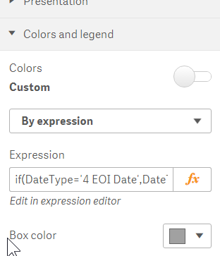
I am using a colour expression in the chart. It was working perfectly. Now I can revert the colours to the original but the bars are lost.
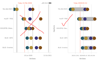
This is the original:
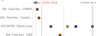
Now, when modifying the colour at the chart settings:
I get this:
And even if I revert to the original colours, the bars are gone...
No idea what's happening here.
My app is a complex one, and i understand that there might be things you need to check, but I cannot share the app with you due to confidentiality policies of my company. However, if it is simple for you to check out this, please go ahead. If not, then I might need to implement another way of doing this perhaps with bar charts... but that is a lot of development time for something a native chart was already doing... Thanks in advance for your help!
- Mark as New
- Bookmark
- Subscribe
- Mute
- Subscribe to RSS Feed
- Permalink
- Report Inappropriate Content
That's an odd one.
For some reason the max/min calculation doesn't work with those color settings. Just looking at it the only thing I can imagine is that the color calculation goes wrong and then the point is regarded as invalid. Cause it also looks like not only the boxes are gone, but also some data points?
Does the same calculation work if you create a table with your data from the distribution plot and then add the color expression as a new column?
Also:
When switching back to the original color did you remove/empty the color expression? If you didn't then it might actually get calculated despite not being used. And thus creating the error.
What happens if you create the chart from the beginning so it matches the original one? Can you get the boxes then?
Regards,
Patrik.
- Mark as New
- Bookmark
- Subscribe
- Mute
- Subscribe to RSS Feed
- Permalink
- Report Inappropriate Content
Sorry, the dots were different because I did the screenshots with filters, once I changed the colour I also tested other things and could not remember which filter I used with the first screenshot so they seem to difer but no dots were lost at all. Only the boxes are gone.
Now, you gave me an idea so, even if I am not done with the chart, it works! I created it from scratch again...
So, thank you!!!
(I still consider odd that only changing the colour was the culprit - something may be wrong...)
Thanks again!
- « Previous Replies
-
- 1
- 2
- Next Replies »
