Unlock a world of possibilities! Login now and discover the exclusive benefits awaiting you.
- Qlik Community
- :
- Forums
- :
- Analytics
- :
- New to Qlik Analytics
- :
- Re: Double dimension bar chart
- Subscribe to RSS Feed
- Mark Topic as New
- Mark Topic as Read
- Float this Topic for Current User
- Bookmark
- Subscribe
- Mute
- Printer Friendly Page
- Mark as New
- Bookmark
- Subscribe
- Mute
- Subscribe to RSS Feed
- Permalink
- Report Inappropriate Content
Double dimension bar chart
Hi,
I have data input like this:
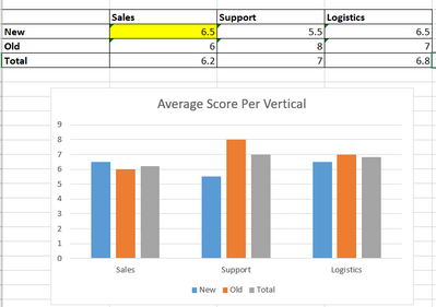
I want to generate bar chart like this
The numbers in the cell is the average score. For example, the yellow cell would be average score of New customers for Sales Ratings (6+7)/2=6.5. I will also want to use 'Date' field as a filter.
With my input, I can only get this in the bar chart in Qliksense:
Does anyone know how to get the chart I showed above in the Excel?
- Tags:
- bar chart
Accepted Solutions
- Mark as New
- Bookmark
- Subscribe
- Mute
- Subscribe to RSS Feed
- Permalink
- Report Inappropriate Content
Hi @cheryl !
I think the best way to solve this is using Crosstable() function on script.
After this, will be more easy to work in the bar chart.
If you can, send a post with a sample data in excel that I try to do here and send you a code.
Another way is using the ValueList() function directly on chart.
- Mark as New
- Bookmark
- Subscribe
- Mute
- Subscribe to RSS Feed
- Permalink
- Report Inappropriate Content
Thanks Joaopaulo!
I used Crosstable() and it works now.


