Unlock a world of possibilities! Login now and discover the exclusive benefits awaiting you.
- Qlik Community
- :
- Forums
- :
- Analytics
- :
- New to Qlik Analytics
- :
- Re: Dynamic Date Dimension
- Subscribe to RSS Feed
- Mark Topic as New
- Mark Topic as Read
- Float this Topic for Current User
- Bookmark
- Subscribe
- Mute
- Printer Friendly Page
- Mark as New
- Bookmark
- Subscribe
- Mute
- Subscribe to RSS Feed
- Permalink
- Report Inappropriate Content
Dynamic Date Dimension
Hi,
i would like to build a 'dynamic date dimension' within a line chart.
What do i mean with that:
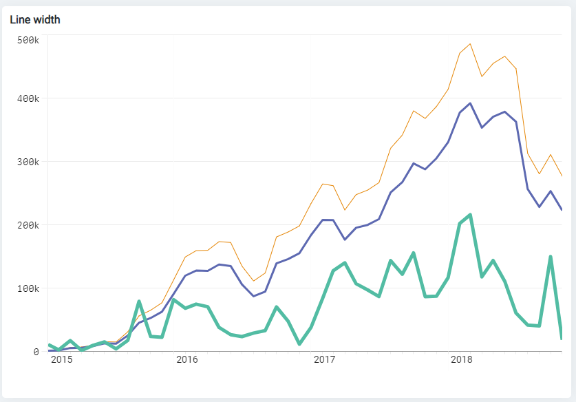
You can see that in the qlik showroom for line charts (top left chart).
By default you see the x-axis divided into years. Only if you scroll down with the mous you will see the single months and later the single dates.
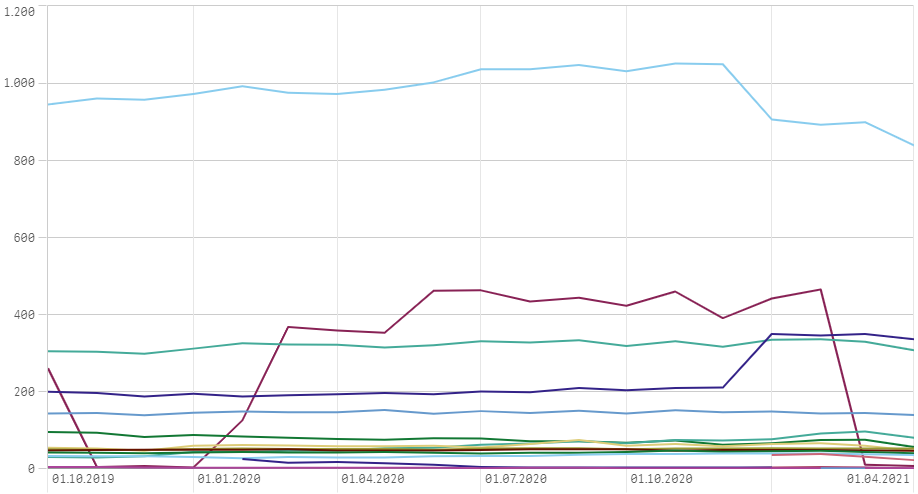
When i take a date dimension and build a line chart like this it shows by default the first date of the month (screen 2).
Can anybody tell me how to format it nicely like in the showroom?
- Mark as New
- Bookmark
- Subscribe
- Mute
- Subscribe to RSS Feed
- Permalink
- Report Inappropriate Content
The Line Chart example seems to imply that you only have a few date values which is why they are showing the actual data values. The one from the showcase site very likely has hundreds of values so they are rolled up in time as the line chart will do for time values.
- Mark as New
- Bookmark
- Subscribe
- Mute
- Subscribe to RSS Feed
- Permalink
- Report Inappropriate Content
Hi,
my dataset has thousands of rows so i dont think this is the problem unfortunately 😕
- Mark as New
- Bookmark
- Subscribe
- Mute
- Subscribe to RSS Feed
- Permalink
- Report Inappropriate Content
Does your line chart shows all the dates present in the dataset?
If yes, try to resize the line chart and make it smaller. May be it can show year->month->date on scrolling.
Regards,
Sudhir
- Mark as New
- Bookmark
- Subscribe
- Mute
- Subscribe to RSS Feed
- Permalink
- Report Inappropriate Content
No sorry it doesnt work like in the showcase.
I really wonder how they formatted their data its a pity we cant look at that.