Unlock a world of possibilities! Login now and discover the exclusive benefits awaiting you.
- Qlik Community
- :
- Forums
- :
- Analytics
- :
- New to Qlik Analytics
- :
- Re: Dynamic Scaling - Y-Axis in Qlik Sense Chart
- Subscribe to RSS Feed
- Mark Topic as New
- Mark Topic as Read
- Float this Topic for Current User
- Bookmark
- Subscribe
- Mute
- Printer Friendly Page
- Mark as New
- Bookmark
- Subscribe
- Mute
- Subscribe to RSS Feed
- Permalink
- Report Inappropriate Content
Dynamic Scaling - Y-Axis in Qlik Sense Chart
Hello,
Qlik Sense Question.
I am producing an order fulfillment report, with an associated chart. The measure of % Fulfillment is:
- Sum(tot_shipped)/Sum(tot_ordered)
The business is keen to review % fulfillment at a monthly level, but when performance is lower than expected, they want to check the weekly and often daily views across a period to see where the performance was low.
So I have set up the data in the chart with alternative dimensions so we can change from Order_Month, to Order_Week to Order_Date to provide flexible views for the user.
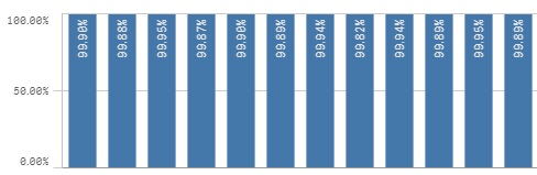
However, the "% fulfillment" is often in the 99.X%'s and Qlik Sense produces a chart where it's hard to see the change in performance easily - please see below for the current view which shows the % per month of 2016 - sorry the screen shot removed the months from X-Axis:
So what I want to do is make the Y axis scale dynamic, by taking just above the MIN performance by month as the approx baseline for the scale of the Y Axis. It would change to look something like this (which I did manually here by changing the Y Axis Min to a static value of 99.8%, which is 0.02% below the MIN value of 99.82%):
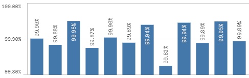
This visualization is much more useful for having a business conversation. I have tried unsuccessfully to use the MIN function - I could only make it work to the point where it would identify the MIN of a single order in the period, which could be as low as 1%, meaning the charts pretty much stayed as per the first example above. I need the MIN calculation to consolidate the performances over the monthly dimension, and have that drive the baseline for the Y-Axis. A static value isn't a workable solution.
Hope someone can help!
Cheers
Giles
Accepted Solutions
- Mark as New
- Bookmark
- Subscribe
- Mute
- Subscribe to RSS Feed
- Permalink
- Report Inappropriate Content
This is the nearest answer to what I needed (thanks mov, but after research and another thread (How to choose a Dimension via IF statement) unfortunately in Qlik Sense there is no way to know the active dimension to make such dynamic requirements possible for what I need. This is a shame as I am sure a lot of people would actually find this useful when charting.
Thanks to all for their assistance. I can't spend anymore time on this now so I have just set a basic min statement as below based on the main dimension discussed by the business, Order_Month.
- min(aggr(Sum(tot_shipped)/Sum(tot_ordered),Order_Month)) - 0.001
Other dimensions that go below the min determined in this statement will simply be displayed by the value and the arrow indicating that the bar in the chart goes below the min. Not ideal, but it will have to suffice.
Cheer again all.
- Mark as New
- Bookmark
- Subscribe
- Mute
- Subscribe to RSS Feed
- Permalink
- Report Inappropriate Content
I found a solution in another thread:
https://community.qlik.com/t5/QlikView-App-Development/Help-Dynamic-Axes-Ranges/td-p/648629#
- Mark as New
- Bookmark
- Subscribe
- Mute
- Subscribe to RSS Feed
- Permalink
- Report Inappropriate Content
Hi - can anyone please help me? Thanks.
- Mark as New
- Bookmark
- Subscribe
- Mute
- Subscribe to RSS Feed
- Permalink
- Report Inappropriate Content
See this: Custom range for Y-axis as maximum value of the measure + fix number
Except you need min rather than max. Aggregate by your chart dimension, which,as I understand could be Date or Week or Month.
- Mark as New
- Bookmark
- Subscribe
- Mute
- Subscribe to RSS Feed
- Permalink
- Report Inappropriate Content
Hi Michael,
Awesome, this is exactly what I need, thanks so much. In line with the explanation in the link, I copied the formula, and mine looked like this:
- min(aggr(Sum(tot_shipped)/Sum(tot_ordered),Order_Month)) - 0.001
This resulted in my chart looking like this:

So as required, the min value for Order_Month of 95.62% is 0.1% above the min on the Y axis i.e. min for Y axis is 95.52%.
From this I have come across my next hurdle, and I hope you can advise me please?
The X axis has 2 alternative dimensions which are:
- Order_Week
- Order_Day
When I use the above formula (only specifying Order_Month), and then I select an alternative dimension on the X Axis (I chose Order_week), the min position for the Y Axis is of course kept relative to the Min for the Order_Month, thus creating a chart looking like this:
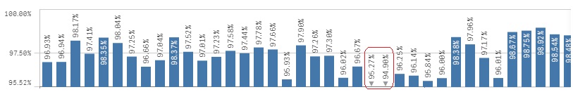
Obviously the 2 items circled in red here are weekly %'s that fall below that Order_Month min of 95.52%. This means that the visualization isn't quite finished for me yet.
What I need is the chart to display the min Y Axis value relative to the min of that specific dimension, i.e. in the example above:
- When choosing Order_Month, the min value would calculate to be 95.52%
- When choosing Order_Week, the min value would would calculate to be 94.80%
- When choosing Order_Day, the min value would would calculate to be 87.86%
Do you have any suggestions as to the best way to achieve that dynamic result? I'm not sure how to make it happen.
Thanks
Giles
- Mark as New
- Bookmark
- Subscribe
- Mute
- Subscribe to RSS Feed
- Permalink
- Report Inappropriate Content
You have to aggregate by chart dimension. If chart dimension can change, your expression will be conditional.
From your description, I can't give you the exact expression, but just the logic:
if(<dimension is Order_Month>,
min(aggr(Sum(tot_shipped)/Sum(tot_ordered),Order_Month)),
if(<dimension is Order_Week>,
min(aggr(Sum(tot_shipped)/Sum(tot_ordered),Order_Week)),
if(<dimension is Order_Day>,
min(aggr(Sum(tot_shipped)/Sum(tot_ordered),Order_Day)))) - 0.001
The only thing you need to figure out is how exactly the dimension condition will look likw.
Please count my open and close (), I could mis-count them..
- Mark as New
- Bookmark
- Subscribe
- Mute
- Subscribe to RSS Feed
- Permalink
- Report Inappropriate Content
This is the nearest answer to what I needed (thanks mov, but after research and another thread (How to choose a Dimension via IF statement) unfortunately in Qlik Sense there is no way to know the active dimension to make such dynamic requirements possible for what I need. This is a shame as I am sure a lot of people would actually find this useful when charting.
Thanks to all for their assistance. I can't spend anymore time on this now so I have just set a basic min statement as below based on the main dimension discussed by the business, Order_Month.
- min(aggr(Sum(tot_shipped)/Sum(tot_ordered),Order_Month)) - 0.001
Other dimensions that go below the min determined in this statement will simply be displayed by the value and the arrow indicating that the bar in the chart goes below the min. Not ideal, but it will have to suffice.
Cheer again all.
- Mark as New
- Bookmark
- Subscribe
- Mute
- Subscribe to RSS Feed
- Permalink
- Report Inappropriate Content
Hello,
I understand that we can't get the active dimension on a chart but what about the selected Measure when we have a defined lternatives measures ?
I have a graph with static dimension but several alternatives, I have tried this :
=if(GetObjectMeasure(0)='Measure Label',Min1,Min2) where "Measure Label si the label of current measure used.
It's not working, any guess ?
- Mark as New
- Bookmark
- Subscribe
- Mute
- Subscribe to RSS Feed
- Permalink
- Report Inappropriate Content
Alban - I tried that too, so see if I could make it work, but no. I am not experienced with this function unfortunately.
- Mark as New
- Bookmark
- Subscribe
- Mute
- Subscribe to RSS Feed
- Permalink
- Report Inappropriate Content
I found a solution in another thread:
https://community.qlik.com/t5/QlikView-App-Development/Help-Dynamic-Axes-Ranges/td-p/648629#