Unlock a world of possibilities! Login now and discover the exclusive benefits awaiting you.
- Qlik Community
- :
- Forums
- :
- Analytics
- :
- New to Qlik Analytics
- :
- Employee clocking visualization
Options
- Subscribe to RSS Feed
- Mark Topic as New
- Mark Topic as Read
- Float this Topic for Current User
- Bookmark
- Subscribe
- Mute
- Printer Friendly Page
Turn on suggestions
Auto-suggest helps you quickly narrow down your search results by suggesting possible matches as you type.
Showing results for
Anonymous
Not applicable
2016-10-31
12:59 AM
- Mark as New
- Bookmark
- Subscribe
- Mute
- Subscribe to RSS Feed
- Permalink
- Report Inappropriate Content
Employee clocking visualization
I have a table of employee daily clocking record.
The table is like below. There is a column for employee ID, a column for clocking time and a column for clocking activity.
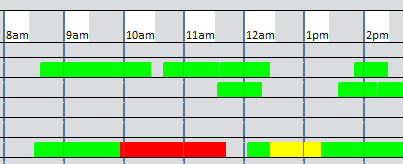
I plan to visualize these record to show a summary of all employee activities within a day with chart similar to below:
different colours stand for different activities.
How should I approach this in Qlik sense?
| applicantid | Clocking | clockingreasoncode |
| B0024 | 6/16/2016 8:16 | 1001 |
| B0274 | 6/16/2016 8:19 | 1001 |
| B0328 | 6/16/2016 8:20 | 1001 |
| B0274 | 6/16/2016 9:26 | 3001 |
| B0274 | 6/16/2016 9:27 | 1001 |
| B0274 | 6/16/2016 9:51 | 3001 |
| B0274 | 6/16/2016 10:18 | 1001 |
| B0081 | 6/16/2016 10:59 | 3001 |
| B0081 | 6/16/2016 11:00 | 1001 |
| B0274 | 6/16/2016 11:45 | 8015 |
| B0032 | 6/16/2016 11:49 | 1001 |
| B0081 | 6/16/2016 12:06 | 3001 |
| B0032 | 6/16/2016 12:12 | 3001 |
| B0274 | 6/16/2016 12:18 | 3001 |
| B0210 | 6/16/2016 13:29 | 1001 |
| B0300 | 6/16/2016 13:44 | 1001 |
| B0243 | 6/16/2016 13:52 | 1001 |
230 Views
0 Replies
Community Browser