Unlock a world of possibilities! Login now and discover the exclusive benefits awaiting you.
- Qlik Community
- :
- Forums
- :
- Analytics
- :
- New to Qlik Analytics
- :
- Re: Gauge chart color code based on if condition -...
- Subscribe to RSS Feed
- Mark Topic as New
- Mark Topic as Read
- Float this Topic for Current User
- Bookmark
- Subscribe
- Mute
- Printer Friendly Page
- Mark as New
- Bookmark
- Subscribe
- Mute
- Subscribe to RSS Feed
- Permalink
- Report Inappropriate Content
Gauge chart color code based on if condition - Qlik Sense
I have calculated dimension, I want to show colour based on condition,
if Calculated value > than 0.80, colour should be green()
if Calculated value < than 0.80, colour should be red()
Also, How to give range and limits using segments?
- « Previous Replies
-
- 1
- 2
- Next Replies »
Accepted Solutions
- Mark as New
- Bookmark
- Subscribe
- Mute
- Subscribe to RSS Feed
- Permalink
- Report Inappropriate Content
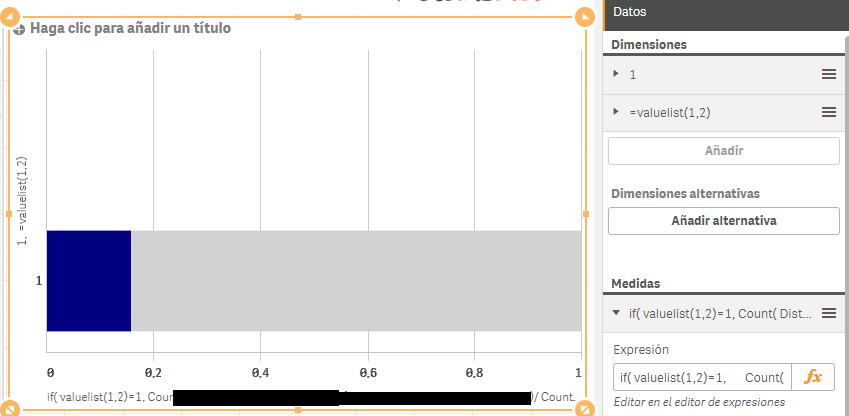
Hi Ram,
so, following the images I sent before you would have sth like:
First Dimention
=1 (or any text you would like)
Second Dimentions
=Valuelist(1, 2) (or any two names you would like
Measure:
if( valuelist(1,2)=1
,[Your Expression that returns a number between 0 and 1]
, 1 - [Your Expression that returns a number between 0 and 1]
)
Color Expression:
if( (valuelist(1,2)=1) and ([Your Expression that returns a number between 0 and 1]<0.8)
, Red()
,if( valuelist(1,2)=1
,Green()
,LightGray()
)
)
- Mark as New
- Bookmark
- Subscribe
- Mute
- Subscribe to RSS Feed
- Permalink
- Report Inappropriate Content
You have to select USE SEGMENTS option under appearance tab. and add Limits and select colors.
for your scenario add one limit and value it to 0.80 and select color as Green
the other color as Red. so if the value falls above 0.80 that will shows as red
- Mark as New
- Bookmark
- Subscribe
- Mute
- Subscribe to RSS Feed
- Permalink
- Report Inappropriate Content
In my case, Range is like 0 - 1. My calculated value is 0.73, So the color should be like for upto 0.73 it should be red because of not reached target 0.8. the remaining range should be grey colour

If it reaches 0.8, then the colour should be green, the remaining range should be grey colour

- Mark as New
- Bookmark
- Subscribe
- Mute
- Subscribe to RSS Feed
- Permalink
- Report Inappropriate Content
In my case, Range is like 0 - 1. My calculated value is 0.73, So the color should be like for upto 0.73 it should be red because of not reached target 0.8. the remaining range should be grey colour
![]()
If it reaches 0.8, then the colour should be green, the remaining range should be grey colour
![]()
- Mark as New
- Bookmark
- Subscribe
- Mute
- Subscribe to RSS Feed
- Permalink
- Report Inappropriate Content
Then use two limits.
1st limit upto 0.73
2nd limit upto 0.83
and final will be gray
- Mark as New
- Bookmark
- Subscribe
- Mute
- Subscribe to RSS Feed
- Permalink
- Report Inappropriate Content
maybe this could help you
- Mark as New
- Bookmark
- Subscribe
- Mute
- Subscribe to RSS Feed
- Permalink
- Report Inappropriate Content
Likewise, In Qlik Sense, is there anything to do?
- Mark as New
- Bookmark
- Subscribe
- Mute
- Subscribe to RSS Feed
- Permalink
- Report Inappropriate Content
My bad, I miss that it was about qlik sense.
So, I am not sure if you can apply conditional colour in the native gauge chart of qlik sense. If you can't, I would try to do a bar chart and play with calculated dimensions.
It is not sth I would liket to do a lot, specially with a big data set, but if you really need it and don't intend to use an extension, maybe you could do it.
Ex:
The first dimension is a plain text. The second one is a value list. The first one represents your expression and the second the gray area.
After that you may be able to work with the conditional for the value list equals to your expression area
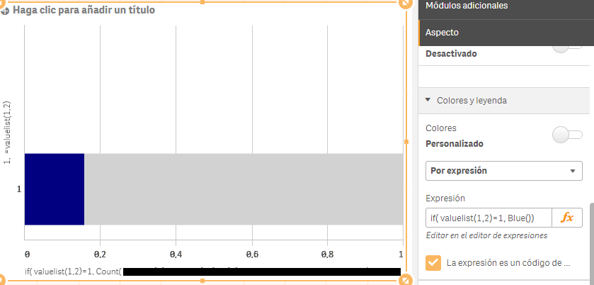
Than you can hide axes and make it look better.
It is not an amazing solution but may work for what you want.
Cheers,
Caio
- Mark as New
- Bookmark
- Subscribe
- Mute
- Subscribe to RSS Feed
- Permalink
- Report Inappropriate Content
Thanks Caio,
According to my requirement, if Mycount is greater than 0.8 -> green color, (i.e) if Mycount value is 0.73, then 0-0.73 should be in red and if Mycount value is 0.85, then 0-0.85 should be in green. Rest(not completed) upto
1 (Mycount value[0.73 or 0.85] to 1)should be in grey colour.
- Mark as New
- Bookmark
- Subscribe
- Mute
- Subscribe to RSS Feed
- Permalink
- Report Inappropriate Content
It's working as per my requirement, but Is there anyway to show the rest in grey colour
- « Previous Replies
-
- 1
- 2
- Next Replies »