Unlock a world of possibilities! Login now and discover the exclusive benefits awaiting you.
- Qlik Community
- :
- Forums
- :
- Analytics
- :
- New to Qlik Analytics
- :
- Grouped Bar Chart different colors for each measur...
- Subscribe to RSS Feed
- Mark Topic as New
- Mark Topic as Read
- Float this Topic for Current User
- Bookmark
- Subscribe
- Mute
- Printer Friendly Page
- Mark as New
- Bookmark
- Subscribe
- Mute
- Subscribe to RSS Feed
- Permalink
- Report Inappropriate Content
Grouped Bar Chart different colors for each measure
Hello All,
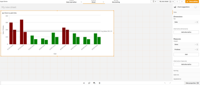
I have a scenario in Qlik Bar Chart, which grouped.I have 1 dimension ( date field) and 2 measure ( sales and pre-sales).
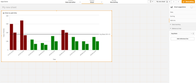
I have reference line which is average of sale for the entire date range.
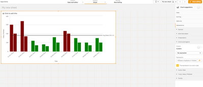
I have implement color of bars based on expression.
If the bar is above Average Sales the bar color is red and if it is below Average Sales bar color is green.
Problem is I also want to have different colors for the Sales Bar and Pre-Sales Bar which are grouped in same date.
Is there a way to achieve this ?
- Mark as New
- Bookmark
- Subscribe
- Mute
- Subscribe to RSS Feed
- Permalink
- Report Inappropriate Content
Hi @baarathi
You can't do that using different measures. Instead of that, yo can split between measures using a calculated Dimension with Valuelist (in example, there are other ways, as logic island in script). Doing so, yo just use a single measure expression , and much more important, you can differenciate between one column and other in colour expression. It will looks something like that
if(ValueList('Sales','Presales') = 'Sales' ,if(Sum(Sales) > avg(TOTAL Sales), Green(), Red()),
if(ValueList('Sales','Presales') = 'Presales',if(Sum(PreSales) > avg(TOTAL Sales), Green(), Red()),
))
Also notice a secons change. If you want to refer to general average for sales, you need to use TOTAL por your average expression ( avg(TOTAL Sales) ). Doing so, you obtein same value (and correct) for all dimensions values.
Attached Example solved.
Hope it helps
Regards
- Mark as New
- Bookmark
- Subscribe
- Mute
- Subscribe to RSS Feed
- Permalink
- Report Inappropriate Content
@forte Thanks a lot, that saved my day.


