Unlock a world of possibilities! Login now and discover the exclusive benefits awaiting you.
- Qlik Community
- :
- Forums
- :
- Analytics
- :
- New to Qlik Analytics
- :
- Re: Help required : Qlik Sense line Graph
- Subscribe to RSS Feed
- Mark Topic as New
- Mark Topic as Read
- Float this Topic for Current User
- Bookmark
- Subscribe
- Mute
- Printer Friendly Page
- Mark as New
- Bookmark
- Subscribe
- Mute
- Subscribe to RSS Feed
- Permalink
- Report Inappropriate Content
Help required : Qlik Sense line Graph
Hi Friends,
I was trying to plot a graph which will show the attrition % month on month. I managed to do that.
However, now I am trying to show tenure wise attrition % month on month by using line graph and don't want to make separate graph for tenure bracket "0-179" & "180+".
Have attached the QVF file for referance.
Please help.
- Mark as New
- Bookmark
- Subscribe
- Mute
- Subscribe to RSS Feed
- Permalink
- Report Inappropriate Content
Hi kaushal,
So you have to show tenure wise attrition % in same chart is it.
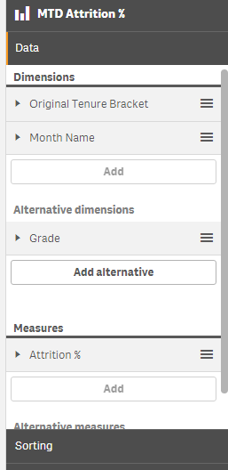
You may use alternative dimensions for your output. i have attached Test.qvf Please verify it.
But the alternative dimensions works only in qlik sense 3.0
Thanks,
- Mark as New
- Bookmark
- Subscribe
- Mute
- Subscribe to RSS Feed
- Permalink
- Report Inappropriate Content
Thanks for your response.
I know this. Is there a way through which i can plot this for one tenure bracket by changing the expression, not the dimensions.
- Mark as New
- Bookmark
- Subscribe
- Mute
- Subscribe to RSS Feed
- Permalink
- Report Inappropriate Content
And also don't want to use filter option.