Unlock a world of possibilities! Login now and discover the exclusive benefits awaiting you.
- Qlik Community
- :
- Forums
- :
- Analytics
- :
- New to Qlik Analytics
- :
- Hide measure legend combined with qsVarialble
- Subscribe to RSS Feed
- Mark Topic as New
- Mark Topic as Read
- Float this Topic for Current User
- Bookmark
- Subscribe
- Mute
- Printer Friendly Page
- Mark as New
- Bookmark
- Subscribe
- Mute
- Subscribe to RSS Feed
- Permalink
- Report Inappropriate Content
Hide measure legend combined with qsVarialble
Hello
I'm using QS Variable to let users choose wheather they want to display quarter, semester sales, targeted sales...
Everything works great using the Pick function in the measure Expression and a if fucntion for displaying or not the label:
Example for the Target 2018 measure
Expression :
pick (vAffichageTarget,
Sum([2018 Target]),0
)
Label
= if ($(vAffichageTarget)>0,'Target '& year(now()),null())
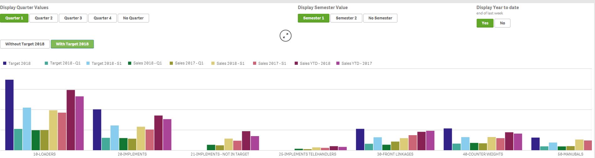
If I click on "Without Target 2018", the target 2018 bar disappears and the label shows the colour and "-" next to it.
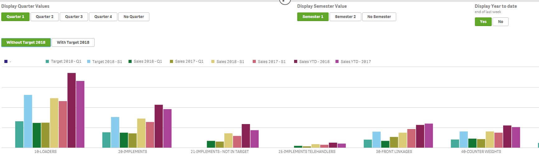
I would like the legend to disappear (I have unchecked "show null values" from the add-ons options) AND I would also like to remove the empty space previously taken by the Target 2018 bar (to make the chart less wider).
Any idea ?
Thanks
pat
- Mark as New
- Bookmark
- Subscribe
- Mute
- Subscribe to RSS Feed
- Permalink
- Report Inappropriate Content
Try to change your measure into:
Pick (vAffichageTarget,
Sum([2018 Target]), Null()
)
- Mark as New
- Bookmark
- Subscribe
- Mute
- Subscribe to RSS Feed
- Permalink
- Report Inappropriate Content
hi
i had already tried before...same result
i have tried with
0
nul()
"
same result with all
- Mark as New
- Bookmark
- Subscribe
- Mute
- Subscribe to RSS Feed
- Permalink
- Report Inappropriate Content
Hello
I went through many different posts. Qlik should hide the legend using Null() in the expression (both in the measure and in the label).
I have also tried to use alt(expression, null()) : still the same issue, the legend keeps coming back with the coloured square and - next to it.
Is it a qlik sense bug ?
Is there any extension that could fix this issue ?
thanks
pat
- Mark as New
- Bookmark
- Subscribe
- Mute
- Subscribe to RSS Feed
- Permalink
- Report Inappropriate Content
Hello Again
I'm advancing with my issue
I had a similar behaviour with a pivot table located in the same report.
When using if ($(vAffichageTarget)>0,Sum([2018 Target]), Null()), the pivot table was showing - in the target 2018 column instead of hiding the column.
There is an option below the the pivot table expressions "Display column if":
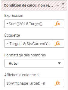
This option did the job !
Is there an option for doing the same with charts ?...or a way to do the same ?
thanks