Unlock a world of possibilities! Login now and discover the exclusive benefits awaiting you.
- Qlik Community
- :
- Forums
- :
- Analytics
- :
- New to Qlik Analytics
- :
- Re: Hiding label column in a pivot table? Or switc...
- Subscribe to RSS Feed
- Mark Topic as New
- Mark Topic as Read
- Float this Topic for Current User
- Bookmark
- Subscribe
- Mute
- Printer Friendly Page
- Mark as New
- Bookmark
- Subscribe
- Mute
- Subscribe to RSS Feed
- Permalink
- Report Inappropriate Content
Hiding label column in a pivot table? Or switching the axes/transposing a straight table?
Hi there,
I am trying to present data (that has been calculated in the script) as tables. Each of the fields shown in the tables below have been calculated using an expression like the one shown because the data has been grouped by the BI Developer before coming through into the script for the app. I want to be able to compare 'groups' side by side in a table and the only way I have been able to make this work is through using several pivot tables next to each other to compare the data.
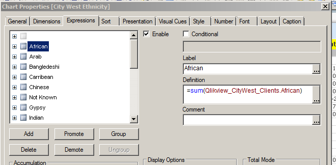
I want to be able to compare 'groups' side by side in a table and the only way I have been able to make this work is through using several pivot tables next to each other to compare the data, as below:
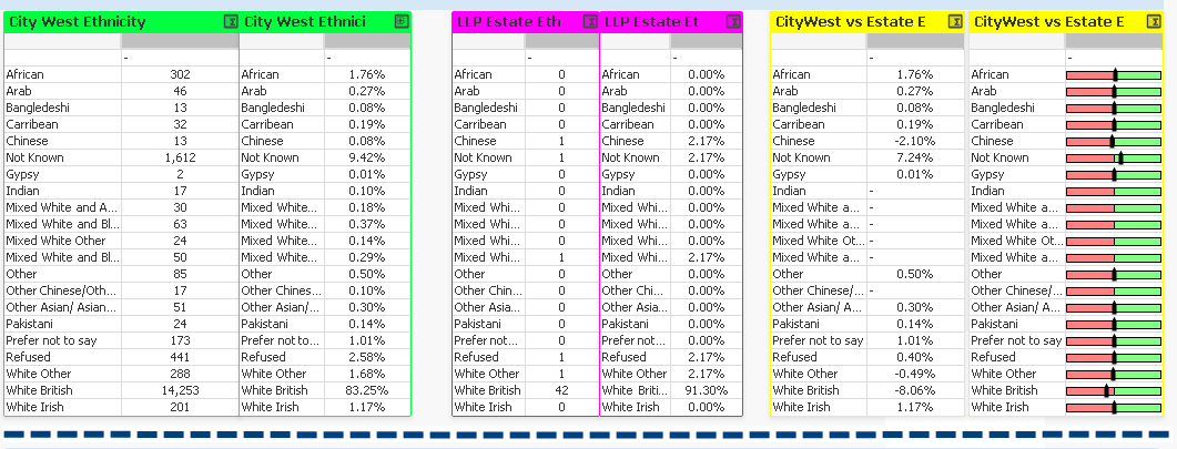
My question is, is there a way to hide the label column on a pivot table?
If the alternative is to use a straight table, I haven't been able to make this work as I need to swap the axes so that the labels are lined up down the left hand side, rather than along the top. As an alternative, is there a way to swap the axes on a straight table so that the labels are listed vertically rather than horizontally?
Thanks for any help,
Loren
- Mark as New
- Bookmark
- Subscribe
- Mute
- Subscribe to RSS Feed
- Permalink
- Report Inappropriate Content
Hi Loren,
could you upload an example qvw?
Andy