Unlock a world of possibilities! Login now and discover the exclusive benefits awaiting you.
- Qlik Community
- :
- Forums
- :
- Analytics
- :
- New to Qlik Analytics
- :
- Re: Highlight Previous Values in Combo Chart
- Subscribe to RSS Feed
- Mark Topic as New
- Mark Topic as Read
- Float this Topic for Current User
- Bookmark
- Subscribe
- Mute
- Printer Friendly Page
- Mark as New
- Bookmark
- Subscribe
- Mute
- Subscribe to RSS Feed
- Permalink
- Report Inappropriate Content
Highlight Previous Values in Combo Chart
Hi All
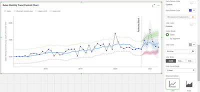
I have a process control chart and would like to highlight the data points say for example if 6 points are consecutively on one side of the mean however I am unsure how to write this.
Please see pic to see what I would like to highlight, many thanks!
Accepted Solutions
- Mark as New
- Bookmark
- Subscribe
- Mute
- Subscribe to RSS Feed
- Permalink
- Report Inappropriate Content
hi ,
you can do it but it's will require quite long expression,
as you need to each point to check all option of location in the string,
so it should look something like this :
=if(RangeMin (Above(sum(Sales),0,6))>40000 or
     (RangeMin (Above(sum(Sales),0,5))>40000 and RangeMin (below(sum(Sales),1,1))>40000 ) or
     	(RangeMin (Above(sum(Sales),0,4))>40000 and RangeMin (below(sum(Sales),1,2))>40000 and RangeCount(below(count(distinct [OrderDate.autoCalendar.YearMonth]),1,2))=2 ) or
           (RangeMin (Above(sum(Sales),0,3))>40000 and RangeMin (below(sum(Sales),1,3))>40000 and RangeCount(below(count(distinct [OrderDate.autoCalendar.YearMonth]),1,3))=3) or
             (RangeMin (Above(sum(Sales),0,2))>40000 and RangeMin (below(sum(Sales),1,4))>40000 and RangeCount(below(count(distinct [OrderDate.autoCalendar.YearMonth]),1,4))=4 ) or
             	 (RangeMin (Above(sum(Sales),0,1))>40000 and RangeMin (below(sum(Sales),1,5))>40000 and RangeCount(below(count(distinct [OrderDate.autoCalendar.YearMonth]),1,5))=5) ,'#B03460', '#3C43B7')
where 40000 represent your mean
- Mark as New
- Bookmark
- Subscribe
- Mute
- Subscribe to RSS Feed
- Permalink
- Report Inappropriate Content
Hi,
using the qlik sense native line chart, you can get to the result below, reason is that you have one color expression for both point and line.
If you want more control over your chart design, you should check out the Vizlib library using the line chart there you can get this result the same as you described.
https://home.vizlib.com/vizlib-library-for-qlik-sense/#trial-library
- Mark as New
- Bookmark
- Subscribe
- Mute
- Subscribe to RSS Feed
- Permalink
- Report Inappropriate Content
hey @lironbaram
Thanks for your reply!
Is there an expression I could use if 6 points in succession are on one side of the mean? I am currently using the vizlib chart 🙂
- Mark as New
- Bookmark
- Subscribe
- Mute
- Subscribe to RSS Feed
- Permalink
- Report Inappropriate Content
Hi,
I think you need a bar chart for this while a line chart only can show one color for one measure. Or you can use a combo chart and combine the line with a marker.
You can use a formula like this for coloring:
IF(Above(Sum(Num),1) > 4400 AND Sum(Num) > 4400,LightRed(),Black()) Jordy
Climber
- Mark as New
- Bookmark
- Subscribe
- Mute
- Subscribe to RSS Feed
- Permalink
- Report Inappropriate Content
Hi @JordyWegman
For data points exceeding the UCL and LCL I have an expression similar to the one you provided
I am interested in highlighting X number of points that are consistently above or below the mean, e.g. the data points I have highlighted in my screenshot. Is this possible in Qlik Sense? I hope I am explaining myself clearly!
- Mark as New
- Bookmark
- Subscribe
- Mute
- Subscribe to RSS Feed
- Permalink
- Report Inappropriate Content
Hi @qliky88 ,
I didn't had all the time for my previous answer, but you can expand my calculation with more ANDs. This is different than your calculation.
So my calculation mentions that when 'This' AND 'This' AND 'This' is above X, then color else not. Though, the first point cannot be colored in this way because you don't know if any other high points are following.
You can better prepare this in your script and then loop through the file 2x.
Jordy
Climber
- Mark as New
- Bookmark
- Subscribe
- Mute
- Subscribe to RSS Feed
- Permalink
- Report Inappropriate Content
Hi @JordyWegman
Thanks for your help with this 🙂 Is there any resources online I could use to try and achieve what you have mentioned? I am still relatively new to Qlik Sense and do not think I can complete what you have mentioned without following some sort of tutorial. Thanks!
- Mark as New
- Bookmark
- Subscribe
- Mute
- Subscribe to RSS Feed
- Permalink
- Report Inappropriate Content
hi,
what is the business logic you look to implement highlight only if the previous 6 points are above mean?
- Mark as New
- Bookmark
- Subscribe
- Mute
- Subscribe to RSS Feed
- Permalink
- Report Inappropriate Content
hi @lironbaram
The ask is that if 6 points are on one side of the mean i.e. the ones highlighted for example, the sample is out of spec. These are known as Nelson Rules
- Mark as New
- Bookmark
- Subscribe
- Mute
- Subscribe to RSS Feed
- Permalink
- Report Inappropriate Content
hi ,
you can do it but it's will require quite long expression,
as you need to each point to check all option of location in the string,
so it should look something like this :
=if(RangeMin (Above(sum(Sales),0,6))>40000 or
     (RangeMin (Above(sum(Sales),0,5))>40000 and RangeMin (below(sum(Sales),1,1))>40000 ) or
     	(RangeMin (Above(sum(Sales),0,4))>40000 and RangeMin (below(sum(Sales),1,2))>40000 and RangeCount(below(count(distinct [OrderDate.autoCalendar.YearMonth]),1,2))=2 ) or
           (RangeMin (Above(sum(Sales),0,3))>40000 and RangeMin (below(sum(Sales),1,3))>40000 and RangeCount(below(count(distinct [OrderDate.autoCalendar.YearMonth]),1,3))=3) or
             (RangeMin (Above(sum(Sales),0,2))>40000 and RangeMin (below(sum(Sales),1,4))>40000 and RangeCount(below(count(distinct [OrderDate.autoCalendar.YearMonth]),1,4))=4 ) or
             	 (RangeMin (Above(sum(Sales),0,1))>40000 and RangeMin (below(sum(Sales),1,5))>40000 and RangeCount(below(count(distinct [OrderDate.autoCalendar.YearMonth]),1,5))=5) ,'#B03460', '#3C43B7')
where 40000 represent your mean


