Unlock a world of possibilities! Login now and discover the exclusive benefits awaiting you.
- Qlik Community
- :
- Forums
- :
- Analytics
- :
- New to Qlik Analytics
- :
- Re: How can I add a drill-down dimension to this v...
- Subscribe to RSS Feed
- Mark Topic as New
- Mark Topic as Read
- Float this Topic for Current User
- Bookmark
- Subscribe
- Mute
- Printer Friendly Page
- Mark as New
- Bookmark
- Subscribe
- Mute
- Subscribe to RSS Feed
- Permalink
- Report Inappropriate Content
How can I add a drill-down dimension to this visualization?
Hello all,
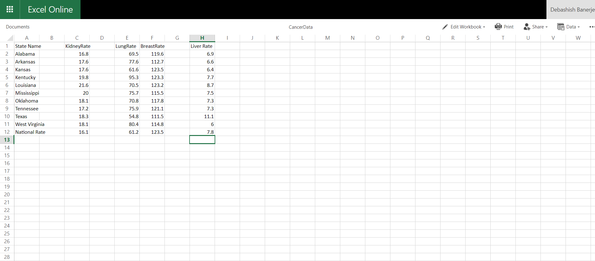
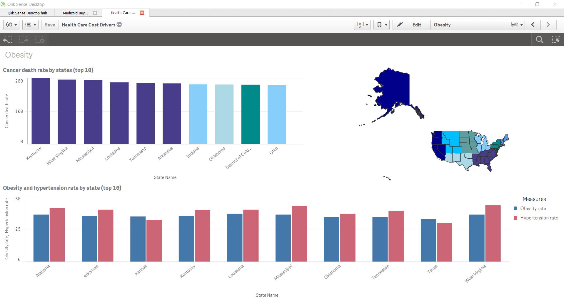
I'm currently working on a Qlik Sense Desktop visualization regarding cancer statistics. In my sheet, I am looking at the ten highest states regarding the risks of overall cancer and added their respective cancer rates. However, I would like to drill-down into those state rates and reveal the rates for individual cancer rates (ex. liver, breast, and kidney cancer) although I'm not sure how this can be accomplished. I'm not sure if this is something done in Qlik Sense Desktop itself or how the Excel sheet is formatted. I am adding screenshots below to provide more insight regarding my problem. I have been stuck for quite some time now and any help would be much appreciated. Thanks again in advance!
Accepted Solutions
- Mark as New
- Bookmark
- Subscribe
- Mute
- Subscribe to RSS Feed
- Permalink
- Report Inappropriate Content
First thing you need to do is to use crosstable load to get a cancer type as a field, not as a column:
Crosstable (CancerType,Rate)
LOAD
State,
KidneyRate as Kidney,
LingRate as Ling,
BreastRate as Breast,
LiverRate as Liver
FROM ...
You'll get a table with the Fields State, CancerType, Rate.
Next, create a master dimension, drill-down,including State and CancerType. Use this dimension in your charts.
- Mark as New
- Bookmark
- Subscribe
- Mute
- Subscribe to RSS Feed
- Permalink
- Report Inappropriate Content
Hi Debashish!
I think if you want to use a drilled down dimension of state and cancer type then your data must be something like the following:
State, CancerType, Cancer%
AZ, Lung, 10%
AZ, Kidney, 20%
AZ, breast, 20%
AZ, liver, 2%
......
.......
Then you can create a drilled down dimension of State and CancerType. And add this new drilldown as dimension in bar graph and Cancer% as measure.
I hope I got your question correctly.
Thanks,
Amuktha
- Mark as New
- Bookmark
- Subscribe
- Mute
- Subscribe to RSS Feed
- Permalink
- Report Inappropriate Content
First thing you need to do is to use crosstable load to get a cancer type as a field, not as a column:
Crosstable (CancerType,Rate)
LOAD
State,
KidneyRate as Kidney,
LingRate as Ling,
BreastRate as Breast,
LiverRate as Liver
FROM ...
You'll get a table with the Fields State, CancerType, Rate.
Next, create a master dimension, drill-down,including State and CancerType. Use this dimension in your charts.
- Mark as New
- Bookmark
- Subscribe
- Mute
- Subscribe to RSS Feed
- Permalink
- Report Inappropriate Content
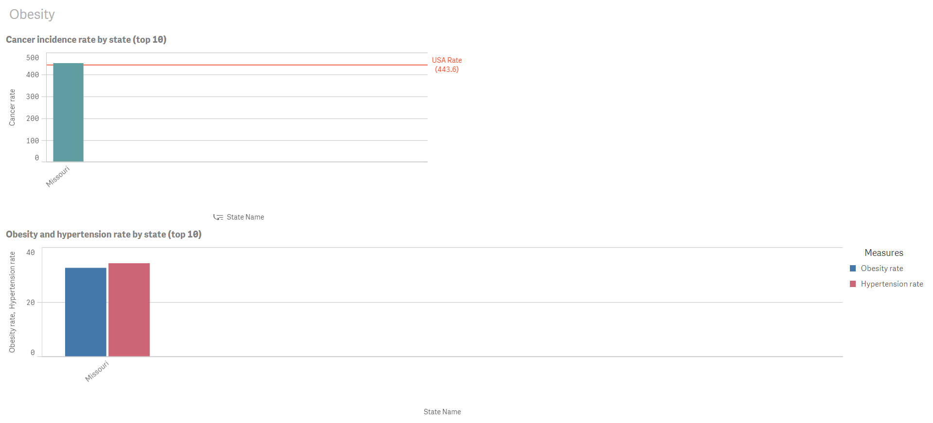
Thank you Michael and Amuktha for your suggestions. I used the crosstable load as you've stated and it successfully created the CancerType bars after you drill down into the State. However, all the bars are the same for each state while some do not even appear under CancerType such as Missouri (screenshot below). What could be the reason for this as well as the fix? Thanks again!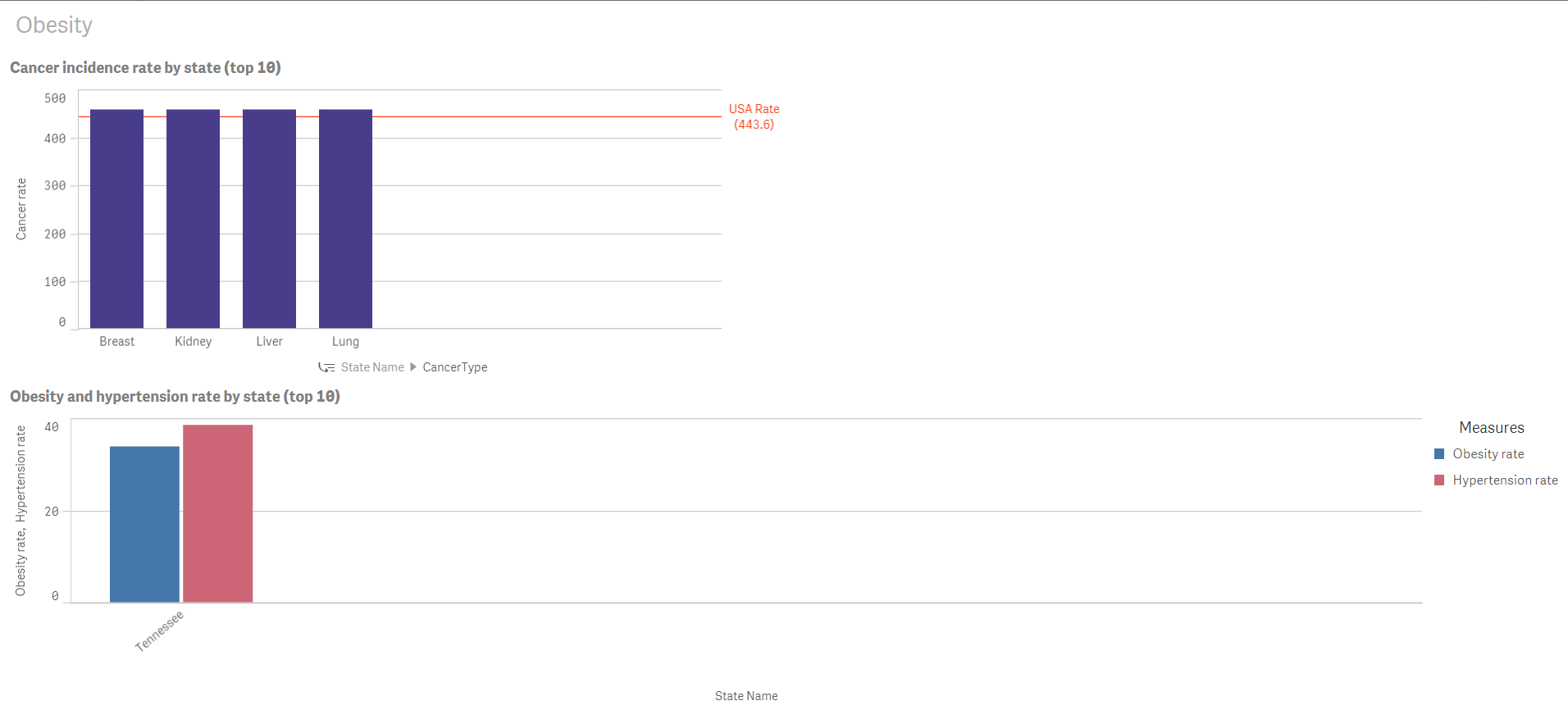
- Mark as New
- Bookmark
- Subscribe
- Mute
- Subscribe to RSS Feed
- Permalink
- Report Inappropriate Content
To help further, need to know the data and the expressions. Maybe you can upload your app so we can see what's there.
- Mark as New
- Bookmark
- Subscribe
- Mute
- Subscribe to RSS Feed
- Permalink
- Report Inappropriate Content
Here's the QVF to my application
- Mark as New
- Bookmark
- Subscribe
- Mute
- Subscribe to RSS Feed
- Permalink
- Report Inappropriate Content
It helps.
The expressions on the front end must be sum(Rate), not the sum(Rate2). The field Rate is the one which you get from the CancerData file.
Some states, like Missouri, simply don't have anything in this table.
- Mark as New
- Bookmark
- Subscribe
- Mute
- Subscribe to RSS Feed
- Permalink
- Report Inappropriate Content
Alright, I understand. However, I added new rates to another Excel sheet so I'm incorporating "CancerRate" instead. How can I make it so that it displays these new rates for the individual types of cancer? How can I link the "CancerRate" to CancerData?
UPDATE: I tried changed Rate in the cross table load to Cancer Rate, however, it drastically alters the statistics for the initial visualization.
- Mark as New
- Bookmark
- Subscribe
- Mute
- Subscribe to RSS Feed
- Permalink
- Report Inappropriate Content
Are you replacing the old sheet with the new one,is it an addition?
In any case - it depends on the structure of the new sheet.