Unlock a world of possibilities! Login now and discover the exclusive benefits awaiting you.
- Qlik Community
- :
- Forums
- :
- Analytics
- :
- New to Qlik Analytics
- :
- How can I color the bar chart with another data
- Subscribe to RSS Feed
- Mark Topic as New
- Mark Topic as Read
- Float this Topic for Current User
- Bookmark
- Subscribe
- Mute
- Printer Friendly Page
- Mark as New
- Bookmark
- Subscribe
- Mute
- Subscribe to RSS Feed
- Permalink
- Report Inappropriate Content
How can I color the bar chart with another data
Hi,
I am coming from Tableau. Here it's simple to overlay a bar chart with a "Count" of further data. How can I do this in QlikSense? Let's say I have a column called "Failure code". The "Failure code" can have 5 different values for each data set. I want to know in a bar chart how often a certain type of Failure code is counted. The dimension is btw YearMonth.
- Mark as New
- Bookmark
- Subscribe
- Mute
- Subscribe to RSS Feed
- Permalink
- Report Inappropriate Content
Hi there
Select Charts on the far left and drag a bar chart onto your sheet. Click Add Dimension and select the YearMonth. Click on Add Measure, scroll to Failure Code and select Count(Failure Code). On the right of the screen (with the bar chart selected), select Appearance, Presentation and drag the Value labels slider. If you want them split per Failure Type then you can add it under YearMonth (Data -> Dimensions). Make sure not to add it as an alternative dimension.
Good luck.
Mauritz
- Mark as New
- Bookmark
- Subscribe
- Mute
- Subscribe to RSS Feed
- Permalink
- Report Inappropriate Content
Thanks for the answer. By adding an additional dimension I only get the different failure code bars next to each other. I attached a screen shot how it looks like in Tableau.
- Mark as New
- Bookmark
- Subscribe
- Mute
- Subscribe to RSS Feed
- Permalink
- Report Inappropriate Content
Hi
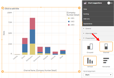
Go to Appearance -> Presentation -> Stacked:
Regards,
Mauritz
