Unlock a world of possibilities! Login now and discover the exclusive benefits awaiting you.
- Qlik Community
- :
- Forums
- :
- Analytics
- :
- New to Qlik Analytics
- :
- Re: How can I make this data usable in Qlik to cre...
- Subscribe to RSS Feed
- Mark Topic as New
- Mark Topic as Read
- Float this Topic for Current User
- Bookmark
- Subscribe
- Mute
- Printer Friendly Page
- Mark as New
- Bookmark
- Subscribe
- Mute
- Subscribe to RSS Feed
- Permalink
- Report Inappropriate Content
How can I make this data usable in Qlik to create a data visualization?
Hello all,
I am currently working on a Qlik Sense visualization regarding health care spending and I am planning to use this data sheet. However, given the format that it is in, I'm not sure how to make working dimensions and measures within Qlik Sense to display this data. Each column is not an aggregation of everything combined and I'd like to show these trends over times in their respective years. How can I go about solving this? Would I have to go into the data load editor or edit the sheet in Excel? I'm attaching a screenshot for your convenience, thanks again in advance and I look forward to hearing from you all!
Sincerely,
Debashish
- Tags:
- qliksense help
- Mark as New
- Bookmark
- Subscribe
- Mute
- Subscribe to RSS Feed
- Permalink
- Report Inappropriate Content
Hi Debashish,
I think you need to load your data two time,
Firstly understand your data is in cross table.
your Dimesions are: AgeGroup , gender, year,
measure are: Sum(levels),Sum(Avegare Annual Growth),
Load Male, Female Data Separately then you will also get total Data.
Thanks,
Arvind Patil
- Mark as New
- Bookmark
- Subscribe
- Mute
- Subscribe to RSS Feed
- Permalink
- Report Inappropriate Content
can you post a sample excel?
If a post helps to resolve your issue, please accept it as a Solution.
- Mark as New
- Bookmark
- Subscribe
- Mute
- Subscribe to RSS Feed
- Permalink
- Report Inappropriate Content
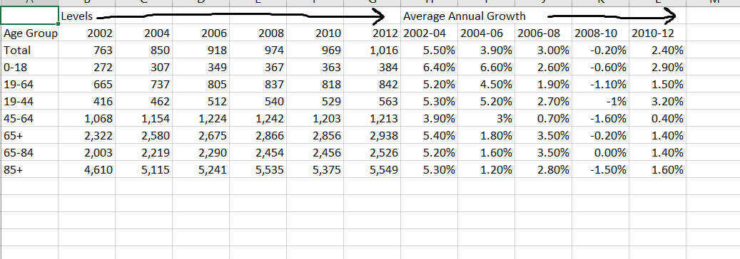
My Excel data looks like this, the arrows are showing how I want "Levels" and "Average Annual Growth" to be the headers for multiple columns and not just one. How can this be done? And how can I proceed with the cross table in order to use this data? Thanks again!
- Mark as New
- Bookmark
- Subscribe
- Mute
- Subscribe to RSS Feed
- Permalink
- Report Inappropriate Content
Refer this post
If a post helps to resolve your issue, please accept it as a Solution.