Unlock a world of possibilities! Login now and discover the exclusive benefits awaiting you.
- Qlik Community
- :
- Forums
- :
- Analytics
- :
- New to Qlik Analytics
- :
- How change a chart using a filter
- Subscribe to RSS Feed
- Mark Topic as New
- Mark Topic as Read
- Float this Topic for Current User
- Bookmark
- Subscribe
- Mute
- Printer Friendly Page
- Mark as New
- Bookmark
- Subscribe
- Mute
- Subscribe to RSS Feed
- Permalink
- Report Inappropriate Content
How change a chart using a filter
Hi group, I hope you can help me: smileysad:
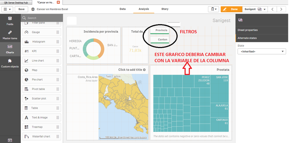
In summary I have a database with some columns "colon cancer, lung cancer, etc" and in the rows the names of districts. The problem is that I want to create a filter that group all the variables (columns) and display 1 by 1 according with the selection and that this selection changes the TREEMAP graph. I leave you an image of how I currently have my dashboard.
- Mark as New
- Bookmark
- Subscribe
- Mute
- Subscribe to RSS Feed
- Permalink
- Report Inappropriate Content
- Mark as New
- Bookmark
- Subscribe
- Mute
- Subscribe to RSS Feed
- Permalink
- Report Inappropriate Content
Hi dwforest!
Attached the file with the data. How shows the below image, I created a dashboard that has in the right down a graph that I would like to change with a filter that will have all the kinds of cancer. In a few words, I need to relate the filter and the graph.
I hope your kindly feedback

