Unlock a world of possibilities! Login now and discover the exclusive benefits awaiting you.
- Qlik Community
- :
- Forums
- :
- Analytics
- :
- New to Qlik Analytics
- :
- How to change the Distribution plot color by dimen...
- Subscribe to RSS Feed
- Mark Topic as New
- Mark Topic as Read
- Float this Topic for Current User
- Bookmark
- Subscribe
- Mute
- Printer Friendly Page
- Mark as New
- Bookmark
- Subscribe
- Mute
- Subscribe to RSS Feed
- Permalink
- Report Inappropriate Content
How to change the Distribution plot color by dimension ??
Hi. I used distribution plot as Movie comprision by Month, Nation.

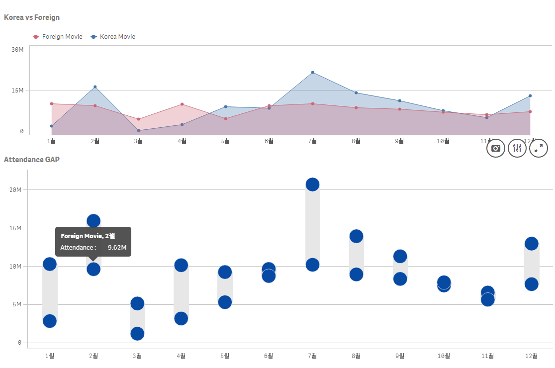
In the above figure, the difference in the number of Movie's Attendance is shown in the distribution plot.
Is it possible to specify colors for each dimension?
ex) Korea Movie point > red color, Foreign Movie point > blue color.
New Visualization(Distribution plot), It seems that it is still limited.
Please tell me if there is any way.
Thank U :^)
- « Previous Replies
-
- 1
- 2
- Next Replies »
- Mark as New
- Bookmark
- Subscribe
- Mute
- Subscribe to RSS Feed
- Permalink
- Report Inappropriate Content
I think so. Please update your qliksense first, then update me if you can now see the custom color by expression.
I'm using feb 2018 version.
Regards,
Jomar
- Mark as New
- Bookmark
- Subscribe
- Mute
- Subscribe to RSS Feed
- Permalink
- Report Inappropriate Content
Version issue is right.
After update qliksense feb 2018 ver, Custom Colors option is showing.
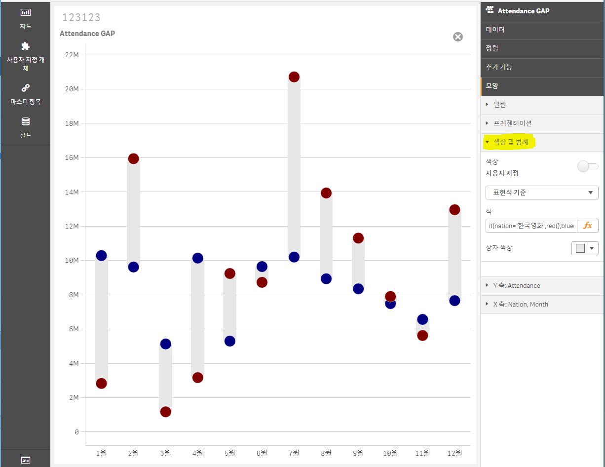
Thanks you, Jomar!!!
Have a nice day 
- « Previous Replies
-
- 1
- 2
- Next Replies »