Unlock a world of possibilities! Login now and discover the exclusive benefits awaiting you.
- Qlik Community
- :
- Forums
- :
- Analytics
- :
- New to Qlik Analytics
- :
- Re: How to create ABC & XYZ analysis in ClikSense?
- Subscribe to RSS Feed
- Mark Topic as New
- Mark Topic as Read
- Float this Topic for Current User
- Bookmark
- Subscribe
- Mute
- Printer Friendly Page
- Mark as New
- Bookmark
- Subscribe
- Mute
- Subscribe to RSS Feed
- Permalink
- Report Inappropriate Content
How to create ABC & XYZ analysis in ClikSense?
I use scatter plot to prepare ABC & XYZ analysis of goods. But scatter plot does not have any sorting of dimension to follow bubbles in ABC X-axis in correct way unlike of QlikView. What should I do to make visualization correct?
- Tags:
- abc-analyse
- xyz
- « Previous Replies
-
- 1
- 2
- Next Replies »
- Mark as New
- Bookmark
- Subscribe
- Mute
- Subscribe to RSS Feed
- Permalink
- Report Inappropriate Content
- Mark as New
- Bookmark
- Subscribe
- Mute
- Subscribe to RSS Feed
- Permalink
- Report Inappropriate Content
Thank you for your participation but as I said earlier I know how to do this diagram in QlikView. This is not a problem.
- Mark as New
- Bookmark
- Subscribe
- Mute
- Subscribe to RSS Feed
- Permalink
- Report Inappropriate Content
the same method used in qlik sense and it's got worked for my case. another link (Henri) solution gave for qliksense.
- Mark as New
- Bookmark
- Subscribe
- Mute
- Subscribe to RSS Feed
- Permalink
- Report Inappropriate Content
Ok, I will watch, thanks.
- Mark as New
- Bookmark
- Subscribe
- Mute
- Subscribe to RSS Feed
- Permalink
- Report Inappropriate Content
- Mark as New
- Bookmark
- Subscribe
- Mute
- Subscribe to RSS Feed
- Permalink
- Report Inappropriate Content
Thank you, this link was helped me. I should use RangeSum and Aggr functions.
- Mark as New
- Bookmark
- Subscribe
- Mute
- Subscribe to RSS Feed
- Permalink
- Report Inappropriate Content
No worries 
I hope you have found your answer
-Angel
- Mark as New
- Bookmark
- Subscribe
- Mute
- Subscribe to RSS Feed
- Permalink
- Report Inappropriate Content
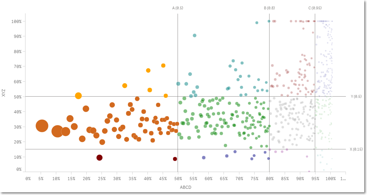
The result is:
Dimension: Client
Measures:
1. ABCD:
max($(Period)
aggr(
RangeSum(Above(Sum($(Period) [Earn]), 0, RowNo())),
([Client],(=Sum($(Period) [Earn]), DESCENDING))
)
)
/Sum($(Period) total [Earn])
2. XYZ:
sterr($(Period) aggr(sum($(Period) [Earn]),[Month],[Client]))/
Avg($(Period)aggr(sum($(Period) [Earn]),[Month],[Client]))
3. Earn
Sum($(Period) Earn)
The 'Period' is time-bound analytic set
The sample diagram is:
- Mark as New
- Bookmark
- Subscribe
- Mute
- Subscribe to RSS Feed
- Permalink
- Report Inappropriate Content
Why are you using sterr() function instead stdev() for calculate XYZ-variation ?
- « Previous Replies
-
- 1
- 2
- Next Replies »