Unlock a world of possibilities! Login now and discover the exclusive benefits awaiting you.
- Qlik Community
- :
- Forums
- :
- Analytics
- :
- New to Qlik Analytics
- :
- How to create an embedded bar chart Actual vs Fore...
Options
- Subscribe to RSS Feed
- Mark Topic as New
- Mark Topic as Read
- Float this Topic for Current User
- Bookmark
- Subscribe
- Mute
- Printer Friendly Page
Turn on suggestions
Auto-suggest helps you quickly narrow down your search results by suggesting possible matches as you type.
Showing results for
Contributor II
2022-07-22
01:30 AM
- Mark as New
- Bookmark
- Subscribe
- Mute
- Subscribe to RSS Feed
- Permalink
- Report Inappropriate Content
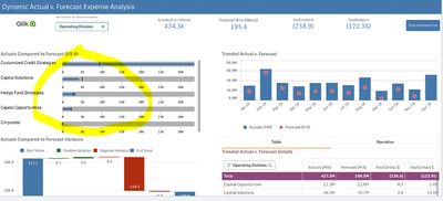
How to create an embedded bar chart Actual vs Forecasted with two measure and one dimension as given in screen shot
Hello teammates,
I am new to qliksense .Can you please let me know if any one has created a bar chart for actual vs forecasted in qliksense similar to below screen short..Also its posted on qliksense offical site
Thanks in advance.
12 Financial Dashboard Examples & Templates (qlik.com)
Regards
Shashi
324 Views
2 Replies
Luminary
2022-07-22
02:44 AM
- Mark as New
- Bookmark
- Subscribe
- Mute
- Subscribe to RSS Feed
- Permalink
- Report Inappropriate Content
Not for that use case, but i have used them in capacity planning.
It is the Bullet Chart you are looking at.
311 Views
Contributor II
2022-07-22
11:58 AM
Author
- Mark as New
- Bookmark
- Subscribe
- Mute
- Subscribe to RSS Feed
- Permalink
- Report Inappropriate Content
Hi Mark,
No the Bar chart on left top corner ,, highlighted in yellow color
No the Bar chart on left top corner ,, highlighted in yellow color
290 Views
Community Browser
