Unlock a world of possibilities! Login now and discover the exclusive benefits awaiting you.
- Qlik Community
- :
- Forums
- :
- Analytics
- :
- New to Qlik Analytics
- :
- How to do more with maps?
- Subscribe to RSS Feed
- Mark Topic as New
- Mark Topic as Read
- Float this Topic for Current User
- Bookmark
- Subscribe
- Mute
- Printer Friendly Page
- Mark as New
- Bookmark
- Subscribe
- Mute
- Subscribe to RSS Feed
- Permalink
- Report Inappropriate Content
How to do more with maps?
Hello,
I have created a simple map as below:
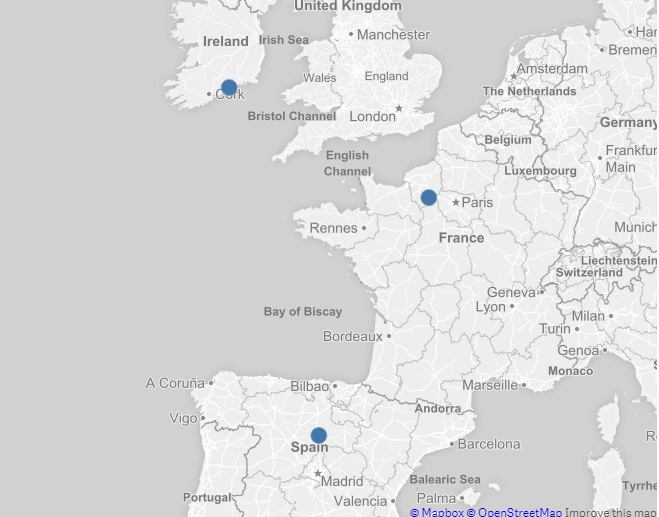
With marks on Ireland, France and Spain. What I would like to do is rank these is some way.
I.E the one with most sales green, second amber, least red OR the size of the dot bigger depending on sales.
Is this possible? If so how? Please try and keep answer in as plain English as possible.
Thanks
- Mark as New
- Bookmark
- Subscribe
- Mute
- Subscribe to RSS Feed
- Permalink
- Report Inappropriate Content
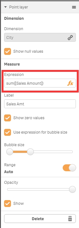
Hi Kieron,
It looks like you haven't added a measure to the chart. To do this expand the Data section and then put the measure in (image attached). You can then go into the "Appearance" section and go to "Colors and legend" (image attached). In this section you can adjust the colors as needed. The easiest way to get different colors based on sales is to use the "By measure" drop down. This will automatically color the dots based on the value of the measure.
-Josh
Qlik
Please mark my response as correct or helpful is appropriate so other members can find answers to their questions.