Unlock a world of possibilities! Login now and discover the exclusive benefits awaiting you.
- Qlik Community
- :
- Forums
- :
- Analytics
- :
- New to Qlik Analytics
- :
- How to handle the very large scale view across lef...
- Subscribe to RSS Feed
- Mark Topic as New
- Mark Topic as Read
- Float this Topic for Current User
- Bookmark
- Subscribe
- Mute
- Printer Friendly Page
- Mark as New
- Bookmark
- Subscribe
- Mute
- Subscribe to RSS Feed
- Permalink
- Report Inappropriate Content
How to handle the very large scale view across left and right Y axis in the Qlik Sense
Hello All,
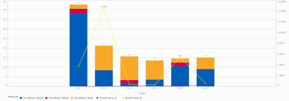
Can you please help in explaining the better way to put the graph with a view when we have drastic ranges over multiple y-axis measures
Data
| Types | Sum(Step1_Step2) | Sum(Step2_Step3) | Sum(Step3_Ste4) | Sum(Criteria_1) | Sum(Criteria_2) |
| Type 1 | 38.1 | 2.3 | 2.2 | 52 | 3,714.6 |
| Type 2 | 8.4 | 0.1 | 12.8 | 15 | 14,495.0 |
| Type 3 | 1.5 | 1.7 | 12.4 | 69 | 353.3 |
| Type 4 | 3.5 | 0.0 | 10.0 | 115 | 261.9 |
| Type 5 | 10.4 | 2.0 | 2.1 | 11 | 5,400.9 |
| Type 6 | 8.9 | 0.1 | 6.1 | 342 | 564.0 |
Using this data we wanted to show that Sum(Step1_Step2) Sum(Step2_Step3) Sum(Step3_Ste4) as Stacked bar information and Sum(Criteria_1) as one Y-axis line and Sum(Criteria_2) as another Y-axis line and problem being the
- Sum(Criteria_1) is way smaller compared to Sum(Criteria_2)
- Sum of Sum(Step1_Step2) Sum(Step2_Step3) Sum(Step3_Ste4) is way smaller than Sum(Criteria_1) sometimes
Hence we are not able to fit the Sum(Criteria_1) which is rarely visible proper in the graph and I have attached the graph in the section below, Can you please help me provide a better solution and some kind of hacks where we can solve this problem
- Tags:
- scale
- Mark as New
- Bookmark
- Subscribe
- Mute
- Subscribe to RSS Feed
- Permalink
- Report Inappropriate Content
Hi Qlikuser3 - I sent this to a few of my colleagues to see what might be the best way to approach this.
Regards,
Mike T
Qlik
Mike Tarallo
Qlik
- Mark as New
- Bookmark
- Subscribe
- Mute
- Subscribe to RSS Feed
- Permalink
- Report Inappropriate Content
@Michael_Tarallo Thanks for looking into this, Please help us with little urgency on this request !!
- Mark as New
- Bookmark
- Subscribe
- Mute
- Subscribe to RSS Feed
- Permalink
- Report Inappropriate Content
Imho, having measures of several orders of magnitude apart is probably not best solved by putting everything in to one chart.
I favor like in this article (https://outlier.ai/data-driven-daily/data-visualization-comparing-multiple-measures-on-the-same-plot...) to reduce to two measures and a dual axis. Another option could be to normalize (if possible) the measures to %.
Thanks,
Patric
