Unlock a world of possibilities! Login now and discover the exclusive benefits awaiting you.
- Qlik Community
- :
- Forums
- :
- Analytics
- :
- New to Qlik Analytics
- :
- Re: How to indicate a sales budget in a bar chart?
- Subscribe to RSS Feed
- Mark Topic as New
- Mark Topic as Read
- Float this Topic for Current User
- Bookmark
- Subscribe
- Mute
- Printer Friendly Page
- Mark as New
- Bookmark
- Subscribe
- Mute
- Subscribe to RSS Feed
- Permalink
- Report Inappropriate Content
How to indicate a sales budget in a bar chart?
Hi,
I have a bar chart showing the aggregated sales per month over a twelve month period. To make it visually easy for the teams to follow up during the year it would be nice to include a straight line in the chart showing the budgeted sales. As an example, the line shall start at $10 000 in January (month 1) and end at $150 000 in December (month 12).
What is the easiest way to achieve this?
Regards//Peter
Accepted Solutions
- Mark as New
- Bookmark
- Subscribe
- Mute
- Subscribe to RSS Feed
- Permalink
- Report Inappropriate Content
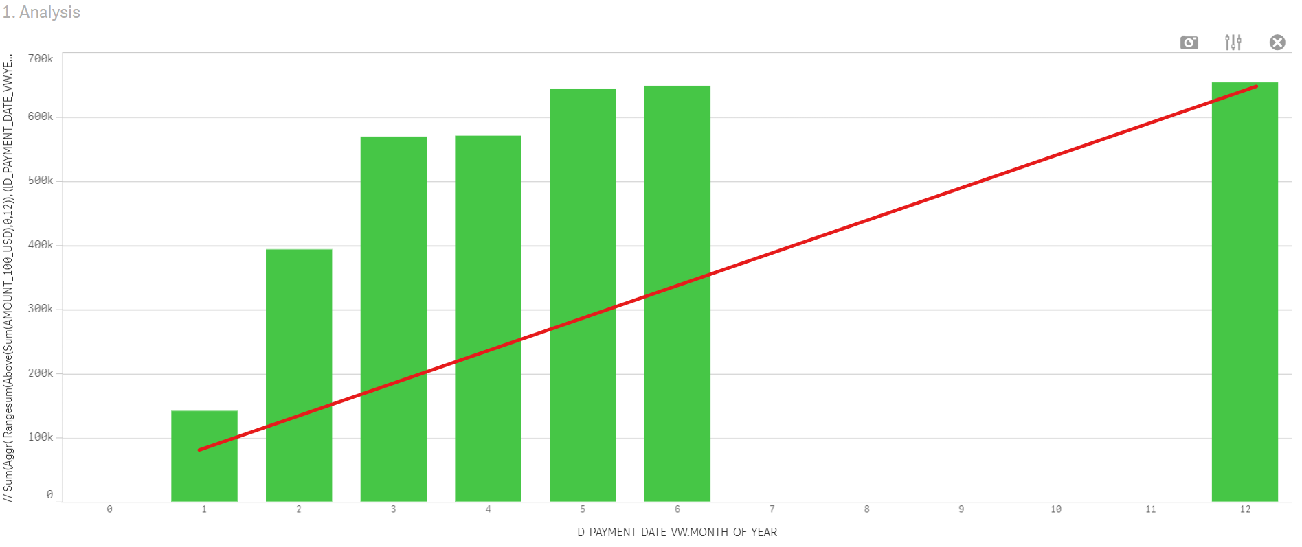
I solved this by adding a table in the data script representing a straight line (one data point per month) where MONTH_OF_YEAR is the common X-axis. I then plotted the curve in a combo diagram. Below is an example of the script. Attached is a screen clip of the final result. Enjoy 🙂
Budget:
LOAD * inline [
BUDGET_OFFICE_NAME|BUDGET_YEAR_NR|MONTH_OF_YEAR|BUDGET_AMOUNT
Gothenburg|2020|1|178333
Gothenburg|2020|2|356667
Gothenburg|2020|3|535000
Gothenburg|2020|4|713333
Gothenburg|2020|5|891667
Gothenburg|2020|6|1070000
Gothenburg|2020|7|1248333
Gothenburg|2020|8|1426667
Gothenburg|2020|9|1605000
Gothenburg|2020|10|1783333
Gothenburg|2020|11|1961667
Gothenburg|2020|12|2140000
] (delimiter is '|');
- Mark as New
- Bookmark
- Subscribe
- Mute
- Subscribe to RSS Feed
- Permalink
- Report Inappropriate Content
@peterstalberg Doesn't a simple line chart having sum of sales per Month resolve your problem?
- Mark as New
- Bookmark
- Subscribe
- Mute
- Subscribe to RSS Feed
- Permalink
- Report Inappropriate Content
Under Add-ons in the properties, add a Reference Line
- Mark as New
- Bookmark
- Subscribe
- Mute
- Subscribe to RSS Feed
- Permalink
- Report Inappropriate Content
Thank you for your reply. I'm aiming for a combo chart with the bars indicating the aggregated sales per month and the line is the budget. Please refer to example in original post. IT seems the "real" problem is that the x-values (month number 1-12) are from different sources/tables. Rgds//Peter
- Mark as New
- Bookmark
- Subscribe
- Mute
- Subscribe to RSS Feed
- Permalink
- Report Inappropriate Content
Hi,
Thank you for your reply. This is a good interim solution I'm using now but what I really want to achieve is in the example in the original post. Rgds//Peter
- Mark as New
- Bookmark
- Subscribe
- Mute
- Subscribe to RSS Feed
- Permalink
- Report Inappropriate Content
I solved this by adding a table in the data script representing a straight line (one data point per month) where MONTH_OF_YEAR is the common X-axis. I then plotted the curve in a combo diagram. Below is an example of the script. Attached is a screen clip of the final result. Enjoy 🙂
Budget:
LOAD * inline [
BUDGET_OFFICE_NAME|BUDGET_YEAR_NR|MONTH_OF_YEAR|BUDGET_AMOUNT
Gothenburg|2020|1|178333
Gothenburg|2020|2|356667
Gothenburg|2020|3|535000
Gothenburg|2020|4|713333
Gothenburg|2020|5|891667
Gothenburg|2020|6|1070000
Gothenburg|2020|7|1248333
Gothenburg|2020|8|1426667
Gothenburg|2020|9|1605000
Gothenburg|2020|10|1783333
Gothenburg|2020|11|1961667
Gothenburg|2020|12|2140000
] (delimiter is '|');