Unlock a world of possibilities! Login now and discover the exclusive benefits awaiting you.
- Qlik Community
- :
- Forums
- :
- Analytics
- :
- New to Qlik Analytics
- :
- Re: How to plot every value of a measure?
- Subscribe to RSS Feed
- Mark Topic as New
- Mark Topic as Read
- Float this Topic for Current User
- Bookmark
- Subscribe
- Mute
- Printer Friendly Page
- Mark as New
- Bookmark
- Subscribe
- Mute
- Subscribe to RSS Feed
- Permalink
- Report Inappropriate Content
How to plot every value of a measure?
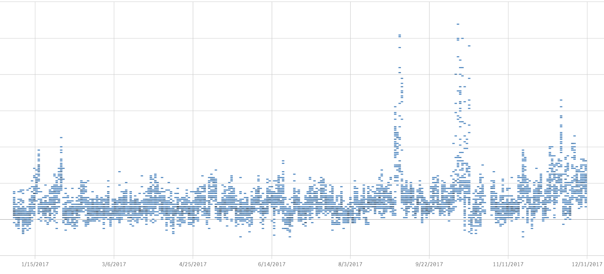
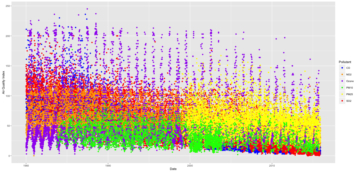
How can I get a similar chart with every value as a dot for a given date?
My data has multiple value for each date and I can only get a line chart with aggregation on the measure. I want to plot every single value for each date.
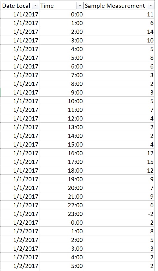
Measurements captured multiple time on a day throughout the year.
- Mark as New
- Bookmark
- Subscribe
- Mute
- Subscribe to RSS Feed
- Permalink
- Report Inappropriate Content
Try creating a scatter plot or just display the values in a pivot table.
- Mark as New
- Bookmark
- Subscribe
- Mute
- Subscribe to RSS Feed
- Permalink
- Report Inappropriate Content
Maybe create a timestamp from your date and time and use this as dimension.
- Mark as New
- Bookmark
- Subscribe
- Mute
- Subscribe to RSS Feed
- Permalink
- Report Inappropriate Content
If I use a scatterplot what would be the measures and dimension?
- Mark as New
- Bookmark
- Subscribe
- Mute
- Subscribe to RSS Feed
- Permalink
- Report Inappropriate Content
Try this:
X-axis: Only([Date Local])
Y-axis: Only(Time)
Dimension: [Sample Measurement]
- Mark as New
- Bookmark
- Subscribe
- Mute
- Subscribe to RSS Feed
- Permalink
- Report Inappropriate Content
Thanks for the suggestion. It worked. Basically the dimension used should be a unique value in my case Timestamp.
Now I my chart looks like this due to the density of the dots. How can I make it look like the picture in my initial question. Also how can I adjust the grid lines to be month wise.